Container Feature Playground
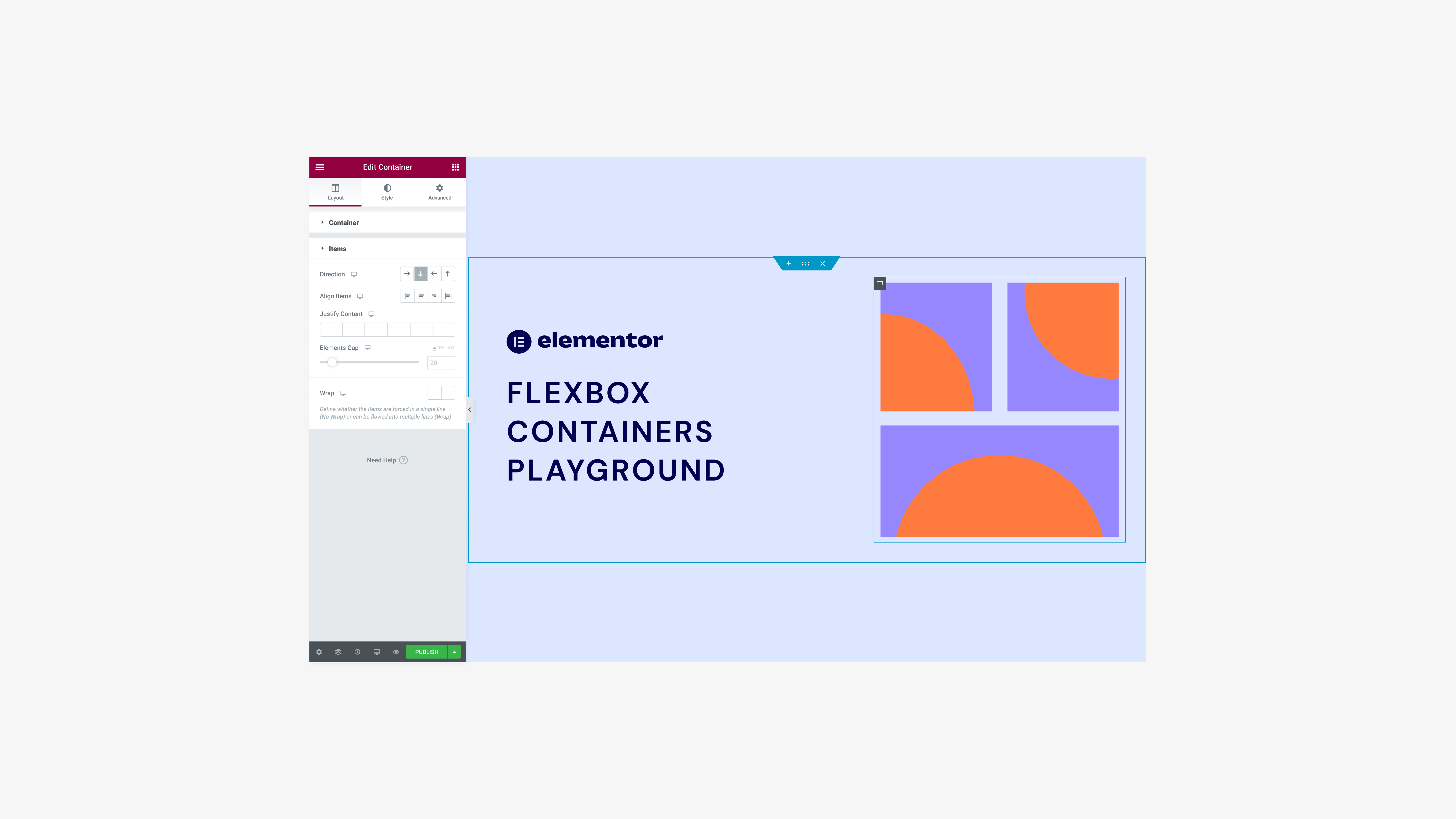
The flexbox container was a long anticipated feature. For years people built websites with columns and sections and it was about time to switch for a better way of building websites. This feature changes the way people are used to building and working, but also will allow Elementor to develop other, much needed features on top of it.
We wanted to make a product playground for a while, and this feature release was the perfect opportunity. It has never been done before so we consulted with a lot of people in the process: Our community leaders who best know our users, the education team that experts on teaching new features and of course or developers - since we needed to invent a new platform for this.
Link to Live Project
Team Lead: Erez Eden
Product Marketing: Gabriella Laster, Asaf Shevach
Team: Danielle Stelman, Asaf Rotstain, Nofar Shlomo
💡 First Thoughts
Although some of our users were familiar with the concept of flexbox containers, many were not and were not looking to change the way they worked. We were thinking a lot about how to make this clear (and fun!) for different levels of users. We decided to exclude new users, since we dive right in the feature and not introducing how to get started with the product itself.The first thing I realised we need, is a simple intro to the main areas of the feature. What are the basic controls that the user needs to know about?
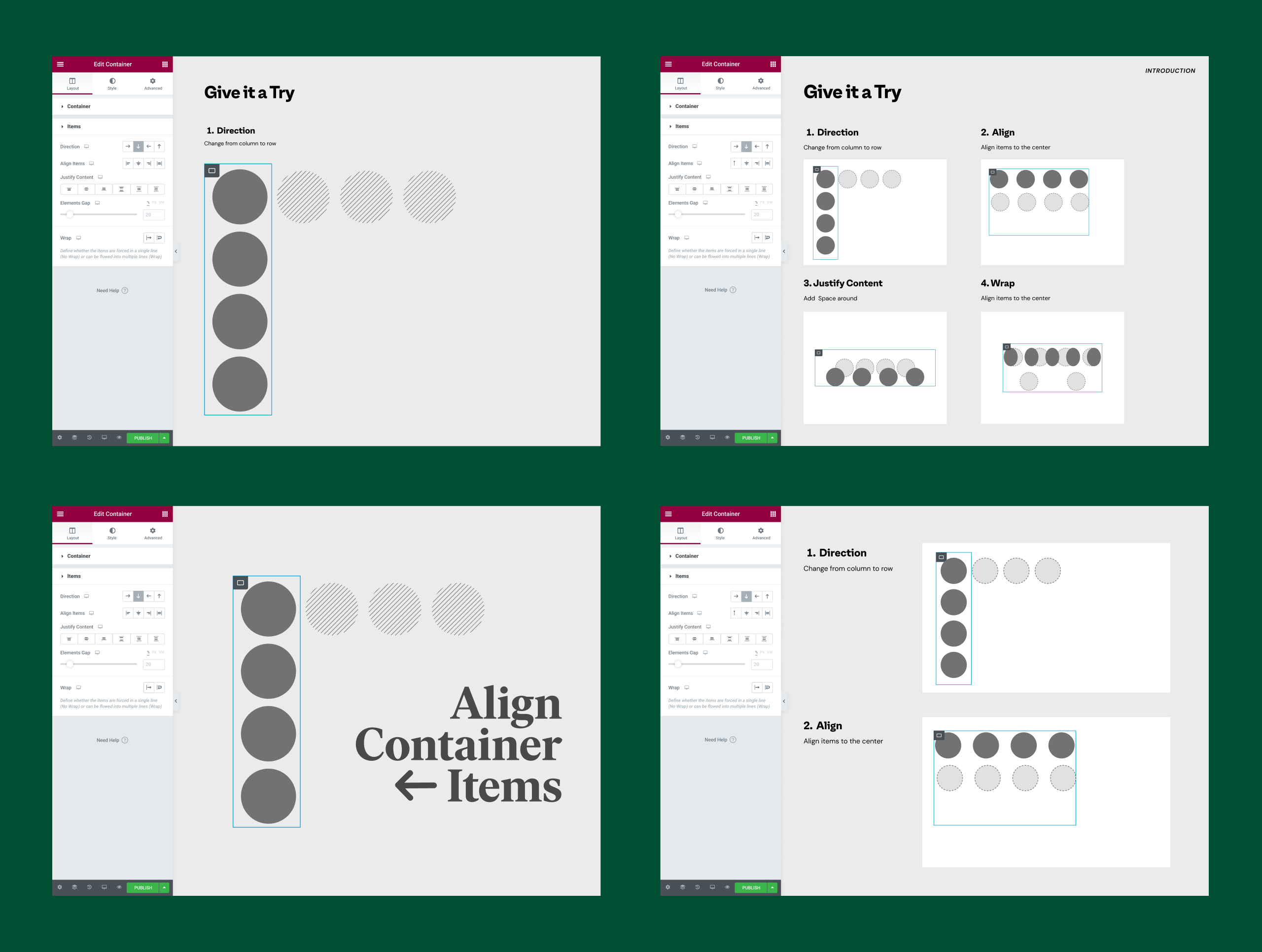
We knew we wanted to use examples that are web components (like a hero section, header, cards, etc). But the first impression should be even more simple, so why not just use shapes?
Here are some tests we did and later on the final result:
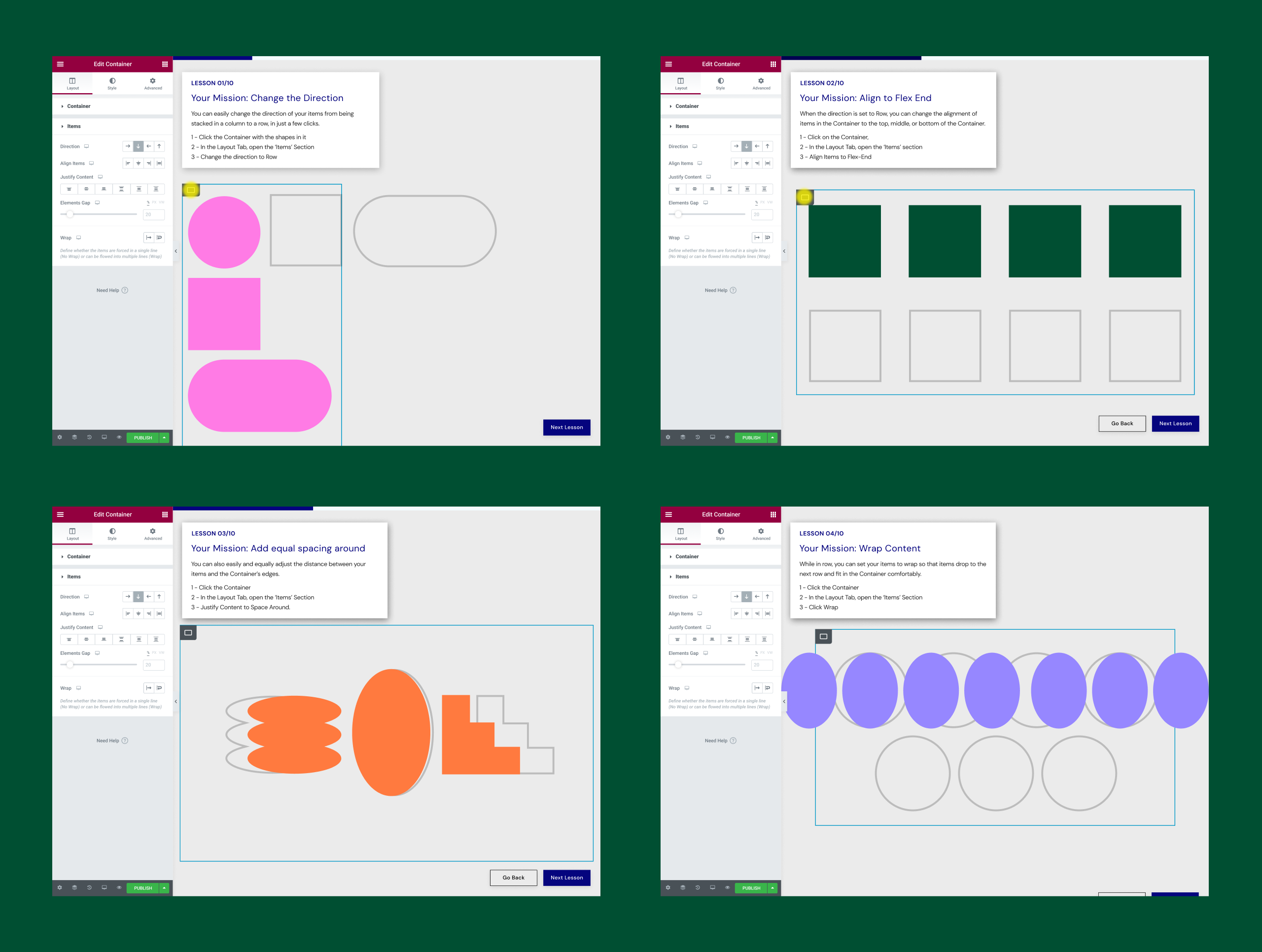
Intro final result
🧭 Instructions & Navigation
Except the lesson itself, we had a few elements we needed to include:1. Next & back buttons
2. Basic instructions
3. Hint for extra help (with a gif or not)
4. Final result preview (yes or no?)
5. Progress bar (yes or no?)
6. Container hint (an indication where is the right container to work on in the lesson.
We were only using the Elementor platform capabilities, which is very honest and users appreciate it, but also limiting in some aspects. We built the navigation and instructions with elementor widgets and of course - flexbox containers.
Challenges & Solutions
⚓️
One of the biggest challenges was how to build the instructions and navigation. We were working inside the product and it takes some time to load. So the first decision we made after testing loading times was to make it all a long scroll through the lessons (instead of loading each lesson separately), using a “scroll snap” feature that anchors each lesson.🔮
Another Challenge we discovered was the text of the instructions and hints. We wanted to keep it clean but clear for the users, but the build with containers overlapped some of our options (like the first image on the left) and made it harder to read.The chosen solution was having the basic explanation open and the hint is collapsable and “pushes” the lesson area down the screen. The video gif idea didn’t work unfortunately, since it affected the loading time and needed some extra development time we didn’t have.
🖼
After testing the first versions we made, we realized that having the result image already visible made the users understand the assignment better. Another tool we wanted to incorporate was guiding and live hinting (pando messages), so the user will know he’s in the right direction, but also, since we were short on time we gave it up and worked on more precise copy and UX.
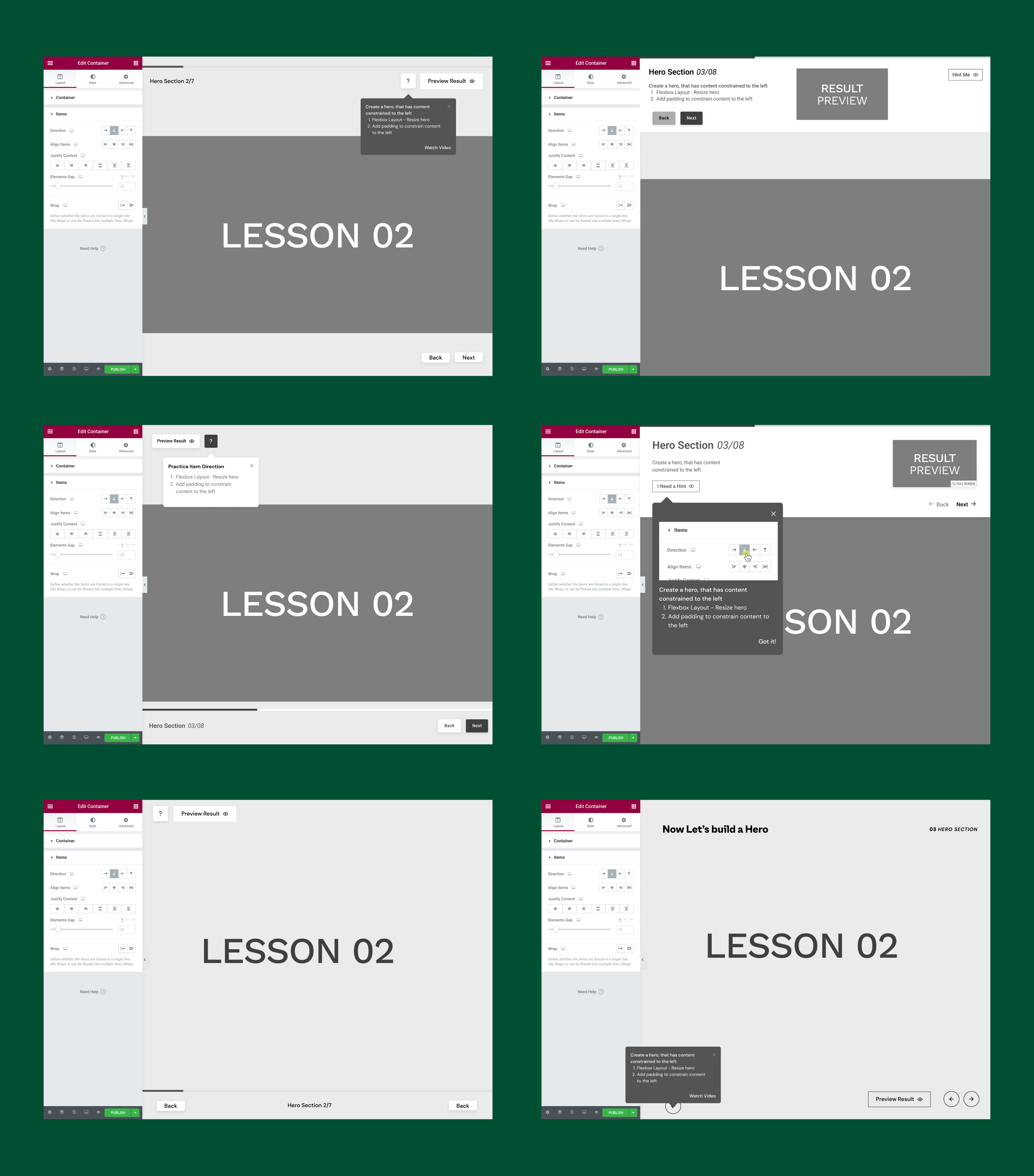
Instructions & Navigation Tests
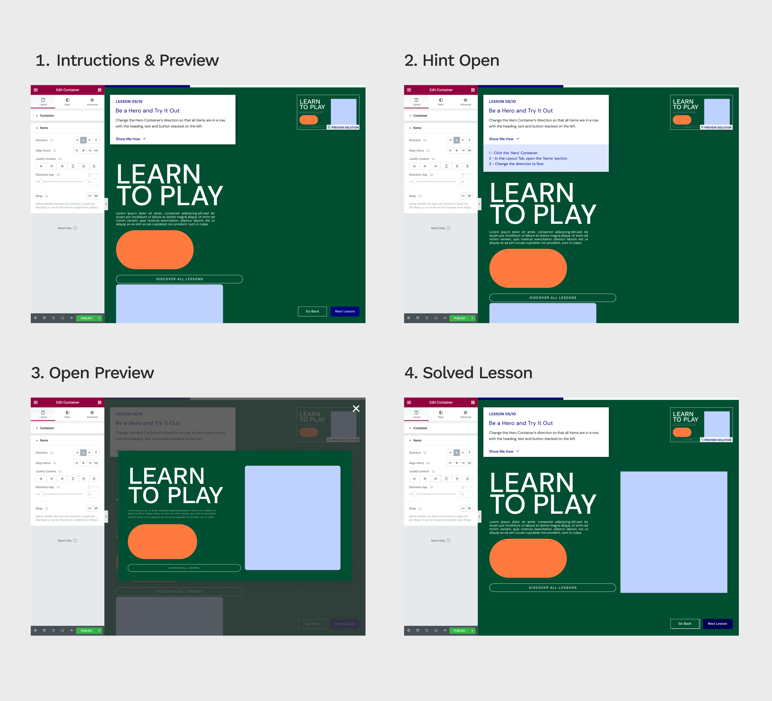
Instructions final result
🚦 Gradually increasing difficulty
Since we were aiming at different levels of proficiency between our users, we didn’t want them to be bored or feel it’s too hard, so we started the lessons from basic simple shapes you align with one click to complex layouts that need multiple steps to achieve. That was also the reason the hints (or step-by-step instructions) were hidden by default - You can always get more help, but you should try it yourself first, as it was a better learning and implementing experience.After analyzing the first results after the release, we believe it paid off - 81% of the users reached the last “thank you” slide.
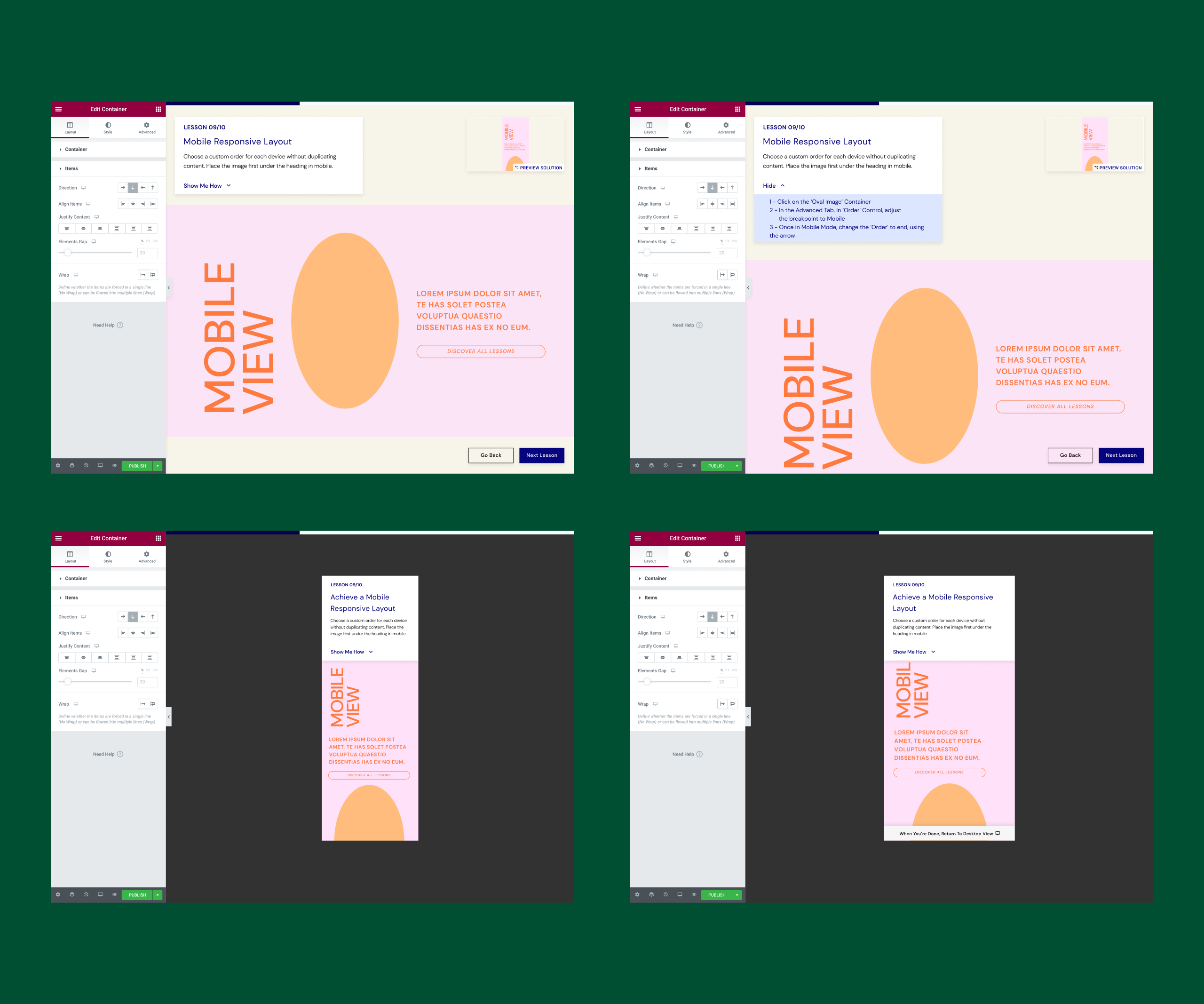
More Complex levels

More Levels
💭 Thoughts for the future
Since it was our first time to make a product playground, a lot of things failed, took more time than expected and new problems occurred along the way. I believe it’s part of the fun with those kinds of things, especially in a startup environment. Yes, the schedule is crazy at times but it pushes you further and you’re allowed to make mistakes. We were a small, very committed team that had our users in mind all the way through, and it really paid off. The comments were amazing and asked us to do this more often. This could be an amazing learning opportunity for new features or even for new users that consider paying for the pro version of the product. The potential is endless!What we learned
1. Less is more - Keeping it simple and clean, even copy wise, makes a huge difference for users. We tested a few versions with people in the office and it was amazing to see how small changes increased or decreased resolve time for the same lessons.
2. Next time - adding a guiding tool (like Pendo). This will allow us to do more complex lessons and track the process better
3. Communication and trust - that was the most crucial part working on it. No bad ideas, let's just try and see if it works. I felt so privileged to work with such amazing professionals
4. Testing is everything - When you’re on the inside, you don’t have a clear view of what you’re doing, Seeing people test the product reveals weak spots and unclear instructions.
5. Done is better than perfect. Sometimes it's ok to let small things go for the sake of the bigger picture.
Link to live project