Elementor Website Design System
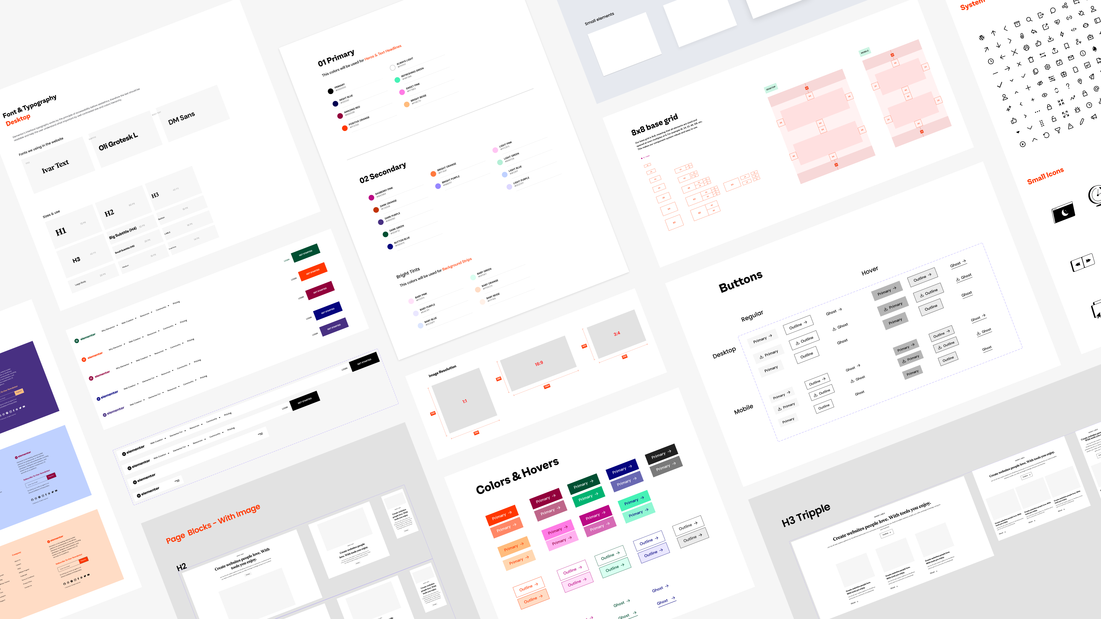
⚡️ Start at the Begining
Why make a design system for a website?
1. Many people were involved in the elementor.com project. New designers joined the team, some only temporarily since we needed more working hands for the tight deadline. Also new developers and product marketing managers joined and it became harder to keep the consistency going.
2. Other teams also saw the web language being created, and wanted to have guidelines for other things - like landing pages, release material & emails. Another project was happening simultaneously - adding the new brand to the product - that team needed some guidelines to incorporate the brand to the product.
3. We wanted to spend less time on simple repetitive parts of the website and dedicate more time to developing more complex layouts and animations.
What now?
The design system helped us achieve all of those and more. The way it worked was first documenting all the big umbrella decisions - Colors, fonts, grids.. and having this basic style guide - in the figma file and in development. So when I say H3 text block or “light pink”, we all speak about the same thing. Later on more needed components were added. We had 3 rules about what's going in the DSM:
1. Was it developed? (sometimes we made adjustments based on the development needs/limitations)
2. Will we use it more than once or twice? Does it solve multiple scenarios or is it a one-time showoff?
3. Does it work and function as planned? Is it responsive?
Since the day it was born the design system kept on growing and developing, and it’s in use by multiple teams. Some components were added as a request from others, like blog and marketing teams, to fit their needs better. We also kept syncing with other product teams and helped each other and the whole elementor experience to be consistent and coherent.
My Role in the project
The DSM started as a passion project of main and Yanki Bindman. First we started documenting the decisions I made for the web language - colors, type, grids
Later we added basic UI atoms - button styles, breadcrumbs, etc. and finally I built the rest - text blocks, page blocks, showcases, carousels and made them responsive.
I was the owner of the project and kept adding and documenting components with Assaf Rotstain on the dev. side. Just before I left the company, I held a workshop for my team so they can keep maintaining and growing it without me.
The Team
Head of Design: Ronit Cyjon
Team Lead: Erez Eden
Team: Yanki Bindman, Danielle Stelman, Alon Braier, Omri Avraham, Yael Zlotnik
Dev. Team: Asaf Rotstain, Alan Kaler
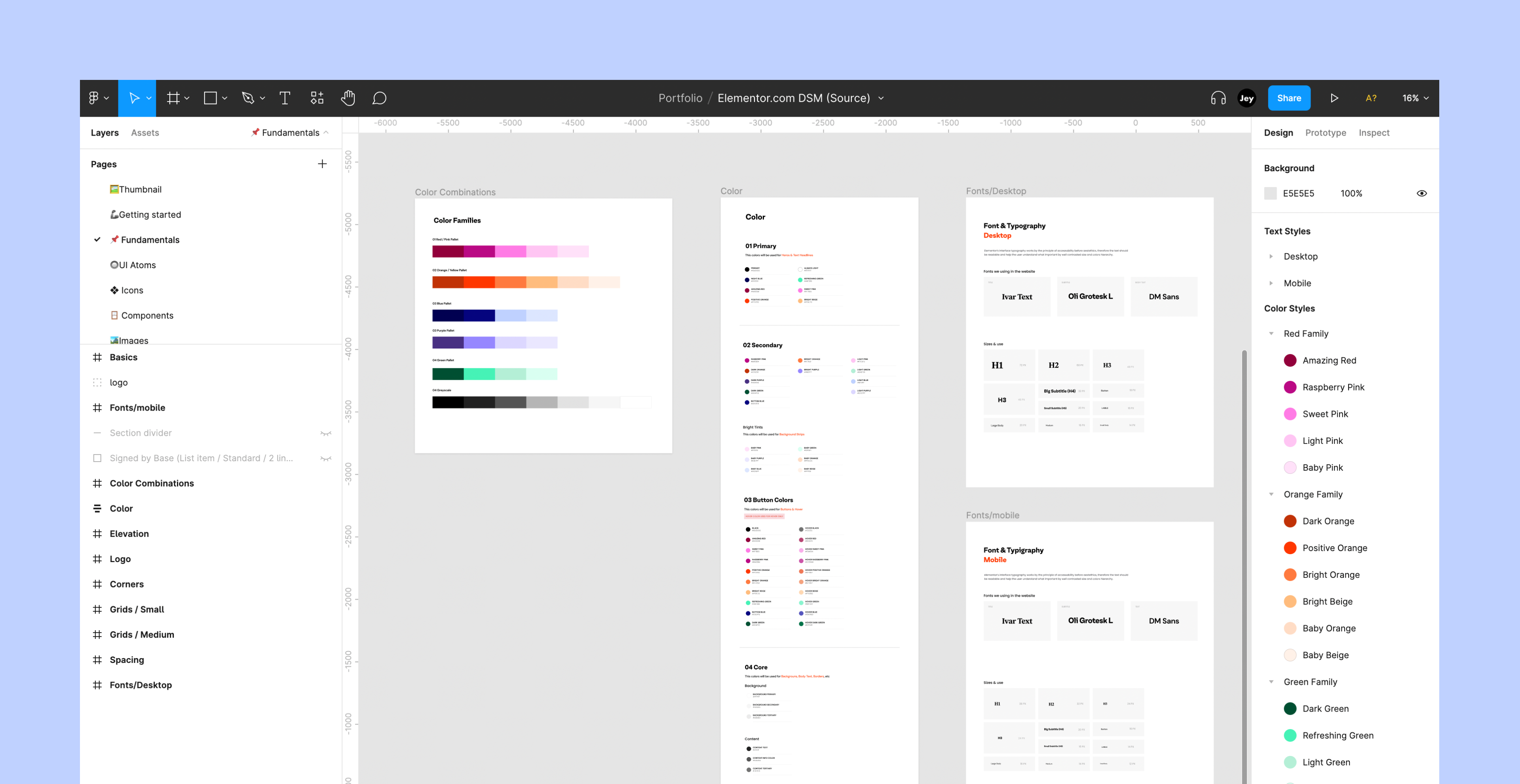
📌 Fundamentals
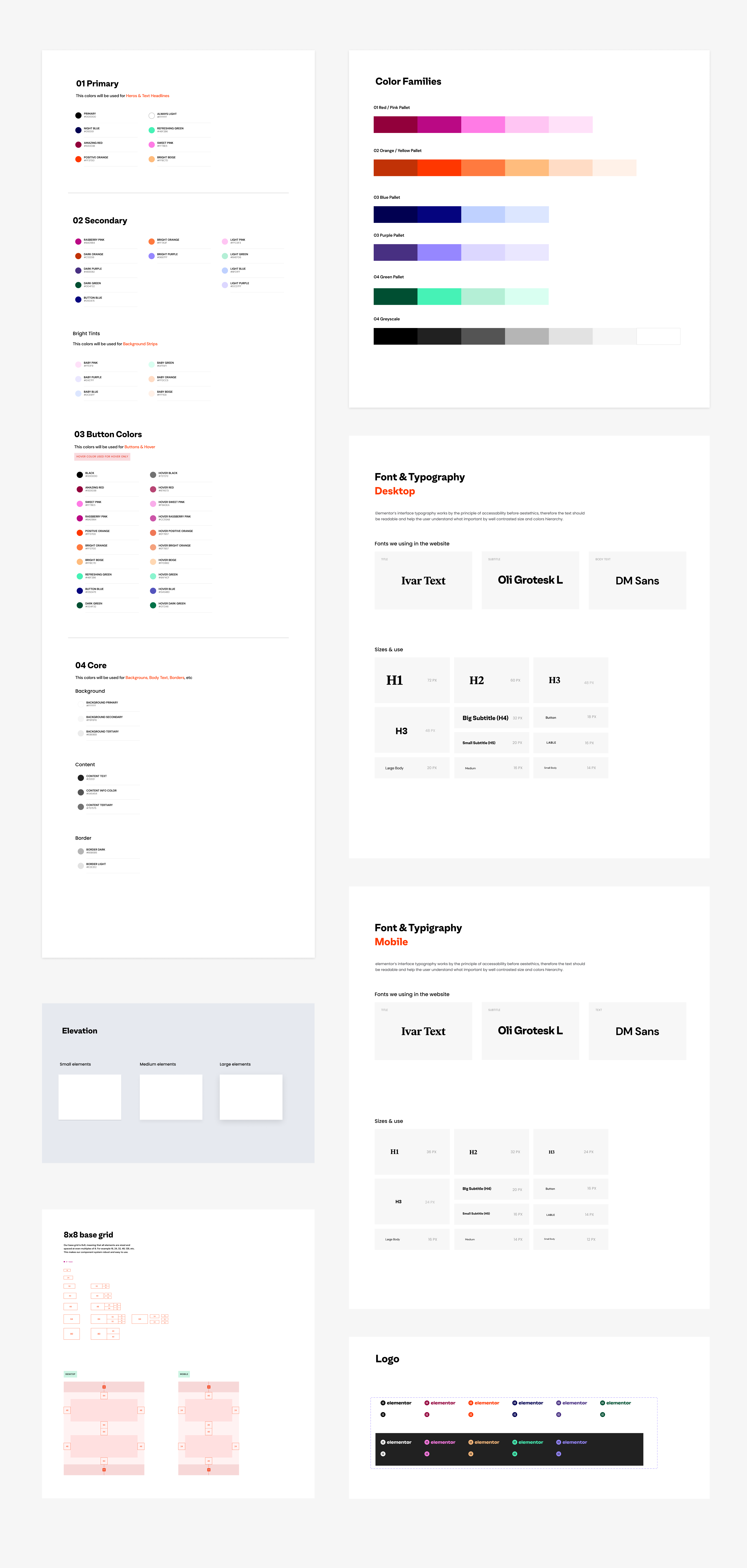
Color and Typography
First thing first - converting the brand language to a web language. We had the primary brand colors that were given, but we needed to add some sub colors and greys to make them work better on the web. Also we had 3 fonts, which is an interesting challenge by itself, so we divided the two headline fonts (Ivar Text bold, Oli Grotesk bold) to primary and secondary headlines. Later on we pushed to buy the full Ivar font family so we can have more web fitted headlines. We created the different hierarchies and text modals (H1-H6 sizes, body blocks, bullets, etc)
Grids
As the majority of our users (~87%) browse the website on desktop, we knew we’re working desktop first. Before the product had custom breakpoints we need to think how the pages will look best on wide and laptop resolutions, how to have a good score with google (since it’s calculating mobile first) and also be true to our users about how we build with our own product. We knew that we don’t actually have much browsing from tablets, but our user tested how responsive we build.
The first thing we did in the beginning was working on wide screens (1920px) but with a narrow grid (1280px) and making sure it looks good on both. Later on we started working on a more standard and common size (1440px). We basically worked for the extreme first - small mobiles (360px) and a 1024px tablet with 768px wide grid.
🔘 UI Atoms
The Elementor brand is bold and colorful, and has no rules or specific color codes for topics. Everything goes and it’s up to the designer to make those decisions. That’s why many of the components come without color and are just represented with grey tones. Components like buttons have a specific use guide next to them, to show the options and how it looks in different states. Same was developed inside the elementor editor and CSS classes were created for the options with their behavior.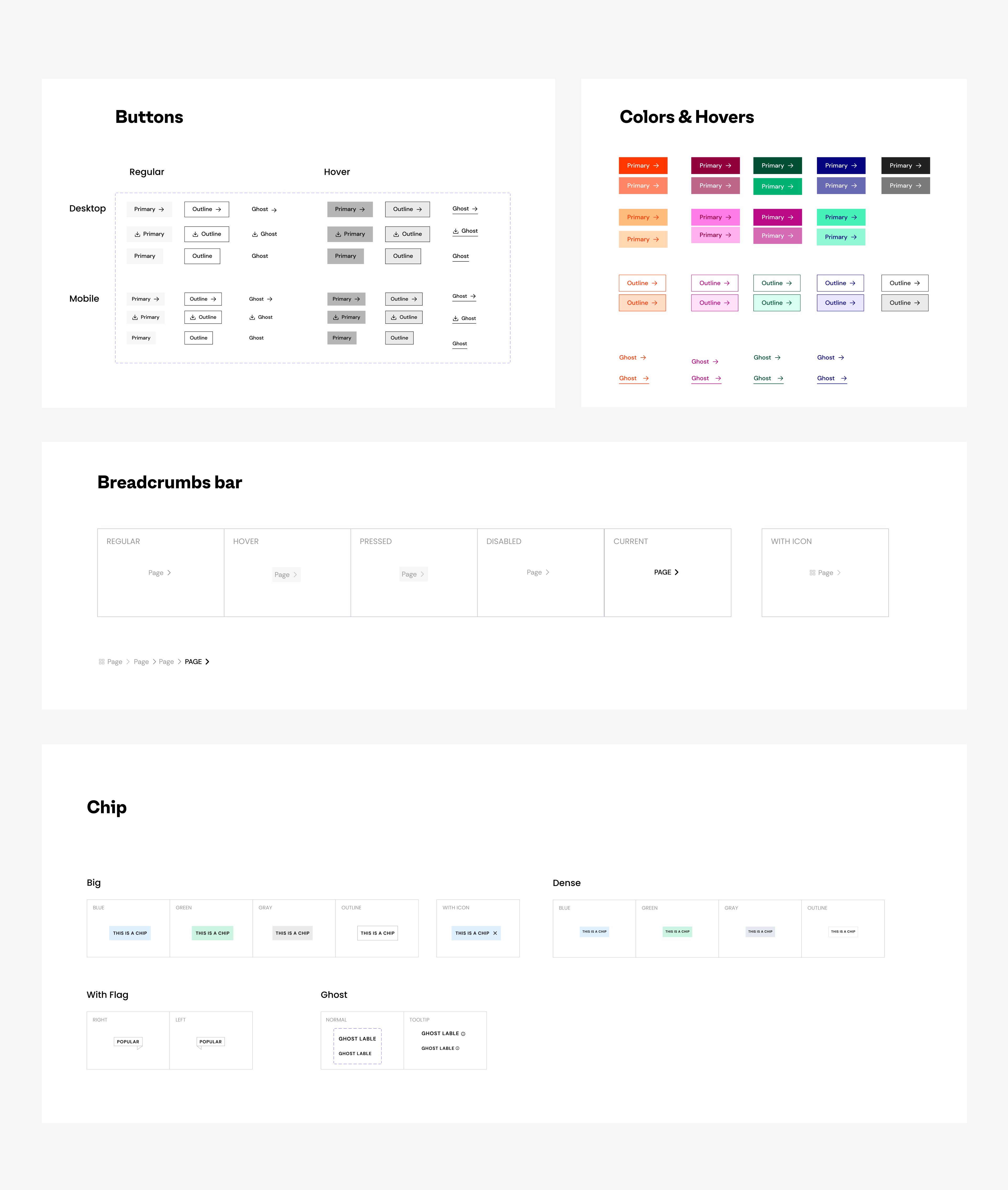
UI Atoms
❖ Brand Assets
We had great brand assets - amazing illustrations and beutiful icons that we need to adjust - how and when we use them? color options, layout rules... It was important to us not to over-use them, and we wanted to keep them as little delights that enrich our stories. The illustrations were used for the emotional parts of the product - to help explain more abstract concepts and add heart to complicated subject, usually with a little loti animation. The icons came first as “mini-illustrations” and were used more on landing pages. We used them for important points we wanted users to stop for, and made lighter versions of them to use on mega-menu and other big lists/card compositions. Those assets keep developing and growing with website itself.Three Icon sizes // Library Examples
![]()
Web illustrations // By Alon Braier
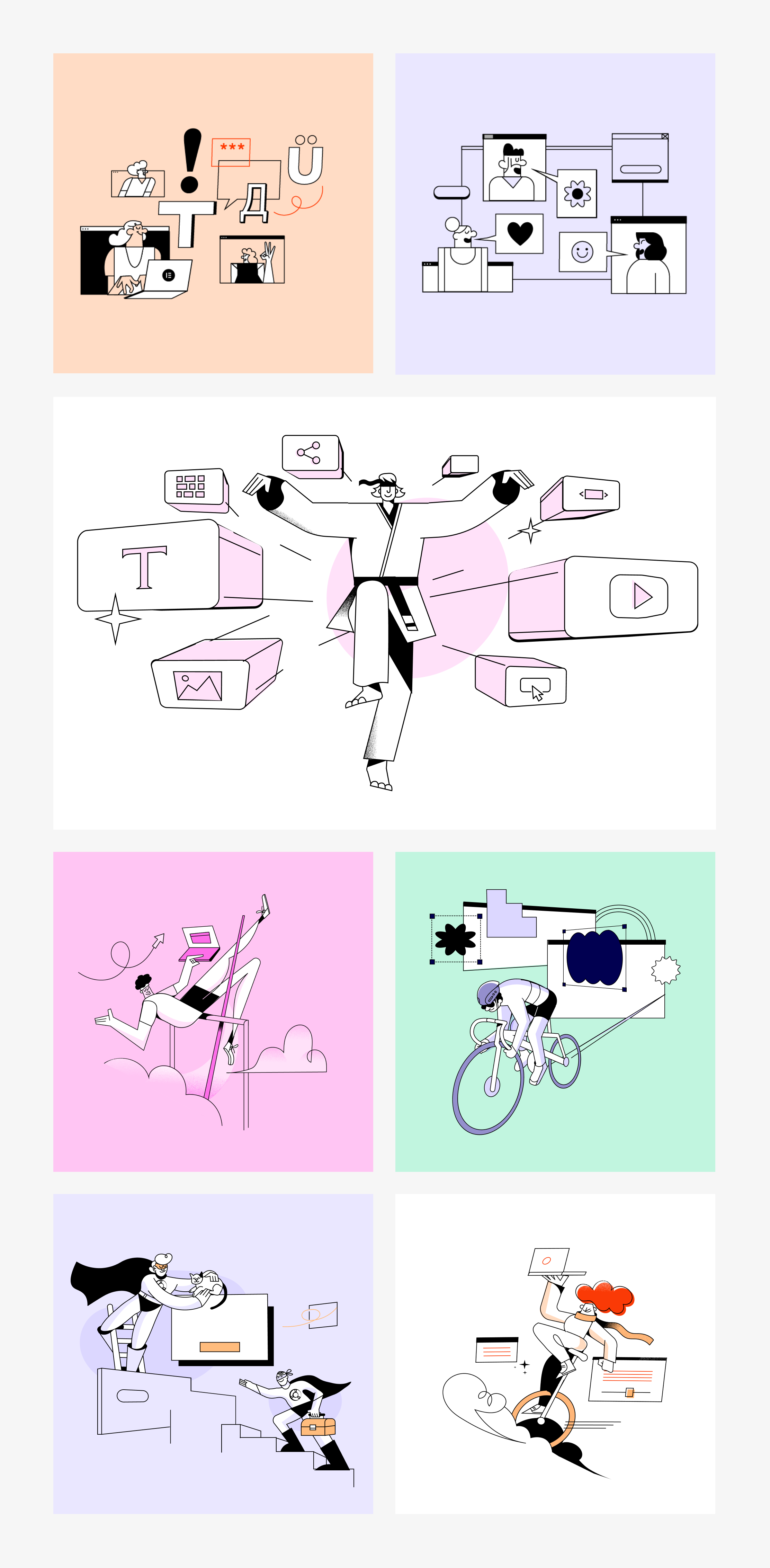
Web illustrations // By Alon Braier
🗂 Components
Or: How not to solve the same problem again and again.The most common components on the website were text and an image to illustrate/demonstrate/mockup. So in order to keep it looking clean. grounded and consistent, we limited the image and video sizes to 4 sizes and resolutions: 3:4 in 2 sizes, 16:9 and 1:1. We paired those images with full text blocks that contain all the possibilities (but you don’t have to use the full version): Label, headline, body text/bullets and a button. And for the ability to build and test a page quickly we created responsive full page blocks. Just change the text and see if your flow and story are working for you. Same blocks were developed and that helped to cut the development time from 2 days to a few hours. Also, it left us more time to concentrate on designing more and crazier components to enrich the web experience.
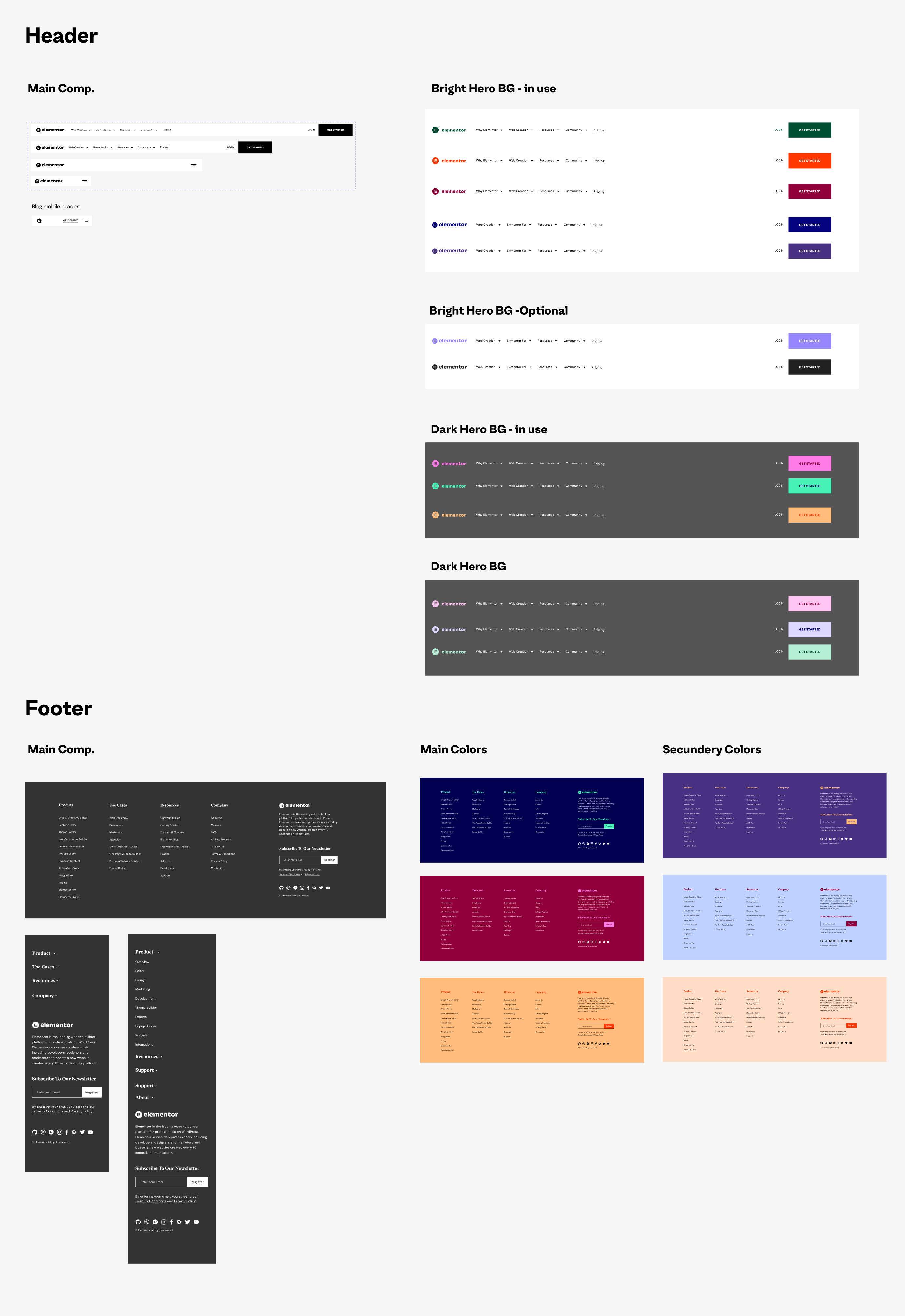
Other than that we added footer and header components and updated them when the website changed and grew (instead of doing it manually on all the pages) and other useful comps. - Carousels, tabs, showcases and more.
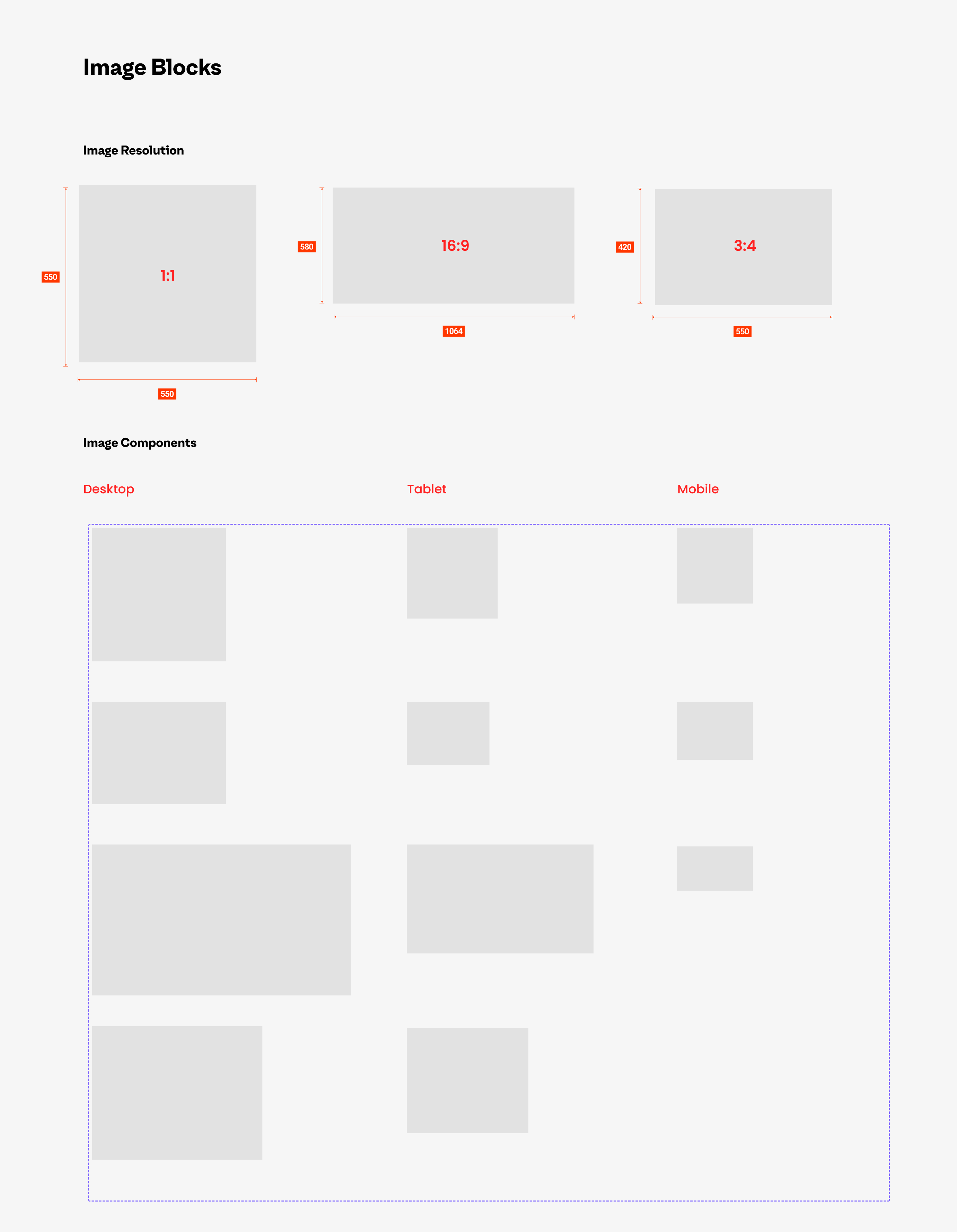
Image Containers
This are BG sizes for various images that are used on the website
![]()
Text Blocks modals
Text sizes and variations
![]() Header & Footer
Header & Footer
This are BG sizes for various images that are used on the website
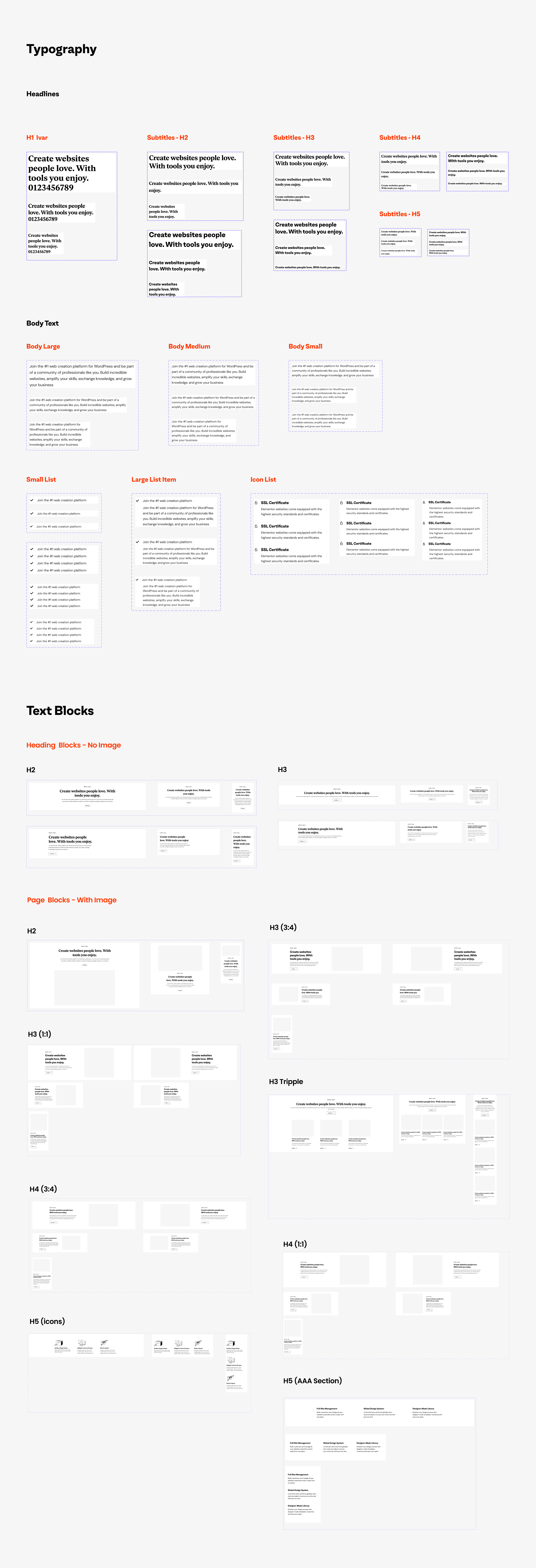
Text Blocks modals
Text sizes and variations
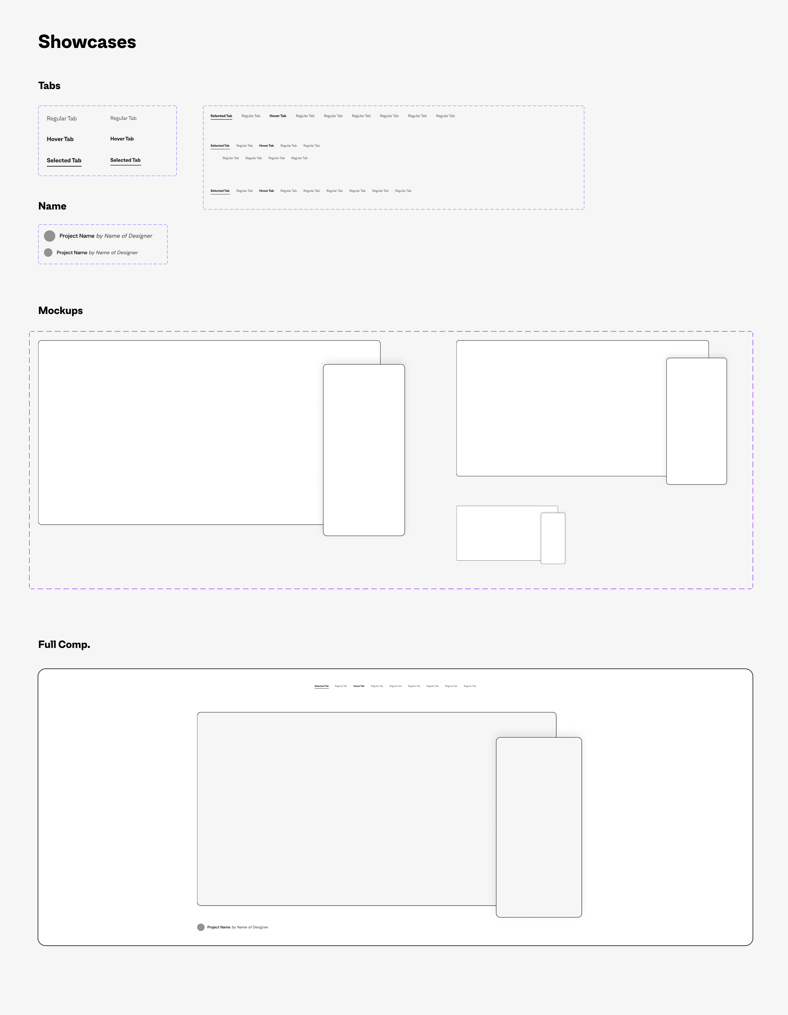
Showcase Componant
🏗 Full Page Build
To demonstrate a little better how it works, take a look at a simple page created with 100% of DSM components and how it looks in the process.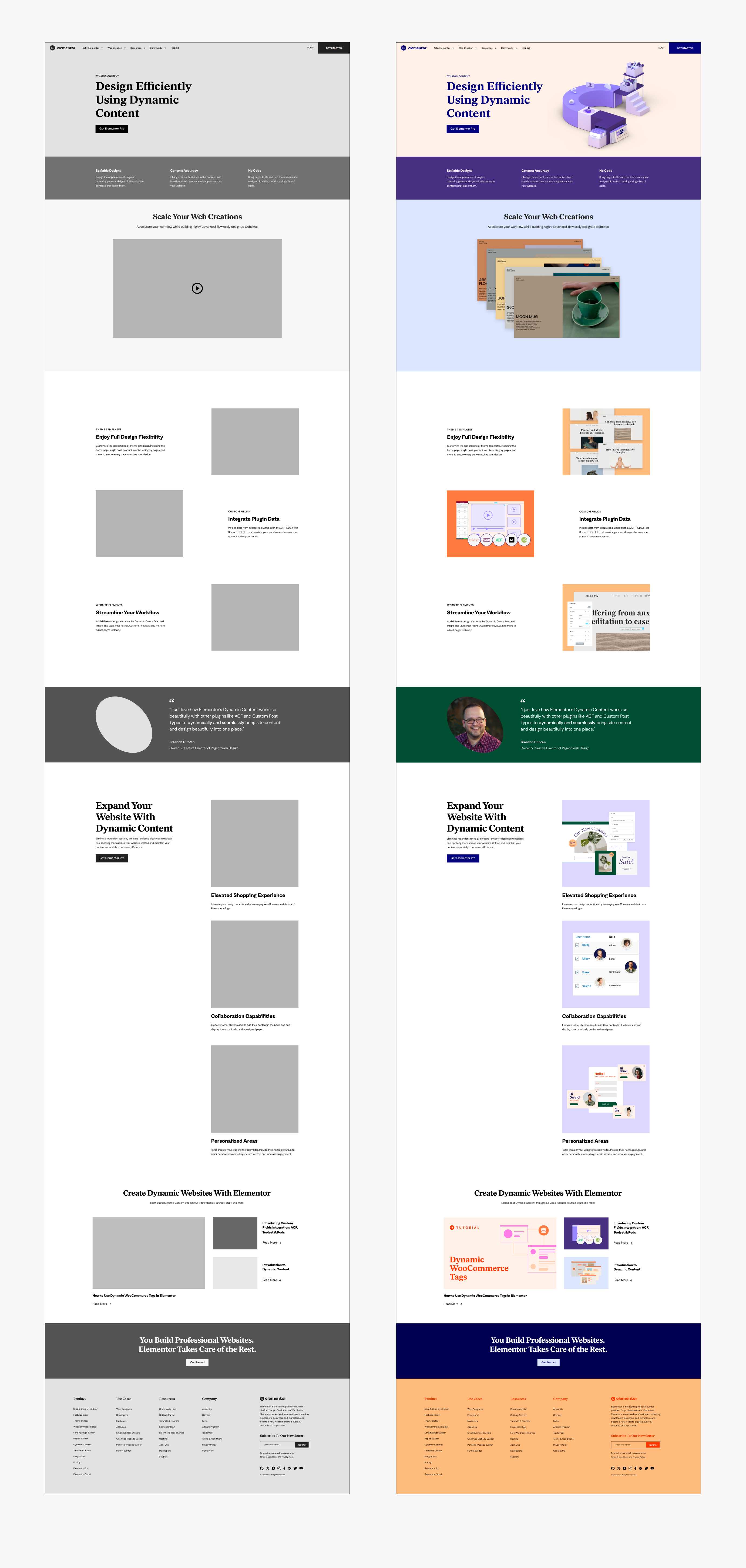
Simple Page Stracture
🏗 Design System Workshop
I knew I was about to leave my beloved team and I’m also a huge fan of sharing knowledge, so I held a design system workshop, tailored to my team's needs, but also added some more important knowledge. We had a lot of fun learning and doing exercises together. Since it went pretty well, I planned more workshops - for the marketing team and the education/developers teams.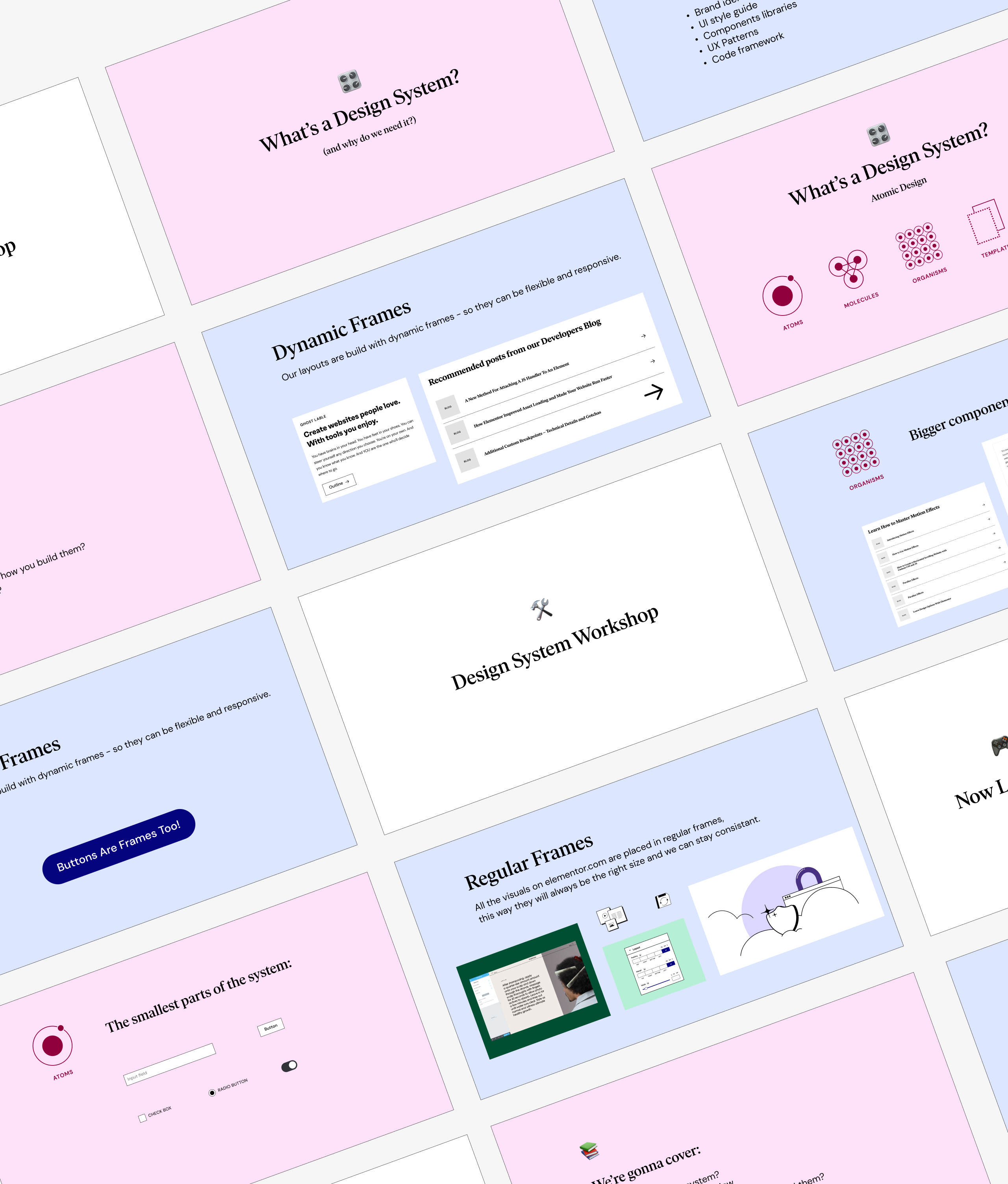
Presentation
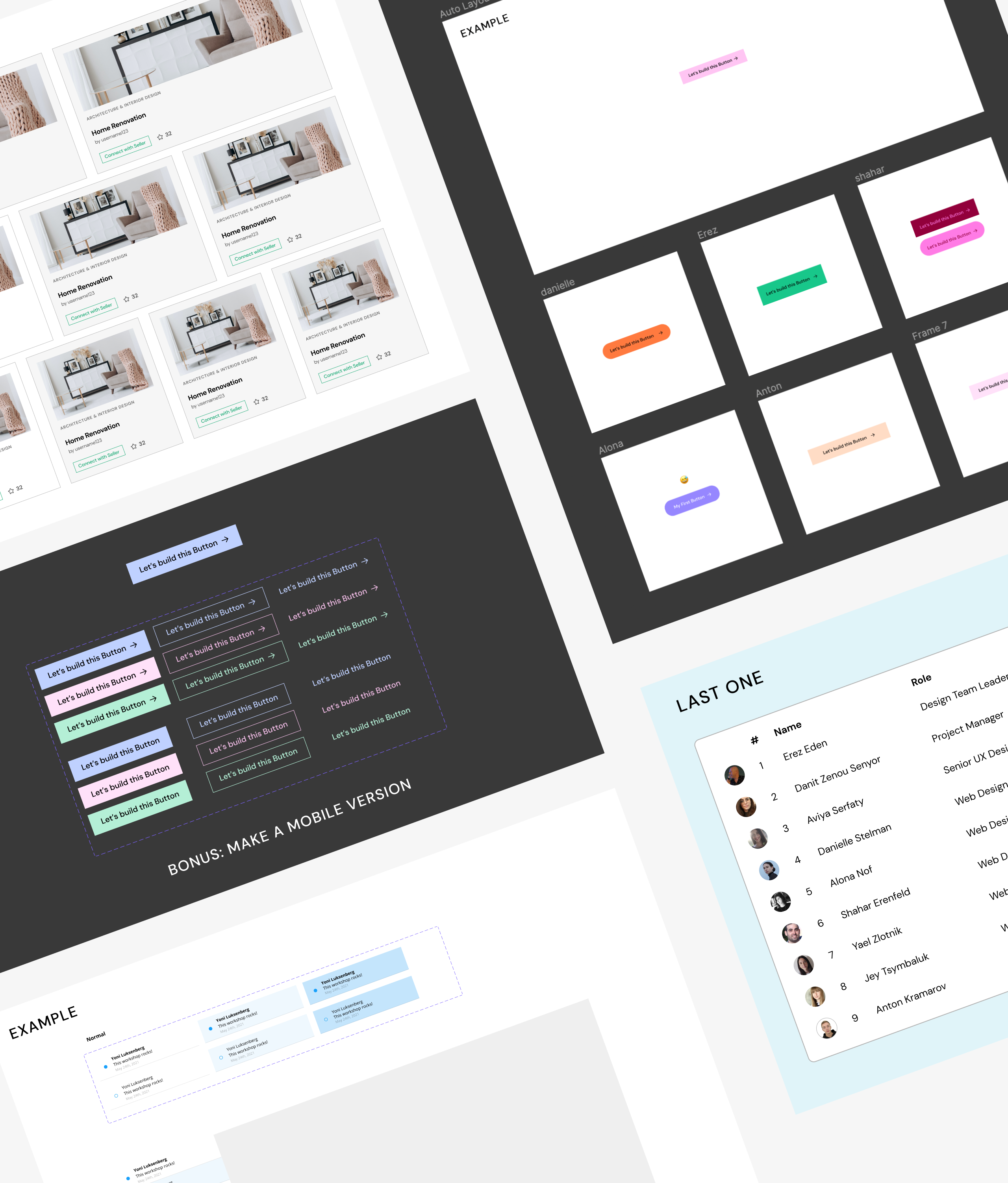
Workshop Examples
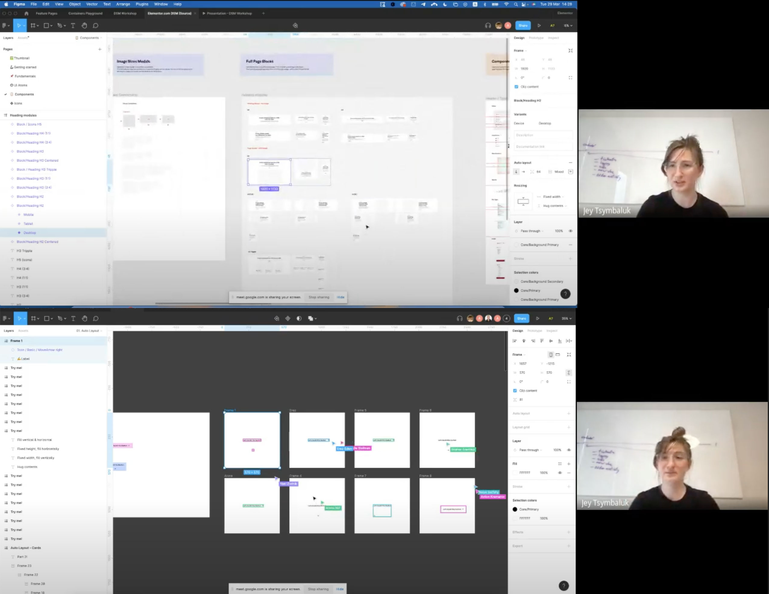
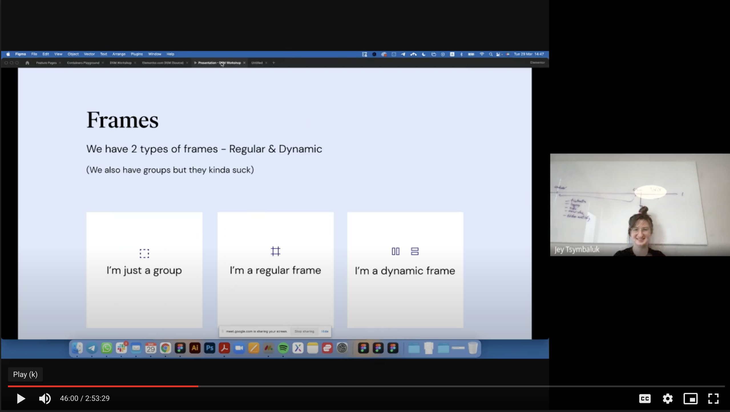
Screenshots from the workshop recording