Elementor.com redesign
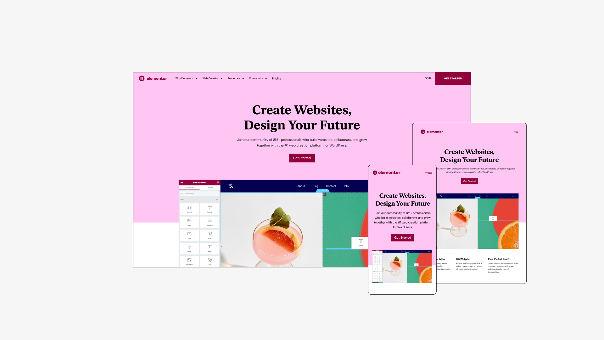
My Role
🏆 2022 Israeli Brand Awards winner // Best Web User Experience (Award Website) 🏆
- Research: competition, existing website & KPI’s
- UX design: Ideation, hierarchy, page structure, design system
- UI design: building the website brand and style guide
- Teaching new team members
- Building healthy workflows with developers
- Helping PMM’s build the roadmap for next stages
🏆 2022 Israeli Brand Awards winner // Best Web User Experience (Award Website) 🏆
Team
Head of Design: Ronit Cyjon
Team Lead: Erez Eden
Product Marketing: Sarah Nielsen, Daniela Soibelman, Johnathan Maimon
Design Team: Danielle Stelman, Alon Braier, Omri Avraham, Yanki Bindman, Yael Zlotnik, Alona Nof, Shachar Erenfeld, Aviya Tzarfati
Dev. Team: Asaf Rotstain, Alan Kaler, Roy Eyal, Nofar Shlomo
Project Management: Danit Senior, Julien Driquez
Special thanks to Yoni Luksenberg, CEO
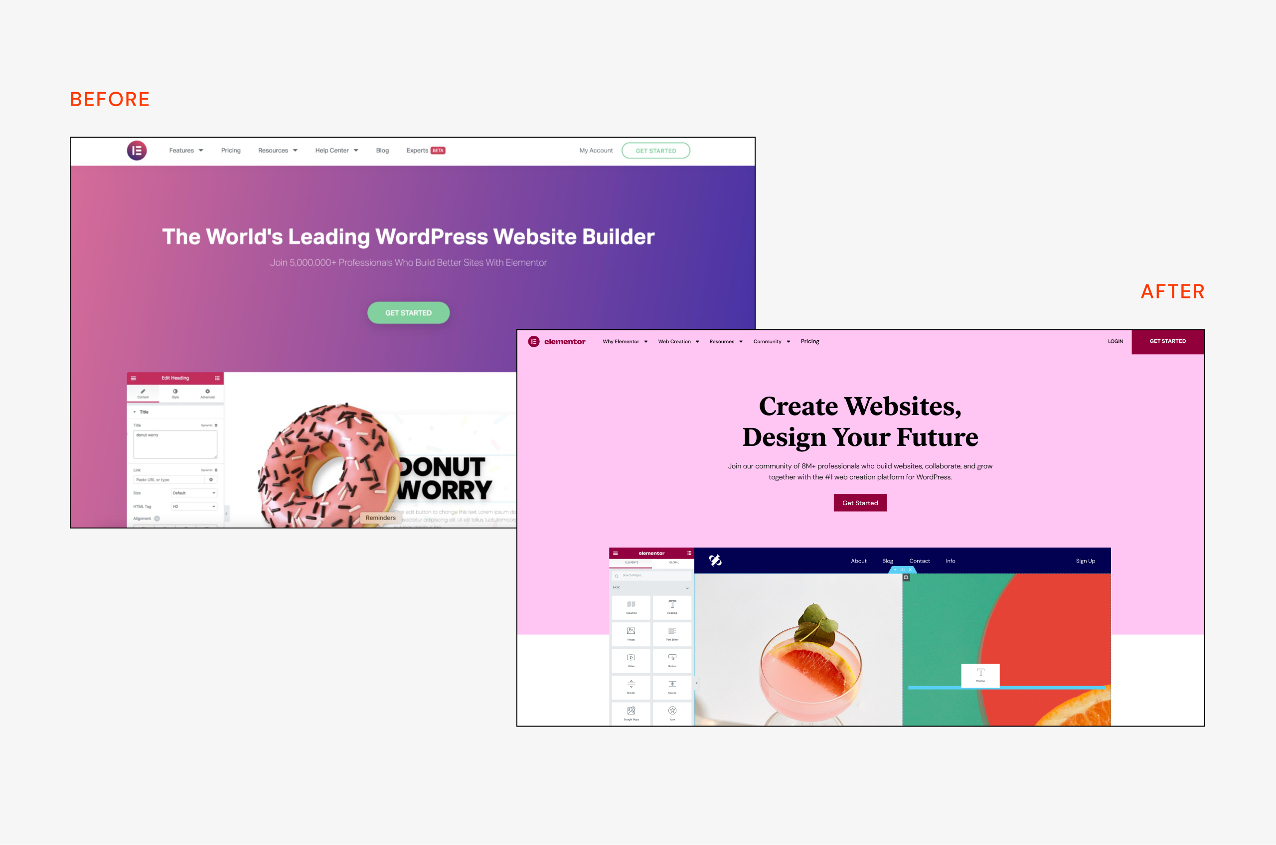
Before & after - home page
👋🏻 Introdusing Elementor
What is Elemntor?
Elementor is the leading website builder platform for professionals on WordPress. Elementor serves web professionals, including developers, designers, and marketers. It started as a humble WordPress plugin and became so much more.
I joined Elementor when the design department started to take shape. One day I was called to a room with Ronit (Head of Design) and Yoni (the CEO) and was given the mission to design the new Elementor website with the new brand.
At first, I had to map all the questions I had - who are we as a company, and what do we represent? what are our business goals? How does the brand react to the web environment? What are our users getting out of it? and what do they need?
Over time new team members joined the effort, a team leader was placed and healthy workflows were created. This project was a huge team effort and I couldn’t do it without the help and advice of so many people.
Live website: elementor.com

⚠️ The Problem
Why redesign a working website? elementor.com was working pretty well and had a good amount of traffic and conversions. We had a few good reasons to do so:1. The brand changed - elementor had a full rebranding and strategy change, it was more than just a wordpress plugin. It became a community of web creators with new goals and aspirations.
2. We had new and higher goals to achieve, first of them was serving the community - with education programs and learning material, new pricing tiers and more.
3. It was simply not the same company anymore and we wanted the website to reflect it. We were telling a new story.
4. Many things didn’t work well - the website wasn't really responsive and accessible and the architecture didn’t make sense anymore. We need to rebuild and restructure.
Product video by Alona Nof & Simon Shor (and that’s me in the green pants below!)
✅ Solution Guidlines
Where do the users go?
One of the first things we learned is that users come back a lot. We didn’t have the data if they already bought the elementor plugin or they are still browsing, but we noticed they came to learn. The pricing page was the most popular one, but after it, we had major traffic in the widgets page, big feature pages and the blog.
How do they browse?
It was very clear that most of the traffic comes from desktop - around 87%. Purchasing from the pricing page was higher - 96%, which made sense, since the elementor plugin is a work tool, a web desktop app, as a professional you’ll probably have your computer for working. Also people make big/important purchases on their computer mostly. So we designed desktop first, but always having in mind the responsive aspect.
How do we build?
It was important to build purly with the elementor plugin and show our users the best capabilities we have. It was limited in some parts but we tried to keep the code used to a minimum and just be creative. The mega menu for example was a “hack”, using the popup feature, but still, purely elementor with a touch of CSS.
The Design
Design-wise we wanted to be bold and to stretch the meaning of web design. We were guided by the idea of the product being part of our users daily life. More than just a work tool - an active and strong global community. This inspired our page hero sections, the bold color palette and the mockups we designed to demonstrate features - true to the product and still bold and inspirational.
The work is not done, probably will never be. The idea was to create a solid base for now and to build on it in the future, while keeping it bold, fresh and adapting to change. Of course we made some mistakes, some are still live and waiting in the backlog to be fixed.
As the design and developer team grew, we knew we had to keep the design language coherent, so that how the web design system was created, you can check out the study case here.
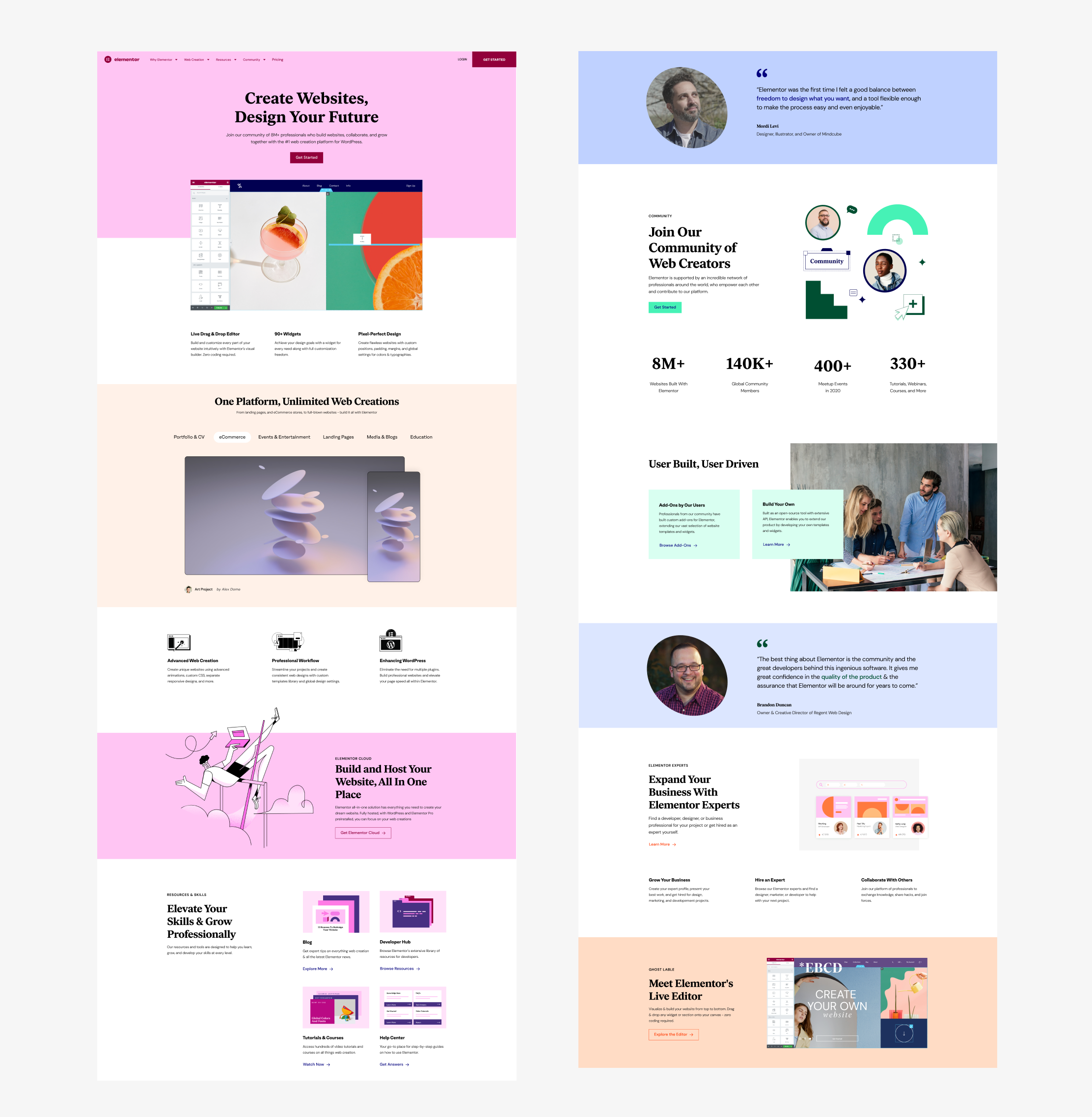
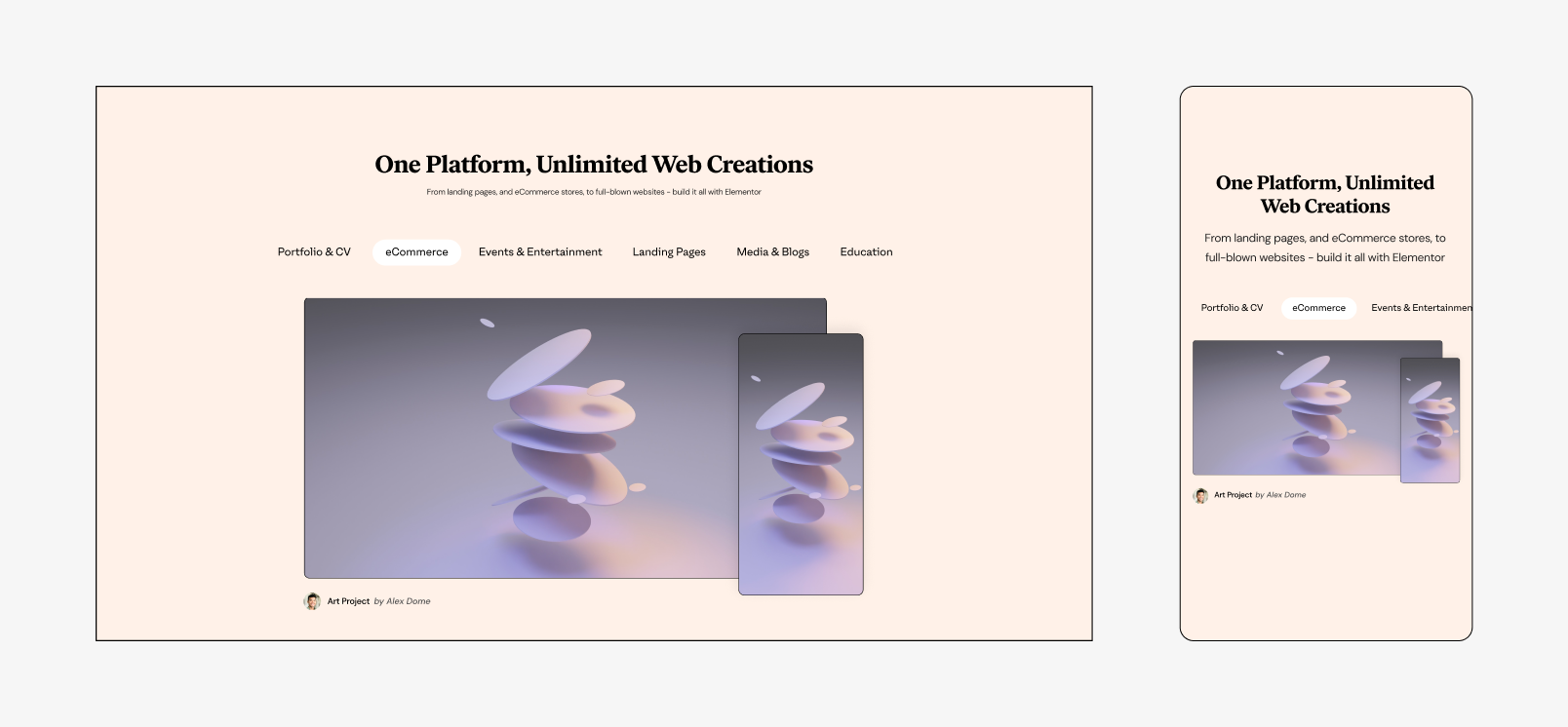 User website carusel
Evolution of the pricing
The 2nd most viewed page after the home page, was the pricing page. It was always a fun challenge to make it work, be clear and also reach all the goals and guidelines from the marketing department. Probably one of my favorite pages to think about.The first redesign happened when the website launched in June 2021, right after 2 new pricing tiers were added. It created a huge shockwave through the community. People were angry, because the $199 plan used to include 1000 websites, but now it’s just 25 websites. How could we do that? There’s of course a great explanation for that, but why should the users care?
The problem
Instead of 3 plans, we now had 5. The main difference between them was the price and amount of websites, there were also some other perks, but that came much later. When sales happen, like on Black Friday, it’s even harder to understand what’s going on. Sales we’re decreasing and we needed to help the effort on our front,
How we solved it
Tests, tests, tests. We did many A/B tests without hypothesis. One of the more successful ones was moving the 2 top tiers to diffrant tab/page, which helped with the sales of the cheaper plans. Design wise we went for the friendly pink approach, and made it all super transparent and easy to compare. We added illustrations and icons to help guide the users.
Collaboration with Yael Zlotnic
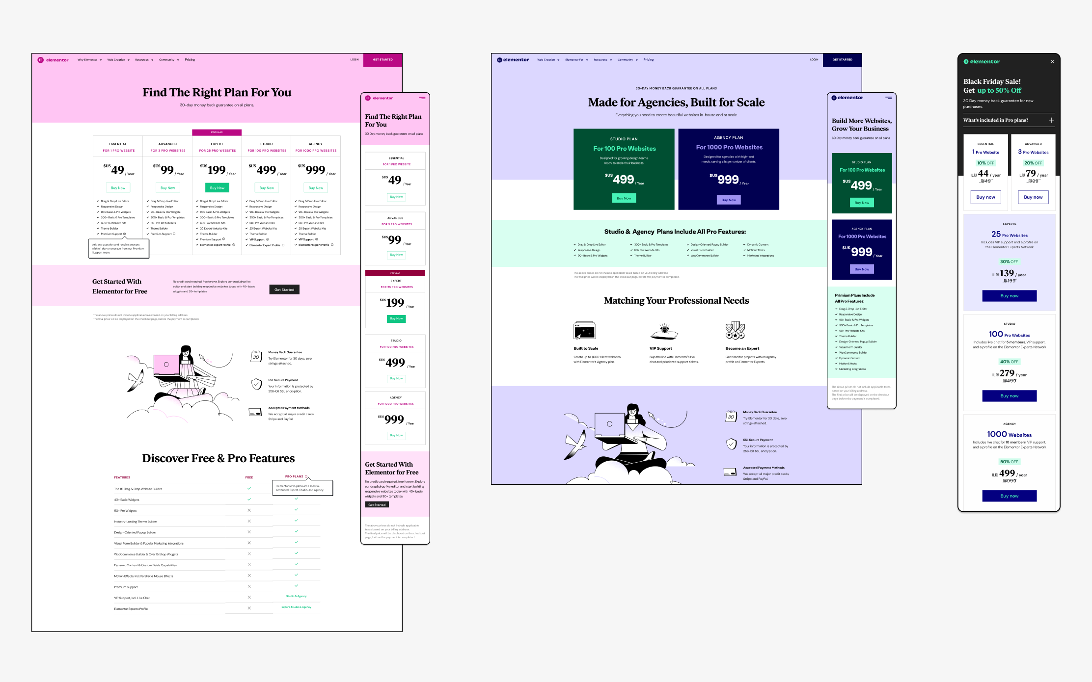
Old Pricing pages
From the left: Plugin pricing // Top tier test // Black Friday Sale
From the left: Plugin pricing // Top tier test // Black Friday Sale
The New Game Changer
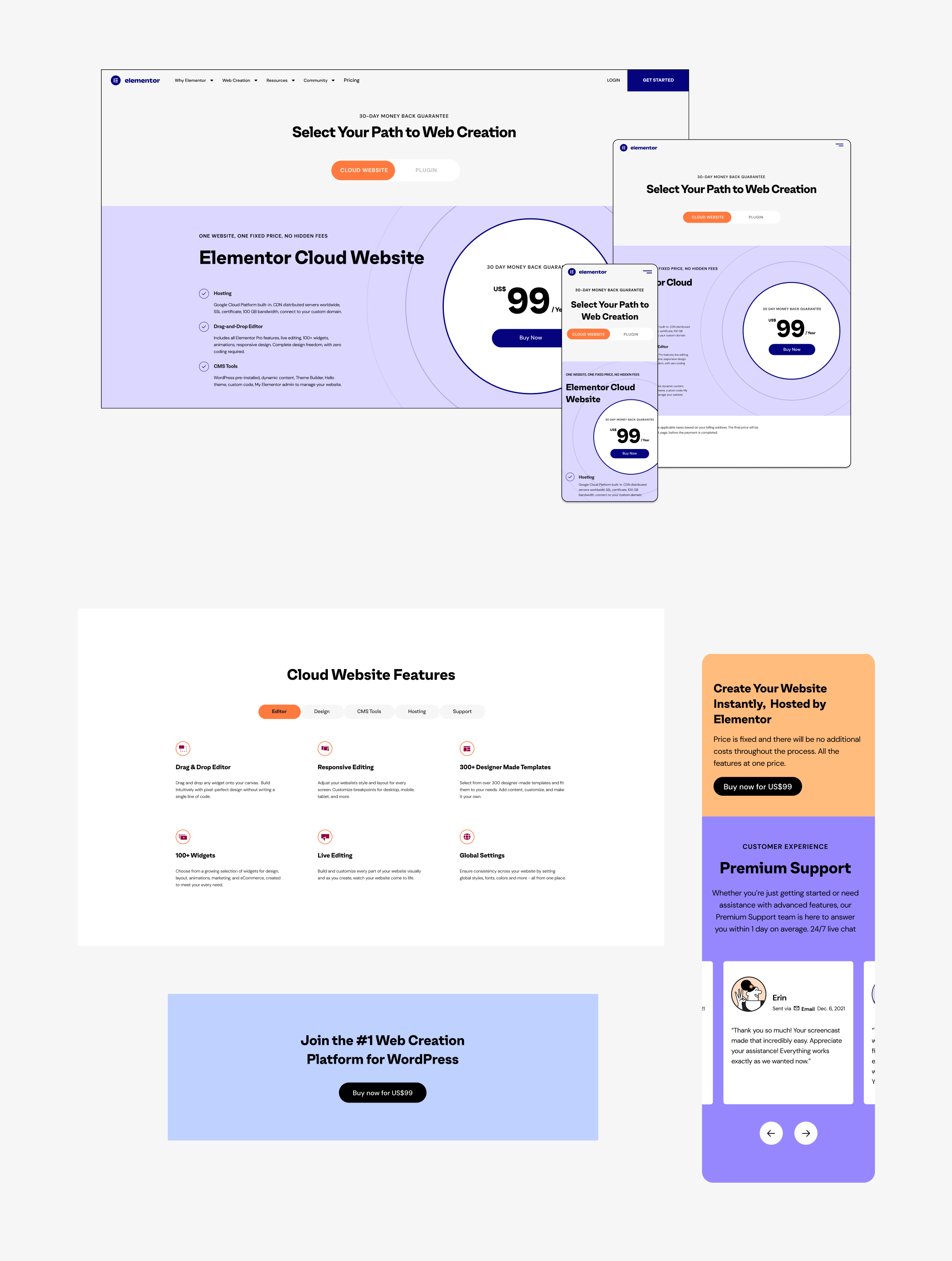
In March 2022, a new player was added to the board - the Elementor Cloud Website. All the advantages on the plugin, but with hosting included. This one was tricky. It was not a 6th pricing tier, it was a whole new product. But it was still Elementor, with all the plugin advantages. We had to explain it very well to our slightly confused community of users.How we solved it
After some tests, we went with the bold approach - “Cloud First'' - which ment we that the first thing you see in the pricing page, was the Cloud Website option, the plugin was 2nd in hierarchy, you need to press the toggle to “reveal” it. After many sketches, brainstorming sessions, we got to this result. We knew it was temporary (more cloud plans were planned), but as always, we were creating a base for the future to come. The branding of the cloud product was those circles that we were trying to combine harmonically in the page.
A collaboration with Yael Zlotnik
Don’t Forget the Plugin
We took this great opportunity to make some much needed updates in the good-old plugin page and help the users understand it better and to find the right fit for their needs. We cleaned it up and made it more simple, but also combined structures from the cloud version for the rest of the page. One of my favorite parts was the feature list - we divided them into tabs and made the comparison for what you get for the free vs. the paid version (see video below).
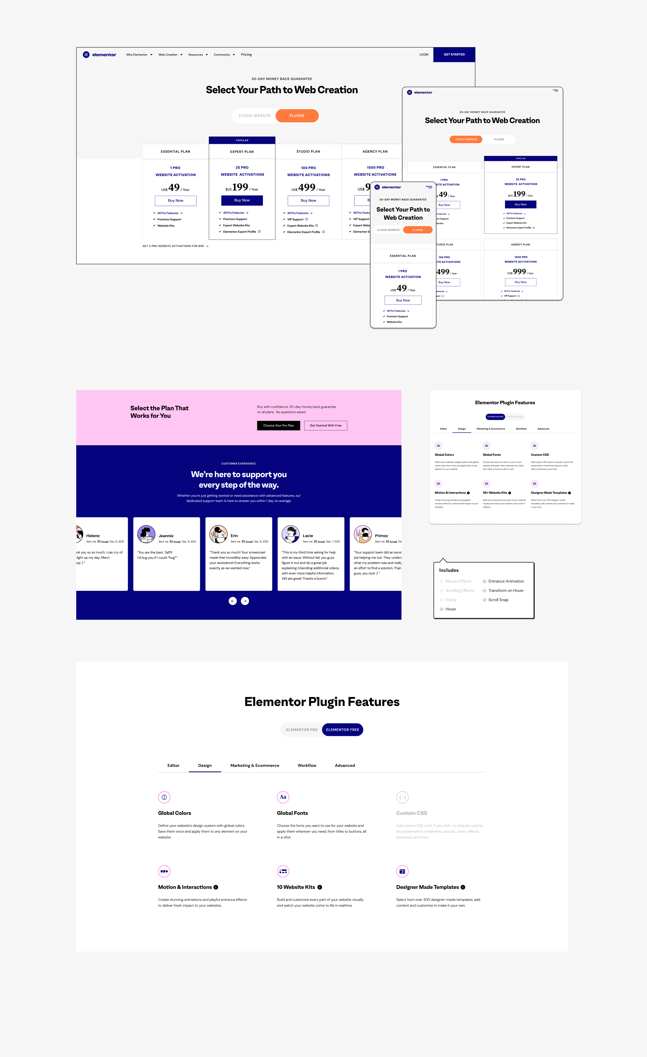
New product pricing - Cloud plan
Feature Focused
Users want to read about features, and not just the new ones. We saw a lot of traffic on feature pages, mostly the big ones Elementor had built in, that wordress users had to buy seperatly before. We created a playful 3D language for the hero section and tried bold colors, videos and illustrations.
Feature Pages
Feature index page
A fun UX challenge was to create a new index for all the Elementor features, including a search option that it didn’t have before. For that we had to use extra developers, since it was not a native Elementor option.
Also, I developed a simplification of the Elementor Editor, to help explain features to our users - where they are, how they look and what they do.
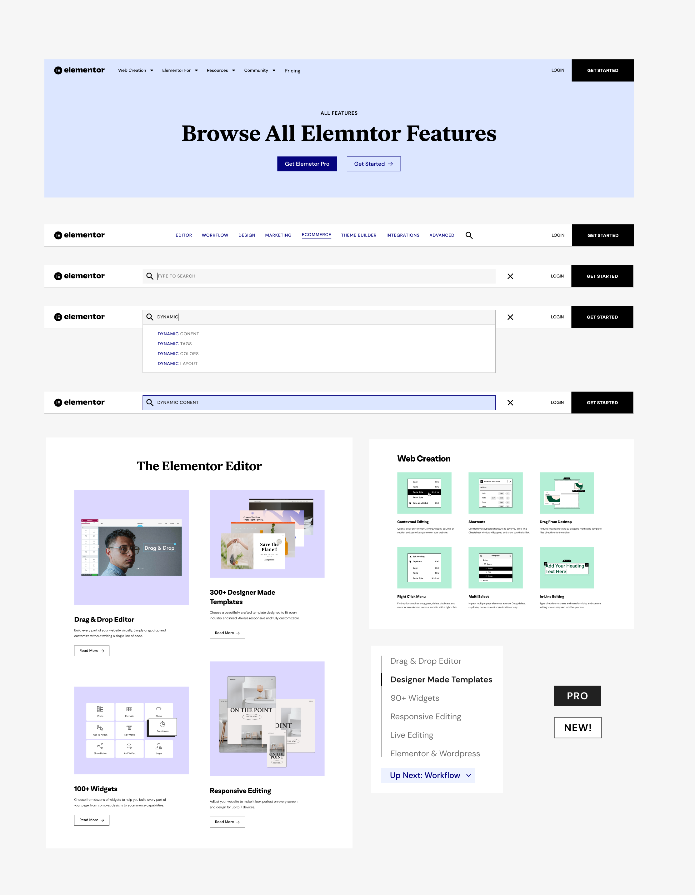
Feature Index Page
Anything for any user
We have 5 main user personas for the website, but of course in real life our users are usually a mix of those: designers, developers, marketers, SMB owners and agencies. We created hubs for each one, with the best features and solutions for them.Live Designer Page

Persona Pages
Designer Page Scroll
Special Pages
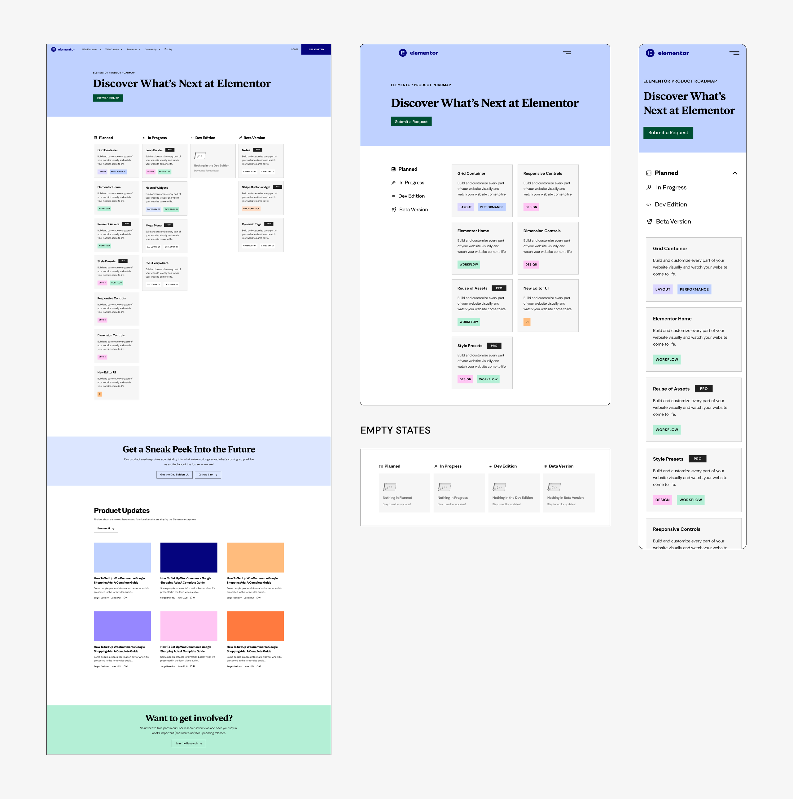
Not all the pages are feature or persona pages, some have no specific category, but they serve a need and tell a story. Those two are my favorite special pages:Roadmap Page
Transparency was always one of our key goals, and since our users always ask us when this and that feature will be launched, we created this roadmap page. Alongside the feature schedule, we added feature updates and an interactive explanation of our development process. The next stage will be adding voting on requested features. This page will be live soon.
Customer Experience Page
Elementor made a huge effort to make the customer service great. It’s our closest interaction with our users, in time of need. It became an award-winning experience and we really wanted to highlight it and the people behind it, make it easy to submit a ticket and explain the difference between our Pro & VIP support.
View live Customer Experience page
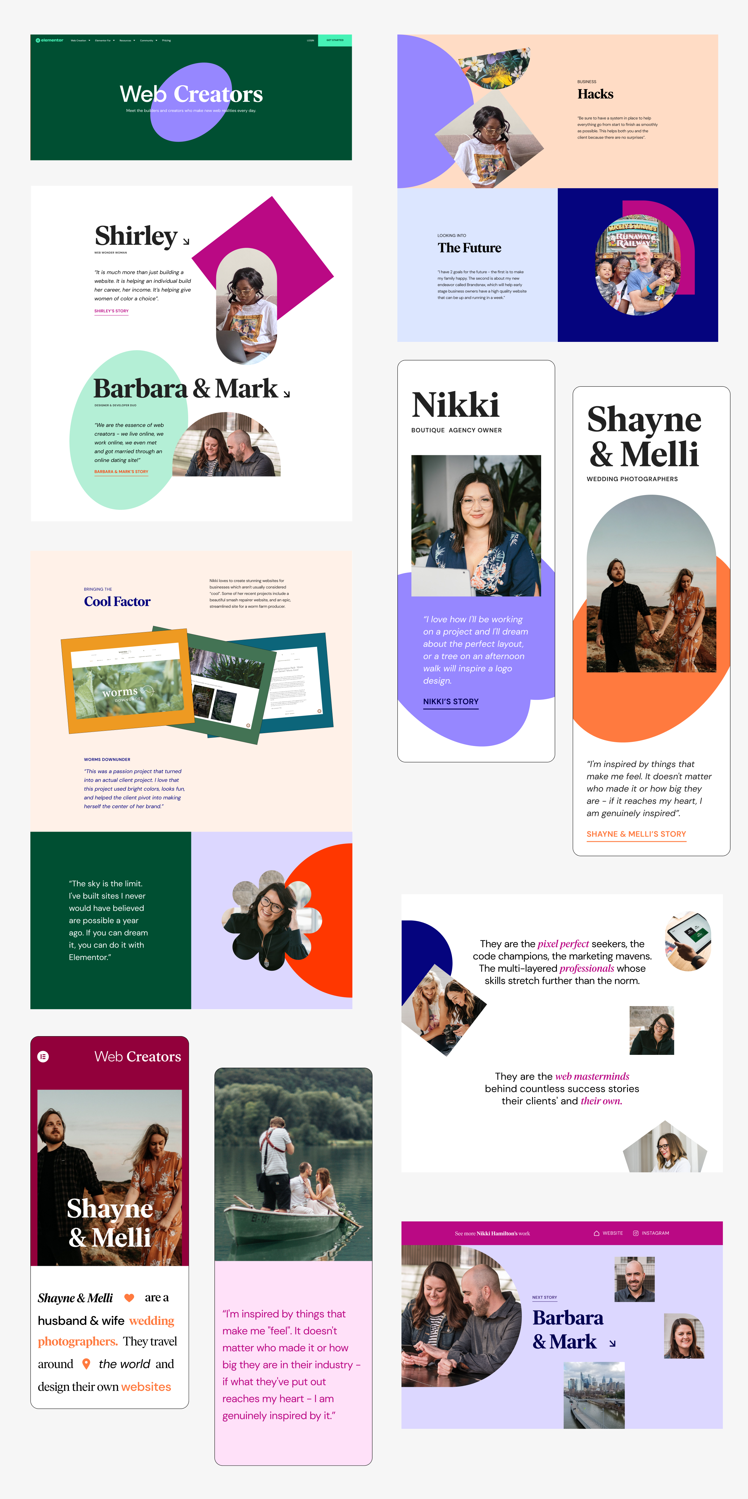
Web Creators Hub
This is the home of a very special project and it’s telling the stories of our actual users - with interviews and videos. We made a sub-brand for it and created a scrollytelling experience.
View live Web Creators Hub
Roadmap Page

Customer Experiance Page
Web Creators Hub