Pricing model update
Background
The business needed to change the product pricing modal, moving from usage based plans that contained all the features to a flexible modal combining more usage options, feature options and introducing annual plans.
Release data: March/June 2023
Users
Potential users, new users and legacy-plan users.
My Role
Release data: March/June 2023
Users
Potential users, new users and legacy-plan users.
My Role
- Planning the design process and writing the PRD - steps, requirements and timelines with the CPO, PM, CEO and Marketing.
- Design research - metodology of paywall implementation, pricing behavioral and psycological impact.
- Hands-on design - app, website and app store.
- Delivering design to the development team - multi-stage hand-off and feature map
- QA
- Post-launch analysis
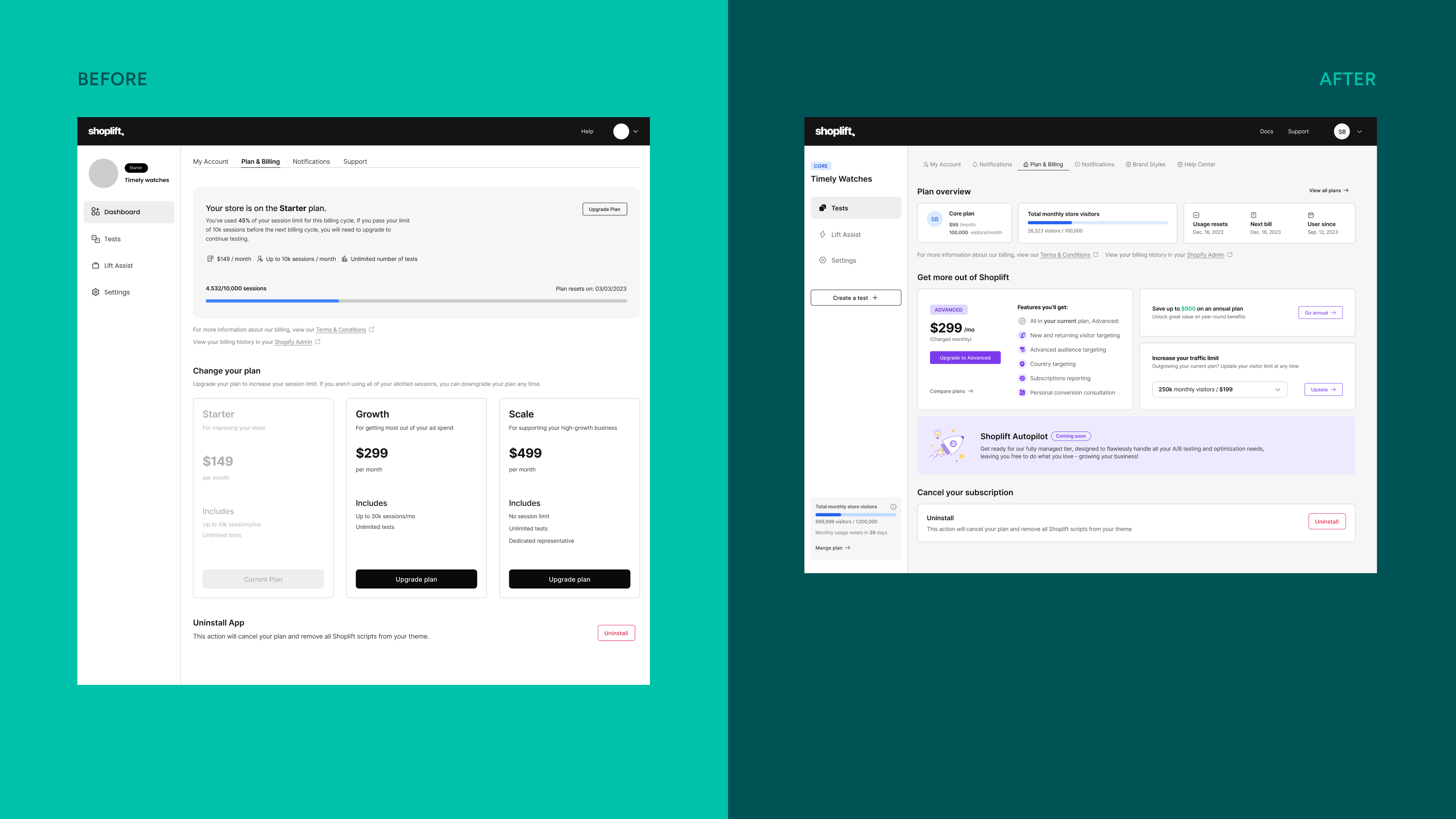
Before & after - home page
⚡️ Challanges
- Scope: The change touched almost every screen in the app
- Risk: Pricing changes create an emotional effect and negative user sentimen
- Risk: Friction in UX and Communication in key moments (like hitting overage or upgrading) can lead to churn.
🍳 Process
Pricing is a sensitive change. My main goals were to avoid turmoil among our current users and get buy-in from our key stakeholders, mainly the CEO. The process had to be transparent and collaborative. I created the project timeline in Figma and in Asana to reflect the tasks and stakeholders buy-in points and created a communicative environment to get eveyone on board for each step of the way.
🔭 Scope
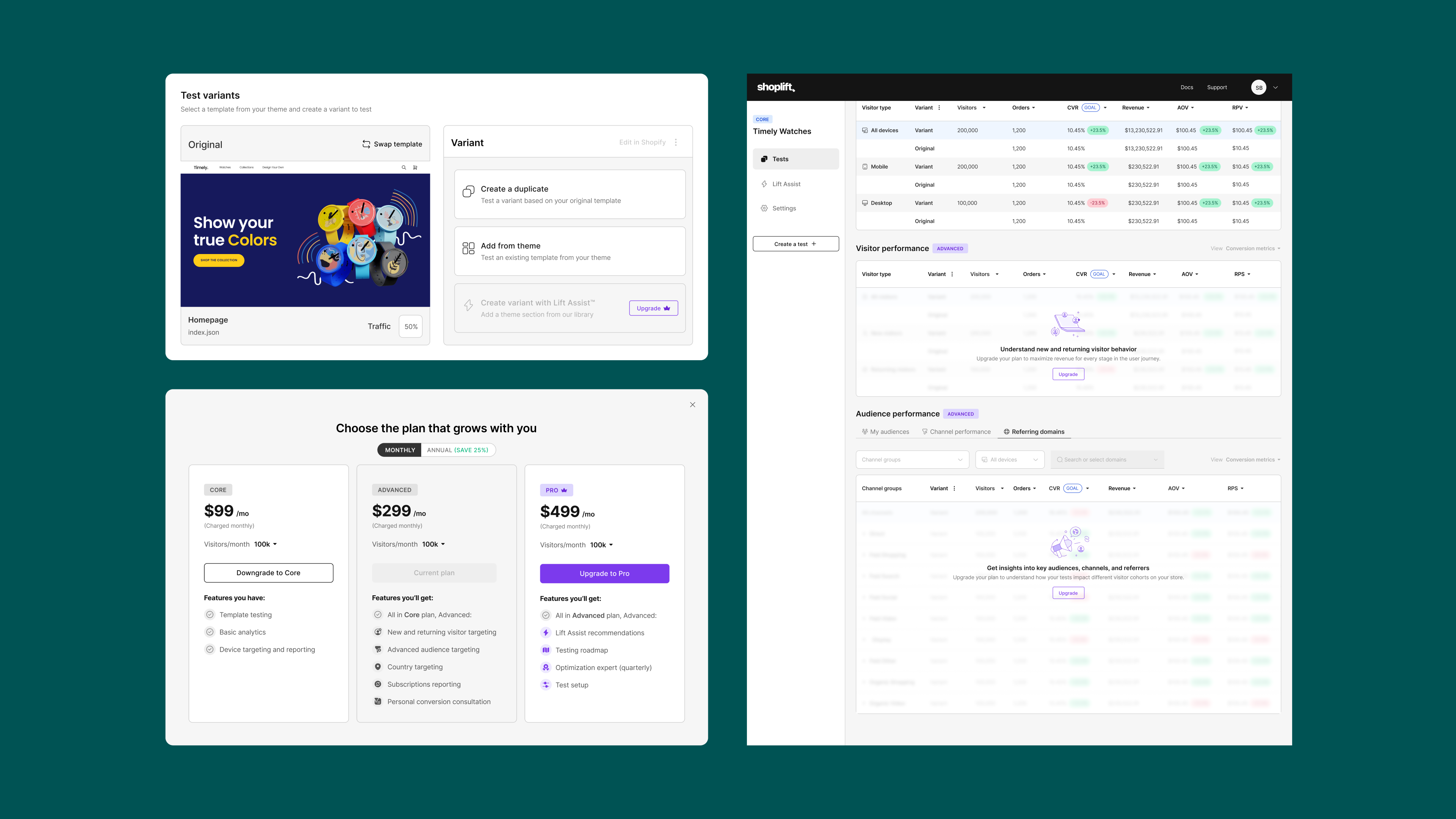
This project had a widespread impact across every screen within the platform and required a unified release. I lead the coordinating efforts across developers, customer success, marketing, and product.Effected areas:
- Signup flow
- Downgrade and upgrade flows (plan type, usage, annual/monthly)
- Overage states
- Update usage count in the global nav (trial and paid plans)
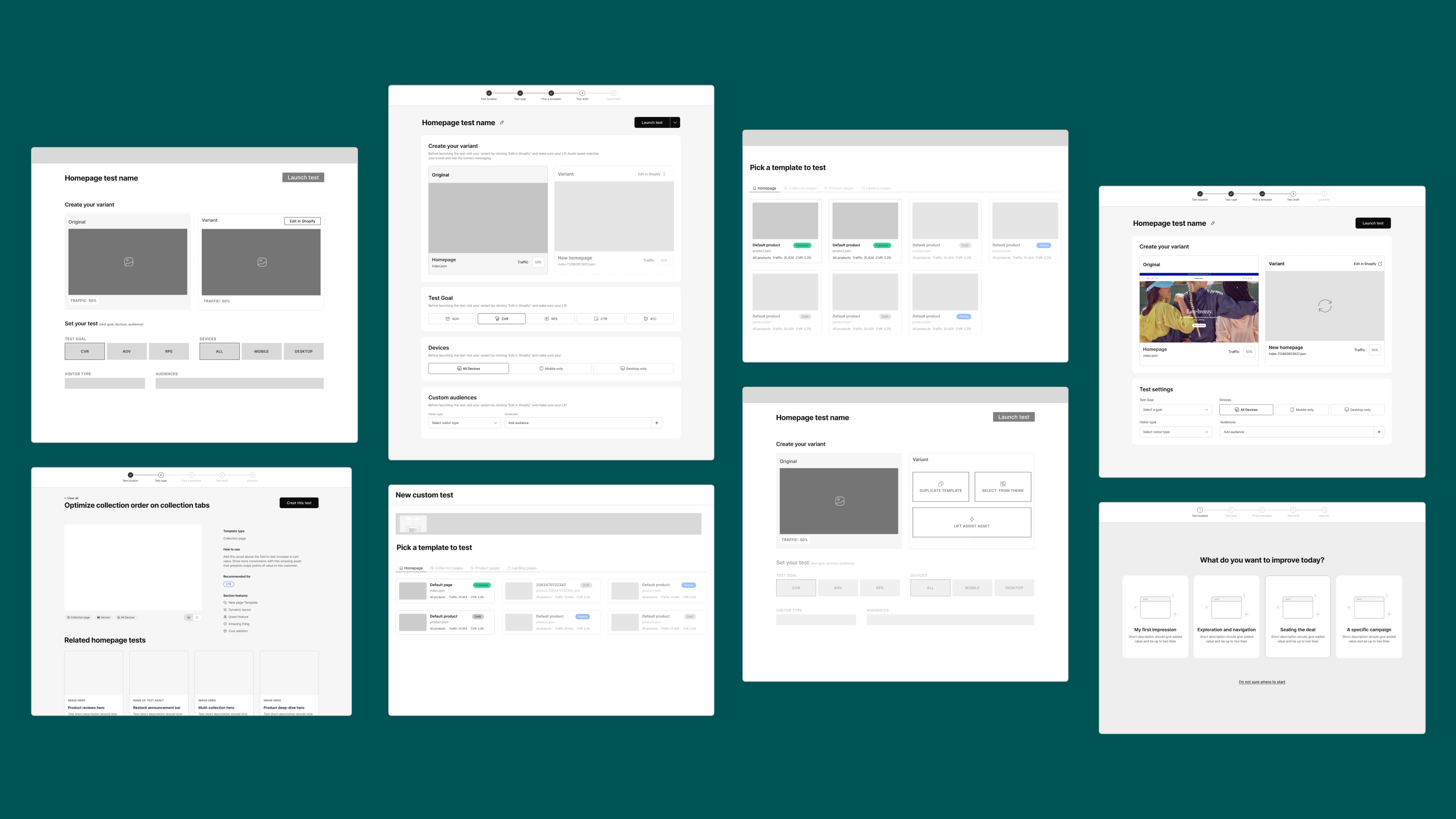
- Test draft (Visitor and audience segmentation, Lift Assist™
- Test reporting (Visitors and audiences, subscription reporting)
- Lift Assist™ and brand styles
- Help Center (Conversion consults, managed accounts)
- New billing page
- Usage counter (Side navigation)
- Support for legacy plans
The screenshot below it the interactive figma map I created for the dev team, since the project was so large and detail oriented. It included links to all the design sections/frames and the Jira tickets. We had it color coded as well.
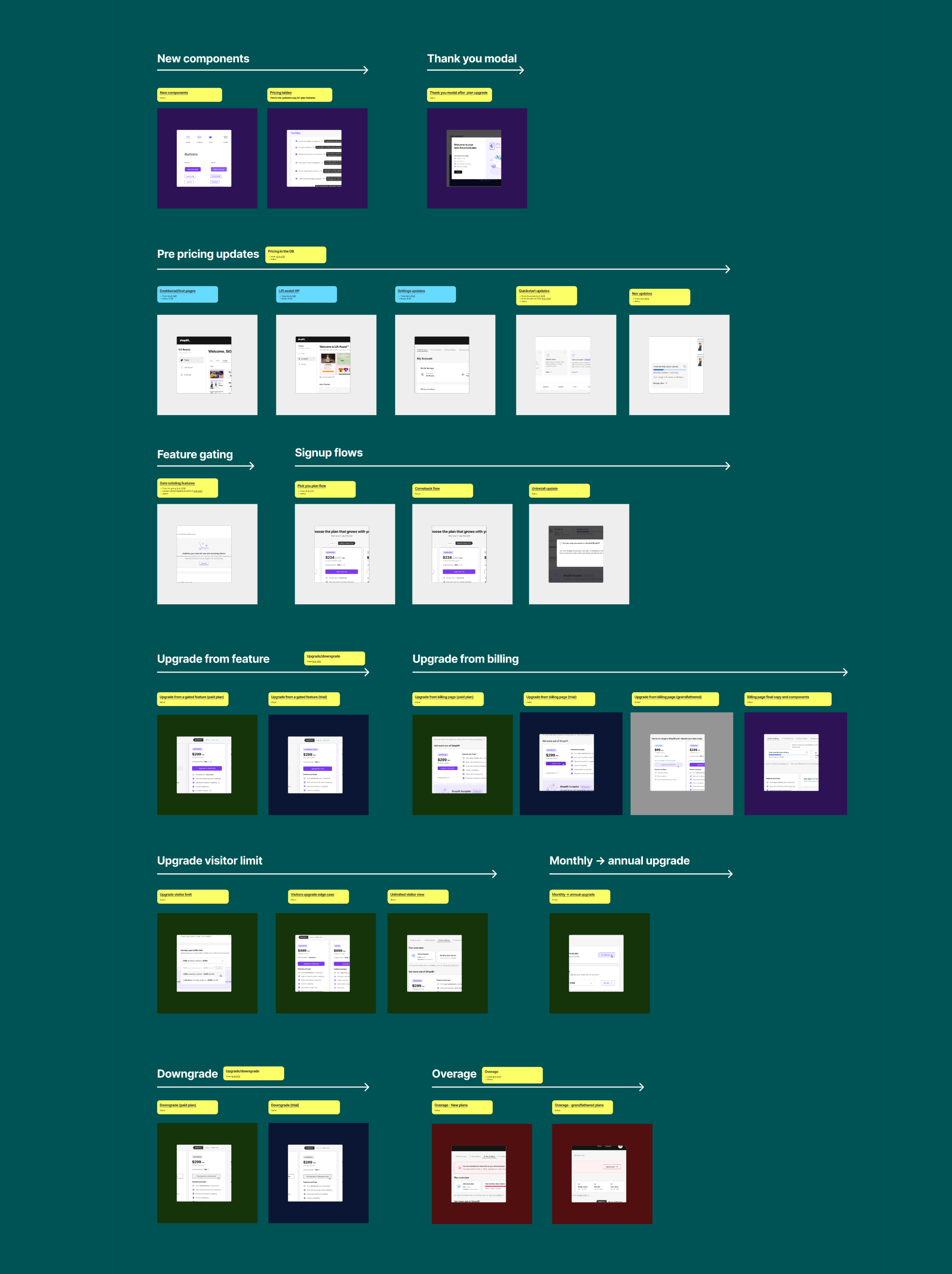
Figma map for developer use
🎨 Designs
Introducing some color to our mainly b/w app, making the upgrade stand out and feel exclusive.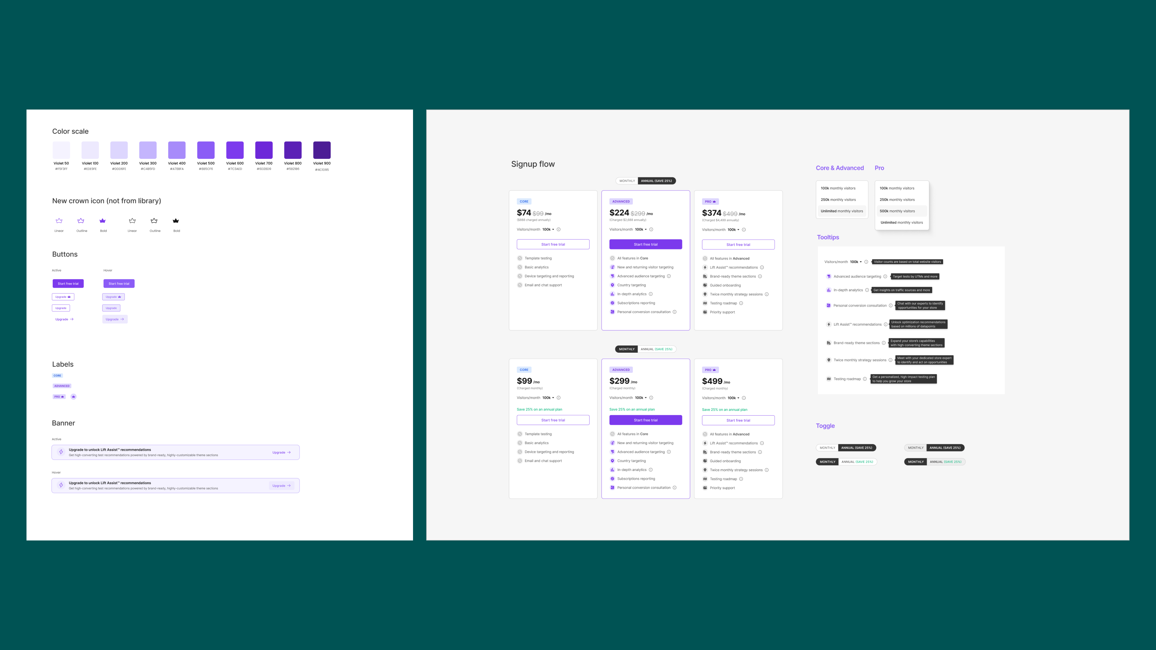
🧱 Paywall / Feature gating
Test draft, test reporting, brand styles, help center and Lift Assist™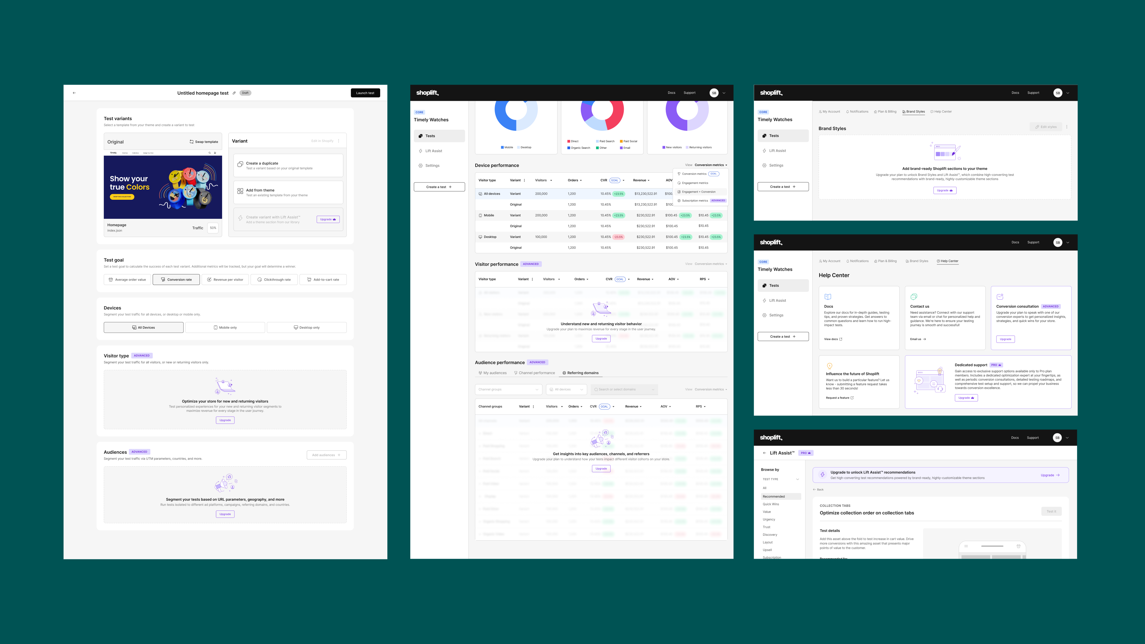
🍾 Modals
Thank you modal and custom plan request form
🚫 Overage state
When a user hits his visitor limit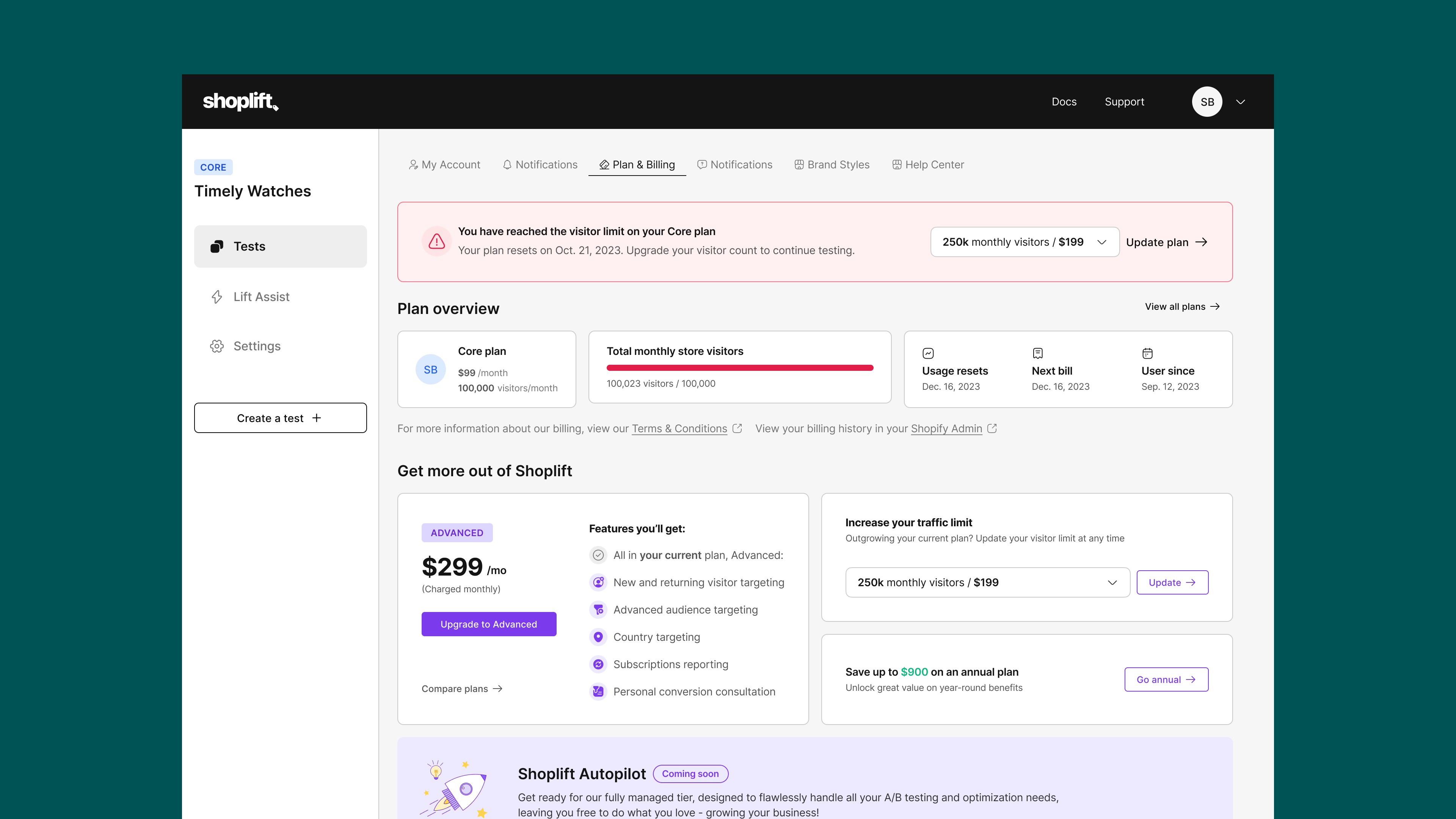
👵🏼 Grandfathered plans
Supporting existing users and encouraging them to switch to our new plans.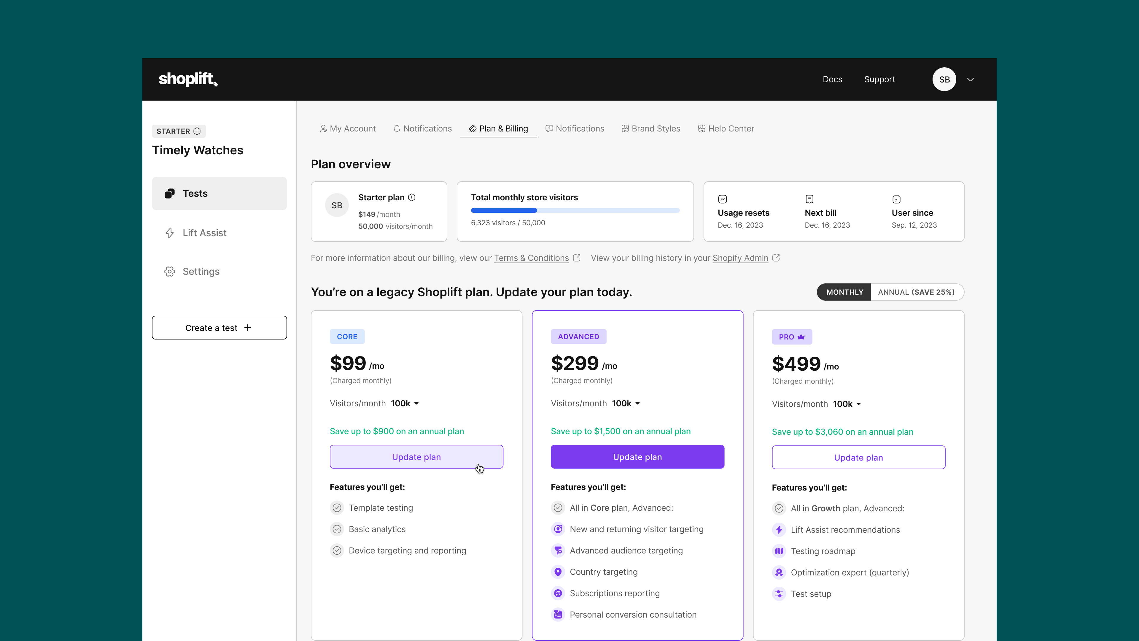
🕸️ App store & Website
New pricing page for the marketing website and update the Shopify app store listing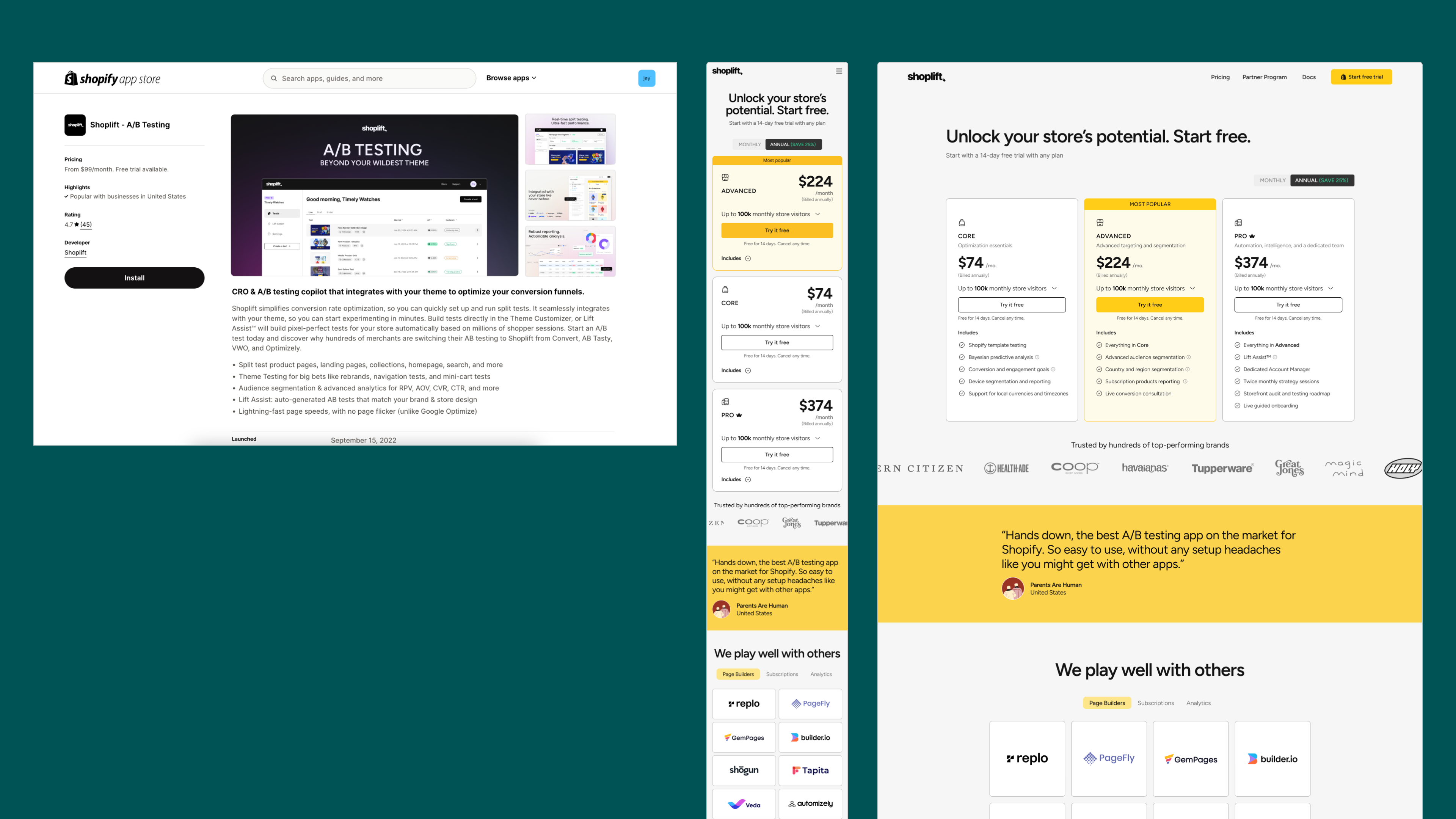
🕸️ App store & Website - New brand!
In June 2024, I lead a rebranding process and the pricing page and app listing got a little face lift :)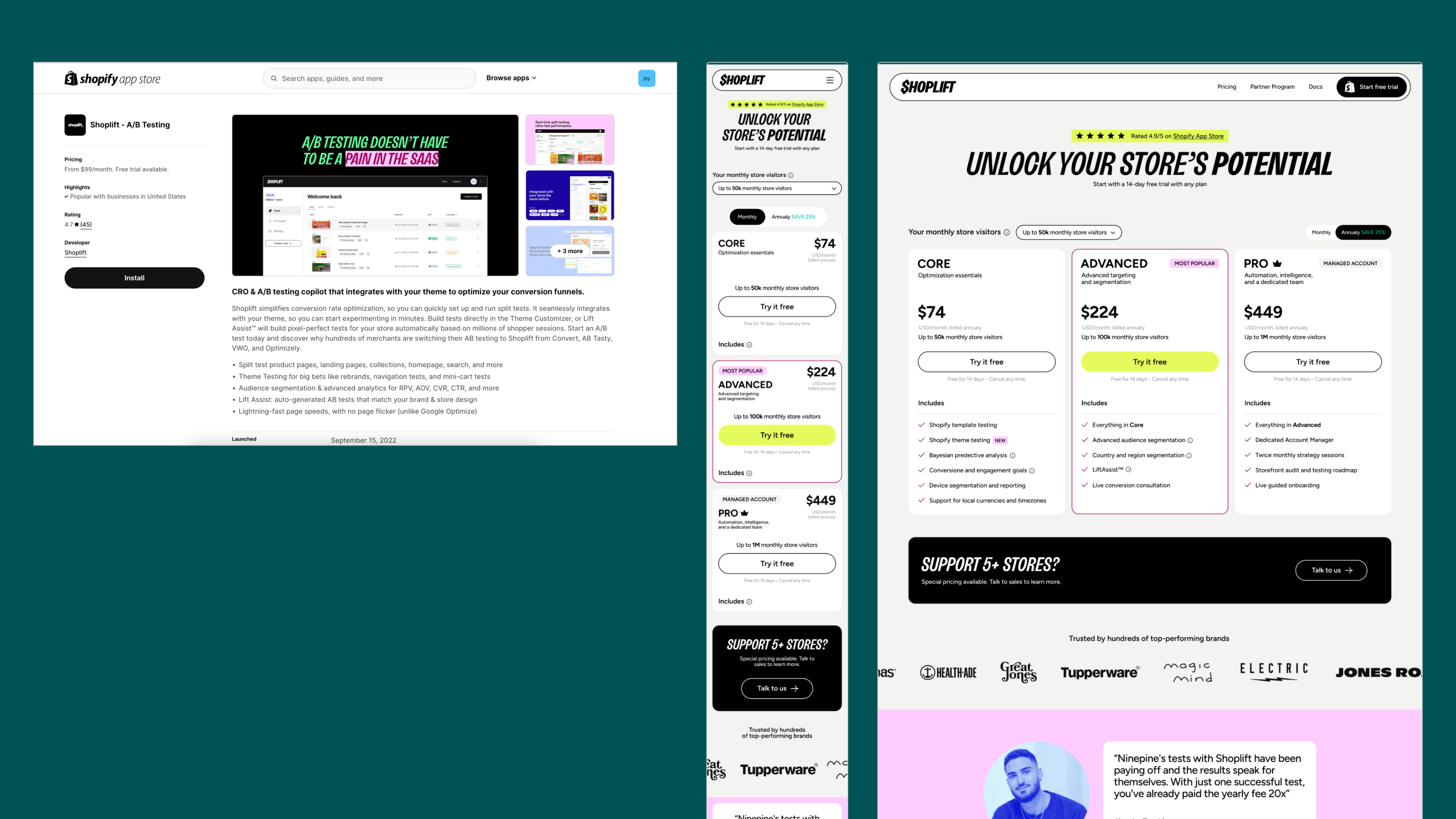
Thank You! ✨️
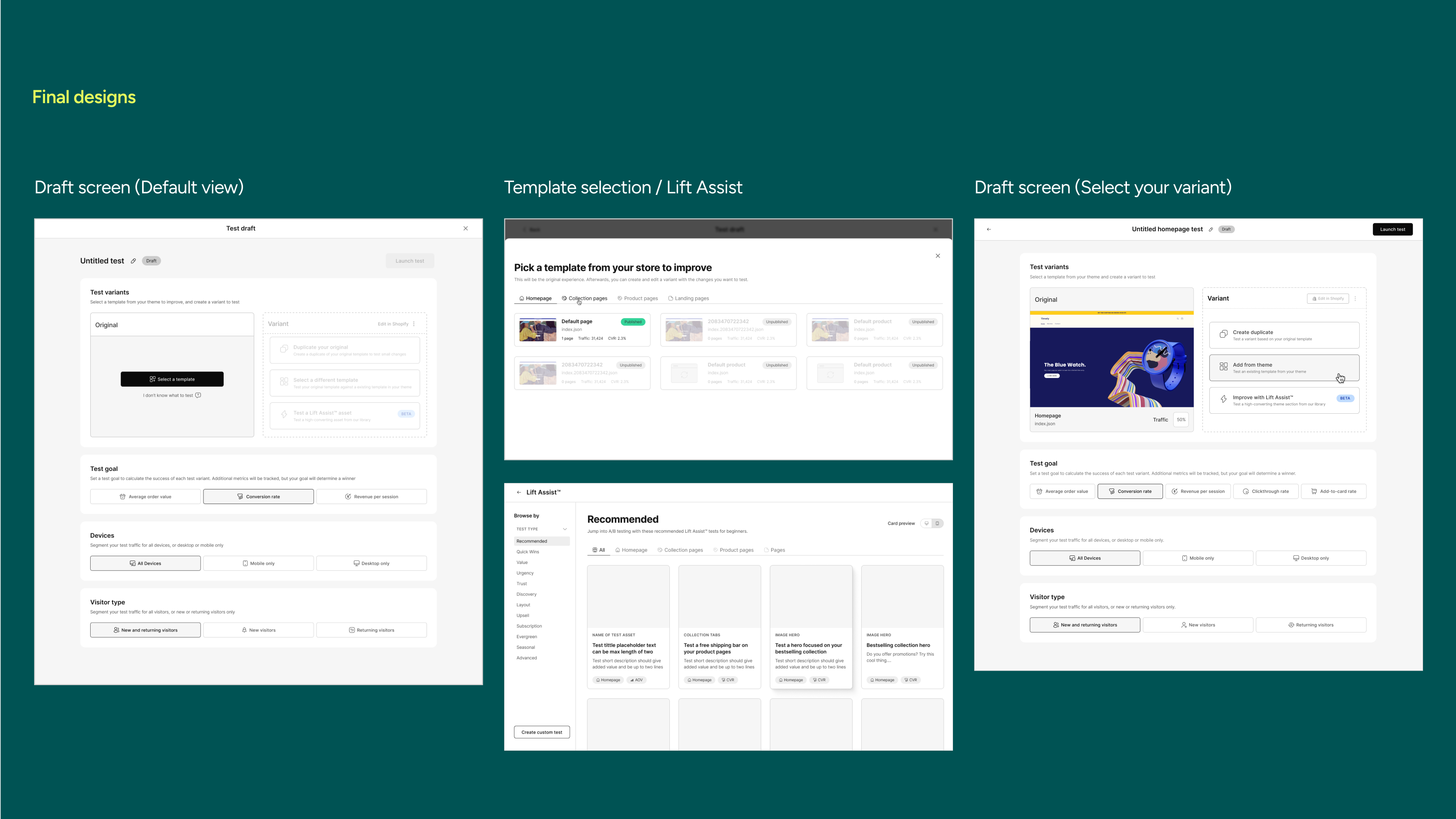
Test Creation Flow
Background
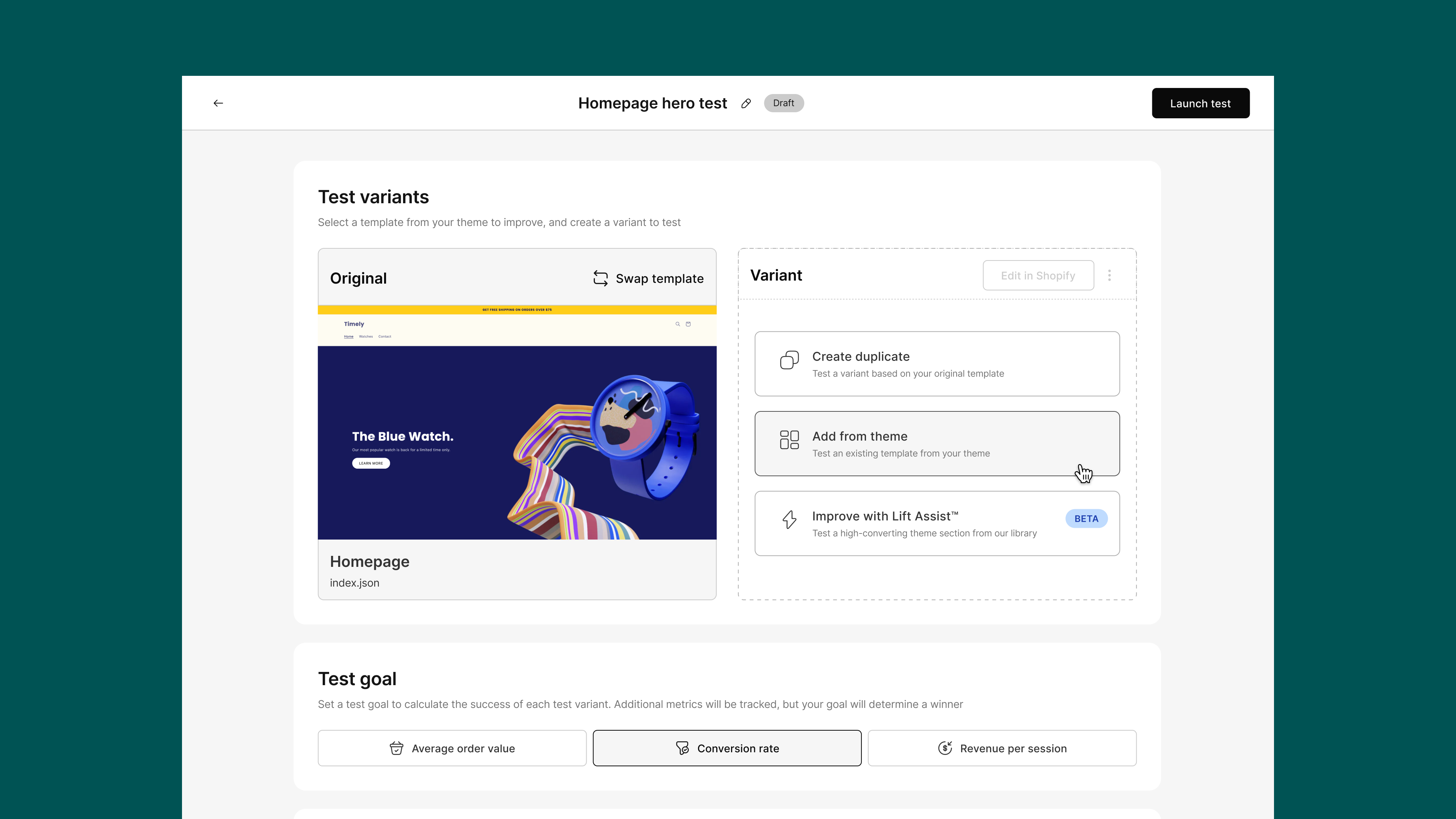
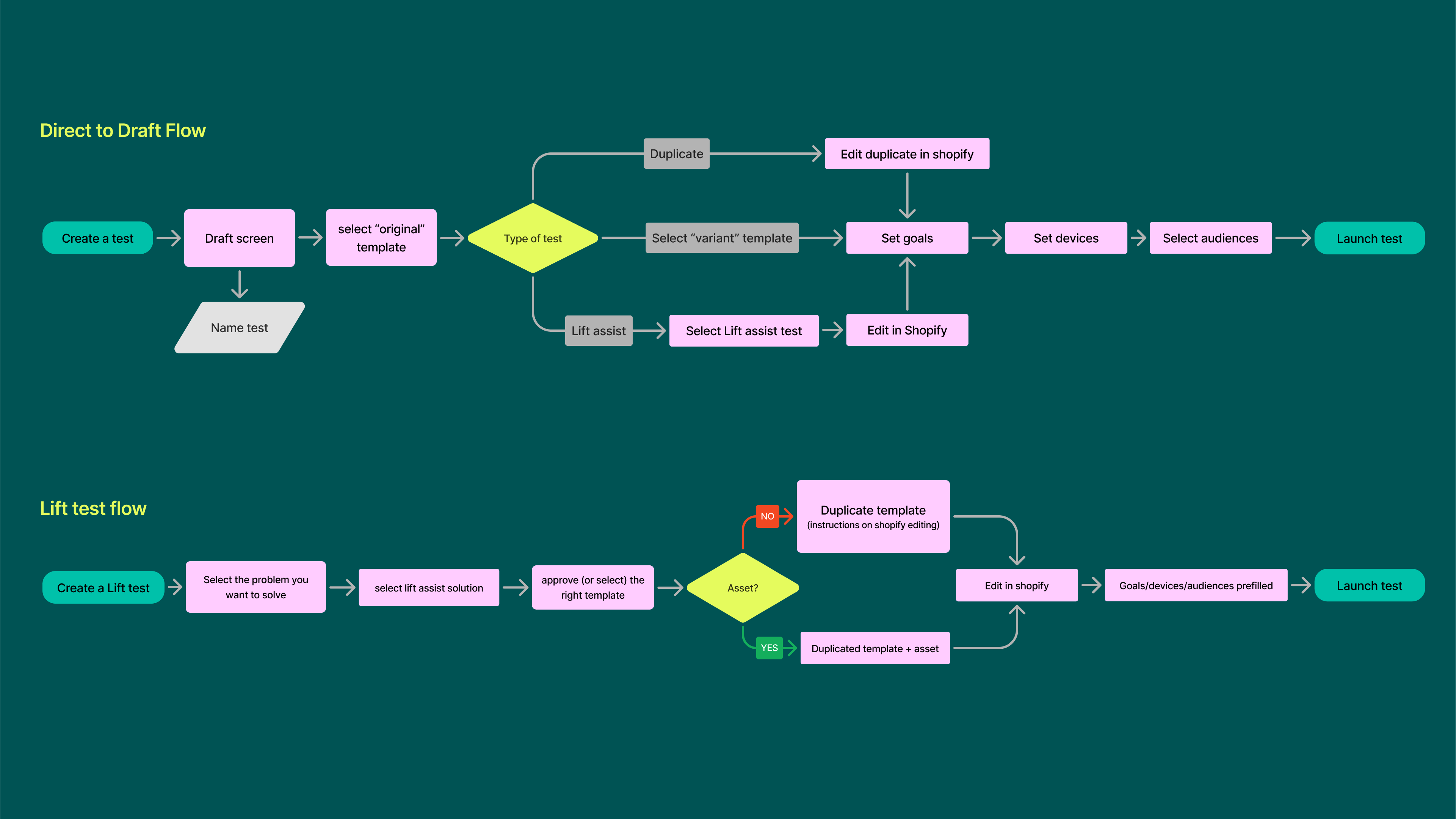
The main user journey in Shoplift is creating A/B tests. At that point in time, our testing capabilities were limited, but we had a rough roadmap to expand on types of tests to support our users' needs. The existing flow was a wizard flow where the user needed to make one decision at a time.
Release date: September 2023
Users
CMOs, E-commerce managers, Store founders
My Role
Release date: September 2023
Users
CMOs, E-commerce managers, Store founders
My Role
- Planning the design process and writing the PRD - steps, requirements and timelines with the CPO
- User research - Talking to CS and conducting user interviews
- Hands-on design and prototyping
- Internal usability testing sessions
- Delivering design to the development team
- QA
- Post-launch analysis

Before & after - home page
⚡️ Challanges
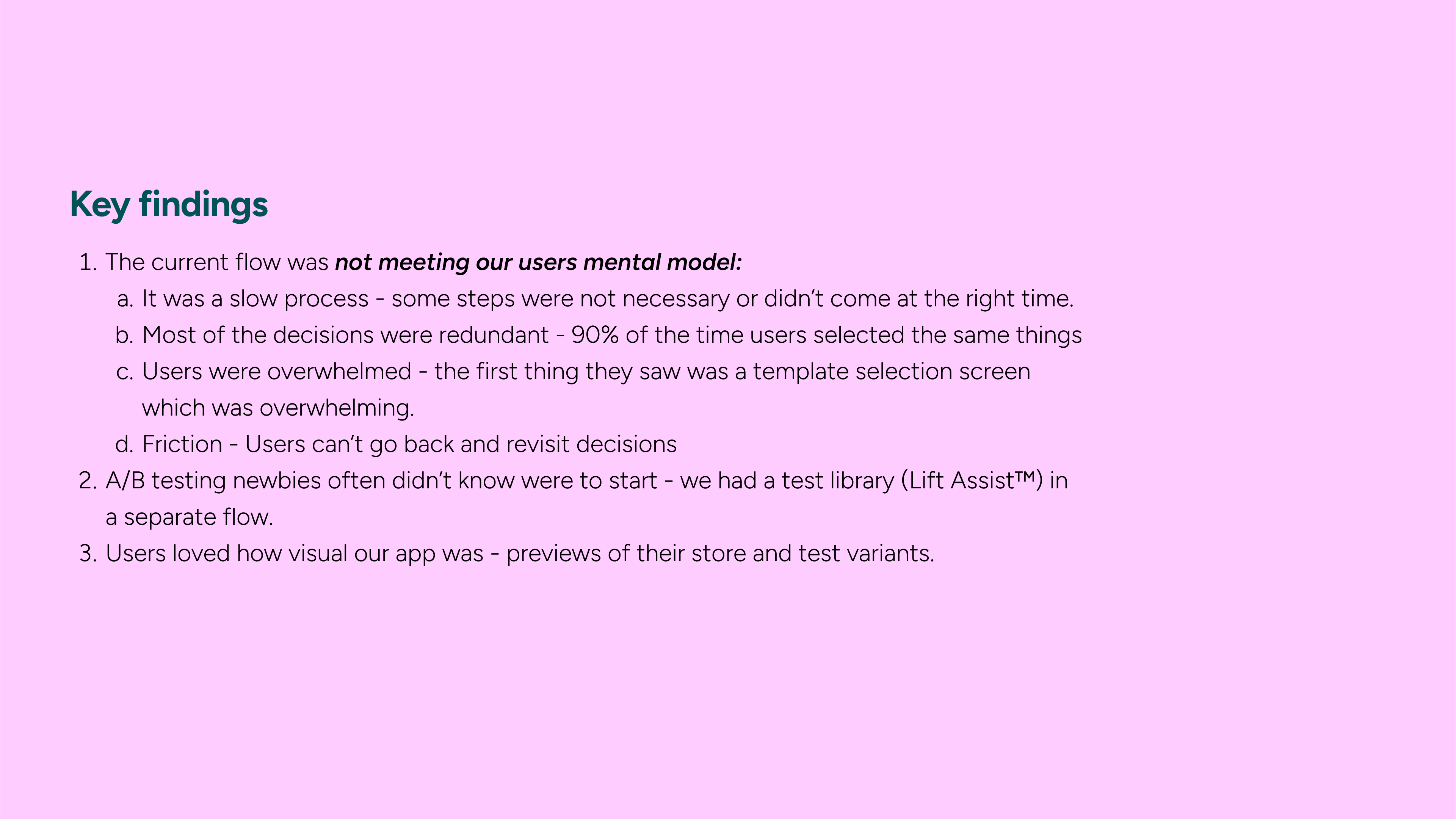
- User needs and gaps of knowledge were not addressed.
- There was no room for expanding the feature
- Technical: The app’s code base was being redone (moving from React to Vue) and this was the last piece to update
- Visual: We were implementing a new design system and needed to solidify the design.
I researched the problem space
- Unmoderated observations (Hotjar recordings)
- Met with customer success - I gather initial sentiment about the flow
- User interviews - in-depth conversations about user goals and needs
- UX and copy review - breakdown of problem areas
✅ Feature Priorities
- Reduce cognitive overload when creating a test
- Reduce test creation time
- Help newbies get started by incorporating the test library into the flow
- Allow the expansion of the flow to more testing capabilities
💡 What I learned
- Our original scope was way too broad. We were too eager to serve nice-to-have ideas and lost time and resources to try to build them in.
- Talking to customer success early in the process changed our core hypothesis about the friction points and that there’s a difference in expectations between novice and experienced users.
- Post launch analysis revealed promising numbers in unexpected areas - we reduced the time to launch a test for first time users.
Later this metric was correlated to our activation research - users who launch tests and get positive results within their trial period are less likely to churn.
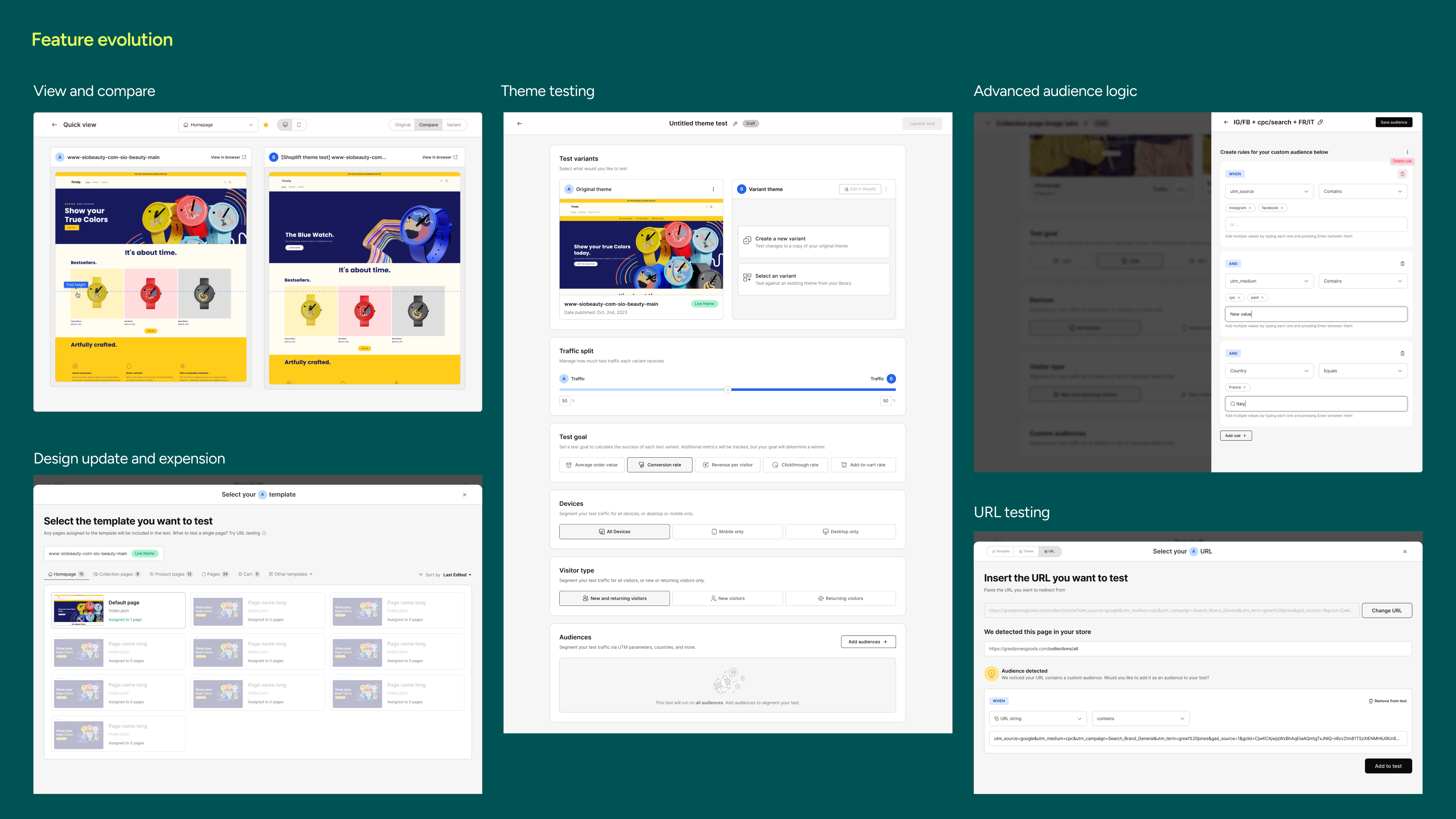
🥂 Since then
As we grew our user base and test creation kept evolving with their needs:- Testing every type of page in the store.
- Adding engagement goals and metrics
- Testing global elements and entire stores (Theme level testing)
- URL split testing (in beta)
- Improved variant previews
- Advanced audience segmentation
- Various UX improvements.
Link to product demo
Thank You! ✨️
Test Reporting 2.0

TL;DR
I redesigned the Test Reporting experience to reduce trial churn by helping users better understand and trust their A/B testing results. While setting up tests was easy, many ended them too early due to confusion, mistrust in metrics, or overwhelming data.I focused on making insights more discoverable, the experience more usable, and communicated the statistical model’s state in human-friendly language.
I’m measuring impact through:
- Reduction in trial churn
- Support ticket volume
- Usability and satisfaction (via CSAT scores and surveys)
This was a cross-functional effort rooted in real user feedback to build clarity, trust, and confidence into the product.
Background
In Shoplift’s early days as an A/B testing tool for e-commerce brands, our focus was on expanding testing capabilities to stay competitive—answering user questions like “Can I test X?” and driving growth. However, as we scaled, we noticed retention gaps: while users loved launching tests, they struggled to grasp key insights from their results. This meant some of our core value propositions weren’t landing, limiting our differentiation from competitors.
Over ~8 months, through support tickets, user calls, and session recordings, we identified a major friction point: the Test Reporting screen. While setting up tests was seamless, interpreting results over time was not. Users needed a clearer, more actionable reporting experience to turn their tests into decisions—and that’s where we focused our efforts.
Release date: May 2025
Users
Trial users & new users
Team
CPO, Product manager, Statistician/data scientist, Backend engineer, Fullstack engineer
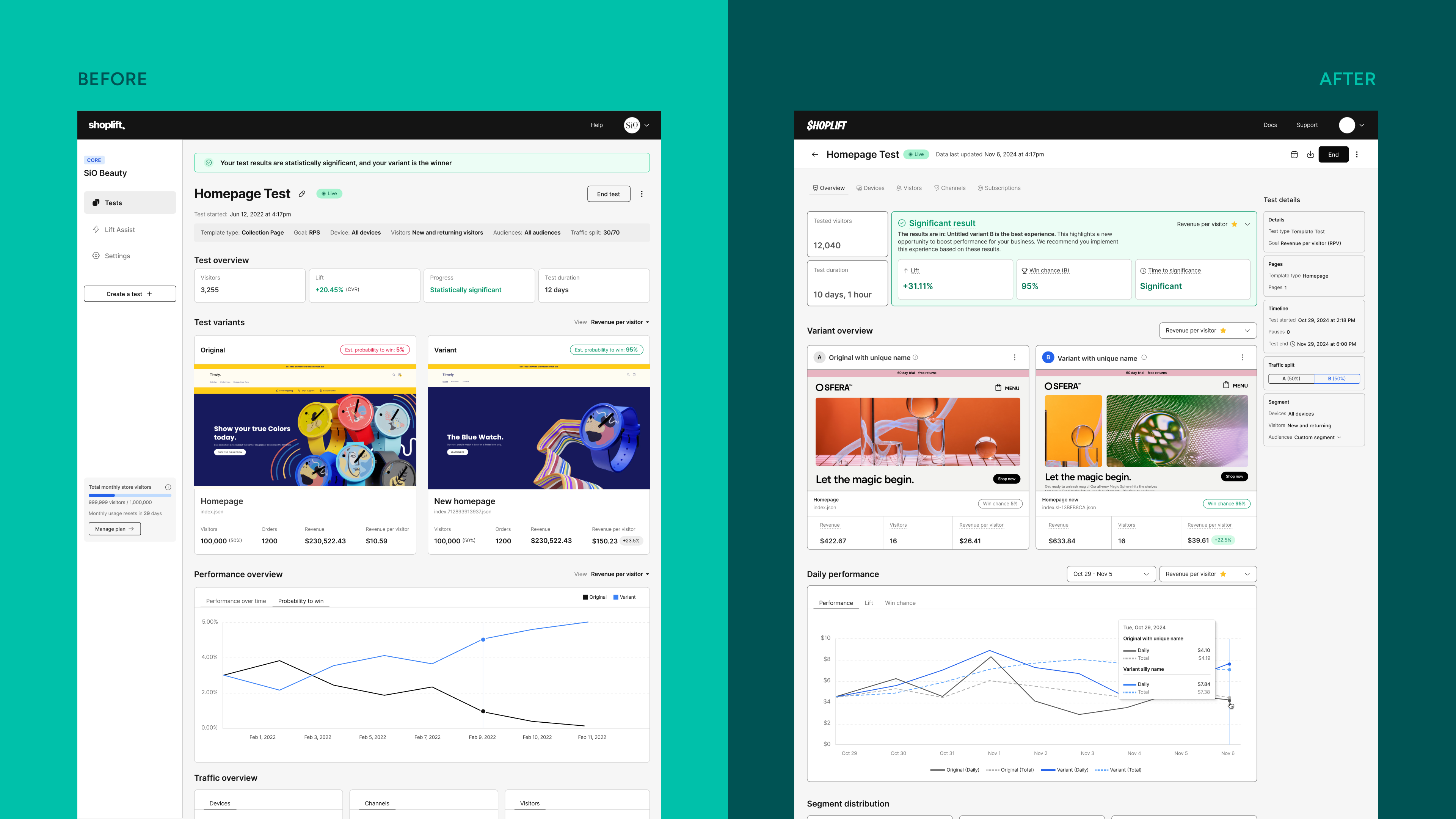
Before & after - reporting page
🔎 Discovery
The reporting experience is where users discover the value of Shoplift, and it’s the core of the product. The reporting screen contains sensitive financial information users need to be able to base business decisions on every day. Our product goal was to keep it simple, clear, and actionable, but as the product grew, our product evolved, and so did our users, and we needed to expand its capabilities while still maintaining our core values.
I broke down the lifecycle of a test by time and analyzed the user sentiment for each period:
📚 Learnings
Through user analysis during the test-running phase, we discovered that most friction occurred within the first 72 hours, especially for new users. Here’s what we learned:
These insights guided our redesign efforts, ensuring that improvements were not just cosmetic but strategically addressed user concerns and friction points.
1. Users Were Ending Tests Too Soon
- Many users prematurely stopped tests due to uncertainty.
- Some weren’t confident their test was set up correctly.
- Small sample sizes led to exaggerated results—big green/red numbers and drastic lifts (positive or negative) made users anxious, prompting them to pull the plug early.
- Conflicting data added to the confusion. We ran two models: Bayesian (rolling hourly updates) and Frequentist (updated daily). Some users saw a negative lift, yet the test was "trending positive," leading to doubt.
2. Trust in Data Was an Important Consideration
- Some users noticed differences between our data and Shopify and GA4, leading to questions about how we calculate metrics.
- Our metric definitions and calculation methods varied from Shopify/GA4, sometimes resulting in different conversion rate figures.
- Strong bot filtering led to variations in visitor counts, which required further explanation.
- As a newer product, Shoplift was still establishing its credibility, and helping users understand our approach was a key focus.
3. The Reporting Experience Was Overwhelming
- The sheer volume of numbers, charts, and tables caused cognitive overload, especially for first-time users.
- Some framing felt scary or negative (e.g., "Inconclusive Data" or "Insufficient Data"), leading users to second-guess their tests.
- Managed accounts (with hands-on guidance) had a significantly smoother experience compared to self-serve users. Having someone to explain the data, set expectations, and guide best practices helped users focus on what mattered most.
4. Improving Reporting Meant More Than Just UI Changes—It Needed to Add Value
- We were capturing valuable data but not surfacing it effectively.
- We needed to future-proof the product—multivariate testing, DOM testing, and custom goals were on the roadmap and would require deeper reporting changes.
- Users frequently requested additional features like goal progress tracking, time-based and segment filtering, and more granular breakdowns.
- We had created high expectations with our advanced capabilities, yet we were missing some basic features that other A/B testing tools had built-in.
These insights guided our redesign efforts, ensuring that improvements were not just cosmetic but strategically addressed user concerns and friction points.
🎢 Feedback loop
The insights we gathered shaped the scope of our focus, allowing me to define a clear design hypothesis and establish success metrics. With these foundations in place, I began working on wireframes and conceptual ideas, gathering iterative feedback from key stakeholders, including the engineering team, our statistician, the customer success (CS) team, and sales. Our discussions focused on several critical areas:- Statistical Integrity & Accessibility
Ensuring that our calculations were mathematically sound while presenting them in a way that was understandable and approachable for users. We aimed to balance scientific accuracy with clear, human-centered communication.
- Technical Feasibility
Evaluating the development effort required, prioritizing efficiency by leveraging existing data rather than introducing entirely new backend structures. The goal was to minimize complexity while maximizing the value of surfaced insights.
- Addressing Customer Confusion
Ensuring the design directly tackled the key pain points users faced in interpreting their test results. We worked closely with the CS team to understand recurring challenges and ensure the new design reduced reliance on support for self-service users.
- Business & Growth Impact
Gathering input from leadership, including the CEO and sales team, to align the project with broader business objectives. This included assessing how the redesign would influence user activation, growth, and investor-relevant metrics like churn reduction.
🕹️ Usability testing
As we prepared for significant changes, it was crucial to ensure that existing users felt supported and not disrupted. To achieve this, we tested a prototype with them, including some out-of-scope elements we were curious to explore.Testing Goals:
- Evaluate the new navigation: Determine if users could easily find what they were looking for.
- Assess the perceived value of the new additions to the reporting.
- Gain deeper insights into how users analyze their test results.
Key Takeaways:
- Positive to neutral reception: While some users appreciated the new look, others were indifferent and immediately focused on exploring the data.
- Navigation clarity: Users had no difficulty finding relevant information. When asked to locate specific segment data, they correctly identified the corresponding tab on the first attempt.
- Data transparency preference: Experienced users preferred seeing raw data upfront, rather than having it pre-interpreted. They valued having our analysis as a secondary layer.
- Visual variant views: Users actively engaged with image-based variant displays in the previous design. This feature was a key part of their workflow and should be preserved in the new iteration.
📊 Final Designs
After incorporating the final refinements based on usability testing and adjusting for planned scope reductions, we arrived at the final experience for developer handoff. During this phase, we addressed a few remaining edge cases, including:- Ensuring compatibility with tests launched prior to the update.
- Validating that updates to the statistical model did not retroactively alter results.
- Accounting for all potential test states and scenarios to ensure a seamless experience.

🔮 Next Steps
Following an impact analysis and user feedback, we prioritized the remaining enhancements for future development:
- Metrics/Goal Tab: Introduce an advanced view that allows users to explore all test metrics simultaneously, with day-by-day breakdowns.
- Segment Performance Charts: Users heavily rely on daily test performance tracking; we aim to extend this view to include segment-level insights over time.
- Expanded Test Timeline View: Enhance the timeline to display test progress, key milestones, and changes such as trends shifts and statistical significance achievements.
- Upcoming Feature Integration: The introduction of multivariate testing and DOM testing will require dedicated representation within the reporting framework.
- Comprehensive Overview Charts: Initially scrapped by the product team, but resurfaced as a critical need from the CS team. This feature will help users and support teams cross-validate test data across multiple analytics platforms (e.g., Shopify and GA4).
- Expanded Reporting Capabilities: Extend reporting to include additional dimensions such as landing pages, product performance, geo-based analysis, and custom segment insights.
Thank You! ✨️
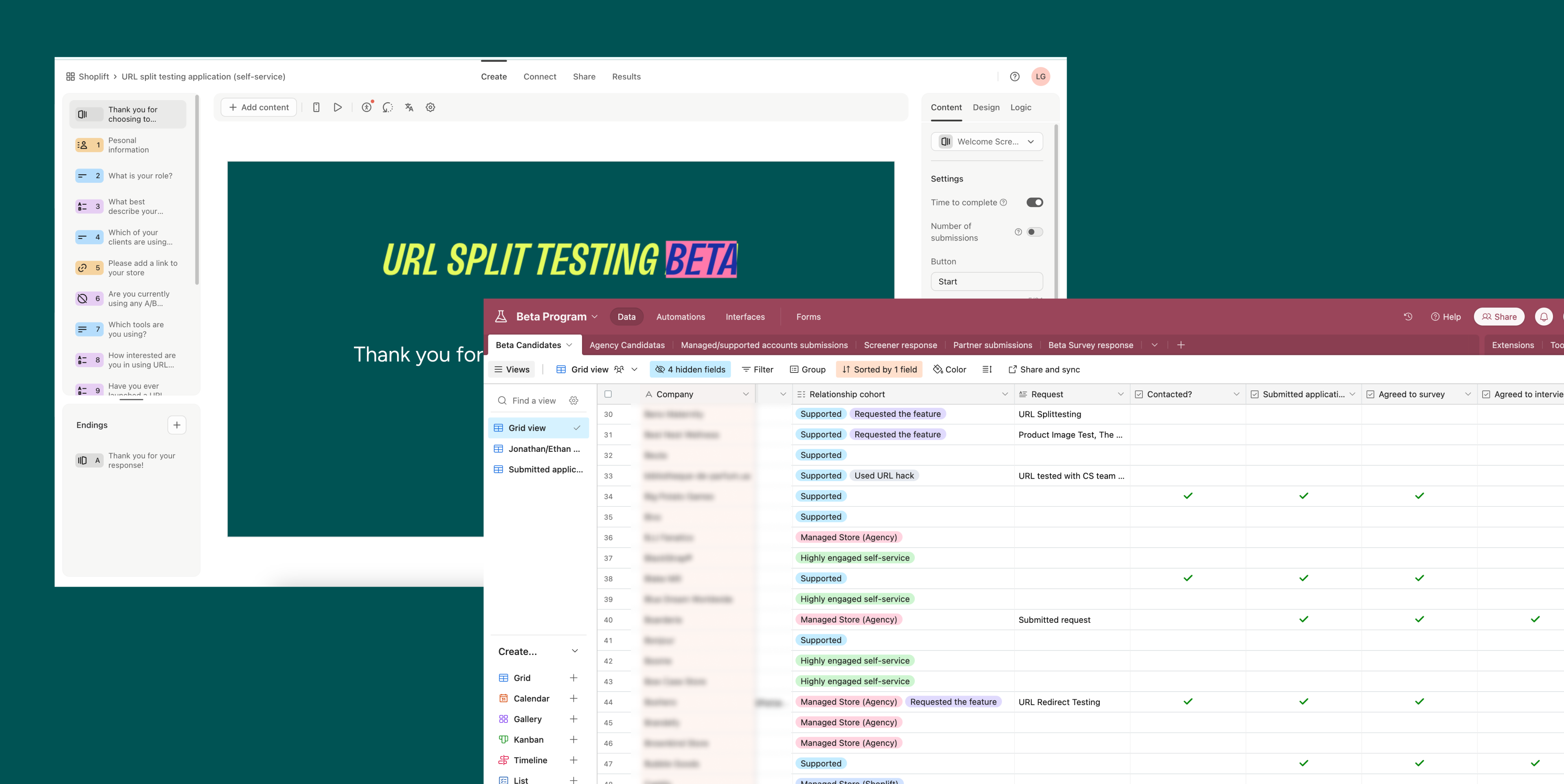
URL split testing Beta Program
TL;DR
URL split testing was a highly requested feature—and also a key internal need for the CS team, who were manually supporting workarounds. We launched a beta program to validate the solution and learn from real user behavior.I built the beta program from scratch, and it’s now a core part of our feature development cycle.
Some of our assumptions were off (we expected more ad campaign tests), but the beta surfaced stronger demand for price and product-level experimentation.
Impact:
- High adoption and real-world usage across diverse test types
- Significantly faster support resolution times
- Minimal friction and clear product-market fit
- Beta process now widely used across the team for future releases
Background
The URL split testing feature was developed to address persistent challenges and align with Shoplift's product objectives:
This feature aimed to expand Shoplift’s testing capabilities, reduce friction for users, and enhance retention, paving the way for long-term growth.
Beta date: September 2024
Release date: December 2024
- Consistent Feature Requests: Users frequently asked for testing capabilities beyond themes and templates.
- Trial Churn: High trial churn rates were attributed to the absence of URL testing as a core feature.
- Manual Workarounds: Customer success teams invested significant time implementing manual solutions for URL testing.
- Support Ticket Volume: There was a high volume of tickets related to "how to set up X."
This feature aimed to expand Shoplift’s testing capabilities, reduce friction for users, and enhance retention, paving the way for long-term growth.
Beta date: September 2024
Release date: December 2024
🤿 Discovery Phase
To guide development, we collaborated with customer success and sales teams, gathering insights into user needs and existing pain points. Key use cases identified included:- Ad Campaign Testing: Testing the effectiveness of landing pages linked from Google and Facebook ads using URLs with UTM parameters.
- Price Testing: Redirecting users to pages with different prices for the same product.
- Product Image Testing: Comparing variations in product images to optimize conversions.
- Collection Page Testing: Testing product layouts and orders within collections.
- Landing page testing: Comparing homepage and landing page designs, including pages created with tools like Replo and supporting nuanced tests requiring custom tools.
- Validating Shopper Flow: Ensuring seamless redirection across multiple steps in the user journey.
- Product-Specific Redirects: Testing templates that showcase products differently.
- Audience Segmentation: Redirecting specific audiences to tailored pages and measuring their engagement.
These insights were pivotal in shaping the MVP and ensuring alignment with user needs.
On the other hand, it was a small scope and low risk feature, which created the perfect opportunity to finally build a beta program at Shoplift.

✅ Feature Priorities
The MVP was designed with simplicity and flexibility in mind:- Maintain Shoplift’s advantage as an intuitive and easy to use A/B testing solution.
- Have a clear interface for setting up URL tests.
- Automated validation to avoid errors and streamline setup.
- Support for common test types, including price, product image, and collection layouts.
- Seamless integration into Shopify’s ecosystem, minimizing friction.
🧪 Recruiting testers
- Organic: We added a link to our documentation that invited users to apply.
- Identifying best candidats: A data query identified around 250 highly engaged, self-service users across all plans and experience levels.
- Managed accouts: Our Customer Success team hand-picked the most qualified accounts to participate.
- Agency partners: We reached out to our partnering agencies to submit their clients.
- Support channels: Users reached out to support and either asked to apply or had a question that URL testing can solve.
We shared an application form and after filtering the unqualified accounts, we ended up with 93 testers from across many cohorts, user needs and experiance levels.
.

🥂 Learnings
As we grew our user base and test creation kept evolving with their needs:Metrics Review on Use Cases:
We were wrong about the primary use cases. Users were mainly testing their product page designs (PDPs) and conducting price tests, which was intersting to learn and apply for the future of the product (we were considering profit optimization features). The numbers:
- Ad Campaign Testing: Only 15% of users tested landing pages, suggesting a need for better user education on this use case.
- Price Testing: A significant 18% adoption validated its relevance.
- Product Image and Collection Page Testing: Moderate adoption rates indicated a demand for these functionalities but also highlighted areas for improvement.
- Audience Segmentation and Advanced Testing: Custom page builder tests and segmented audience experiments showed potential but were less frequently utilized.
Reflection on Original Goals:
- Churn Reduction: The feature addressed the "missing feature" cohort, reducing trial churn.
- Support Efficiency: Average ticket resolution time dropped from 62 hours to 35 hours during the beta, reflecting improved operational efficiency.
- High Adoption: Engagement and feedback indicated the feature met a real user need.
Challenges:
- Low engagement in post-test surveys due to timing around holidays.
- Manual onboarding and feedback collection were resource-intensive.


🥂 Opportunities
Best on the feedback we recived, we now have a plan how to further improve URL split testing and making it a truly seemless experiance.1. Upgrade prompt / Better experience
When a user pastes a URL with a UTM/string, we strip it, but we can also auto-create an audience for him.
- Better experience for Advanced and Pro plans
- Upgrade opportunity for Core plans
2. Testing single products
Fits the most common use case and makes it easier for users to find and confirm the products users want to test
3. Profit optimization / profit reporting (research)
We've seen a lot of use cases of price and offer testing, and I believe we'll continue seeing more. We're starting to gather a good sense of what people are doing, so this is a great research opportunity.


Thank You! ✨️
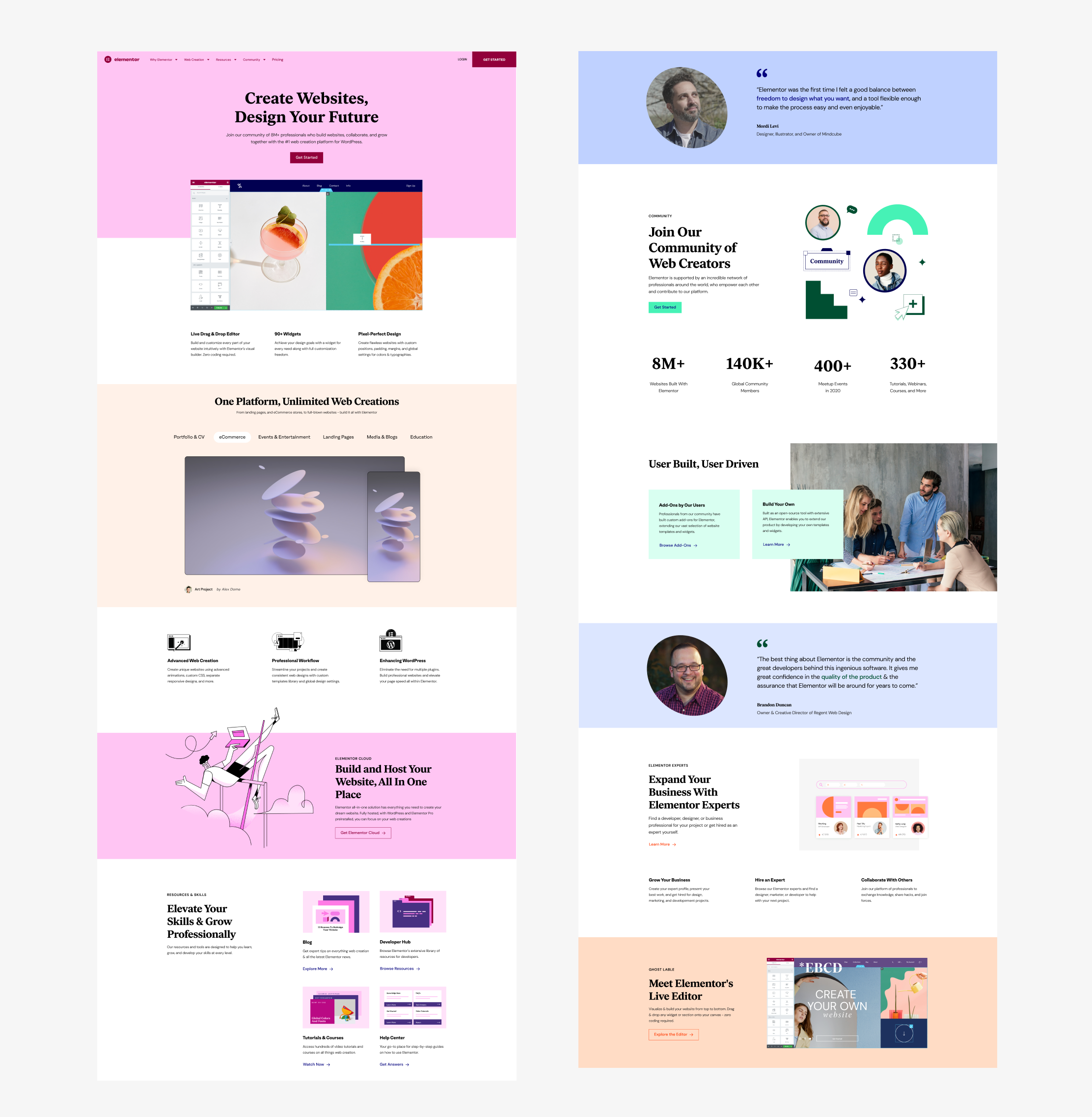
Elementor.com redesign
My Role
🏆 2022 Israeli Brand Awards winner // Best Web User Experience (Award Website) 🏆
- Research: competition, existing website & KPI’s
- UX design: Ideation, hierarchy, page structure, design system
- UI design: building the website brand and style guide
- Teaching new team members
- Building healthy workflows with developers
- Helping PMM’s build the roadmap for next stages
🏆 2022 Israeli Brand Awards winner // Best Web User Experience (Award Website) 🏆
Team
Head of Design: Ronit Cyjon
Team Lead: Erez Eden
Product Marketing: Sarah Nielsen, Daniela Soibelman, Johnathan Maimon
Design Team: Danielle Stelman, Alon Braier, Omri Avraham, Yanki Bindman, Yael Zlotnik, Alona Nof, Shachar Erenfeld, Aviya Tzarfati
Dev. Team: Asaf Rotstain, Alan Kaler, Roy Eyal, Nofar Shlomo
Project Management: Danit Senior, Julien Driquez
Special thanks to Yoni Luksenberg, CEO
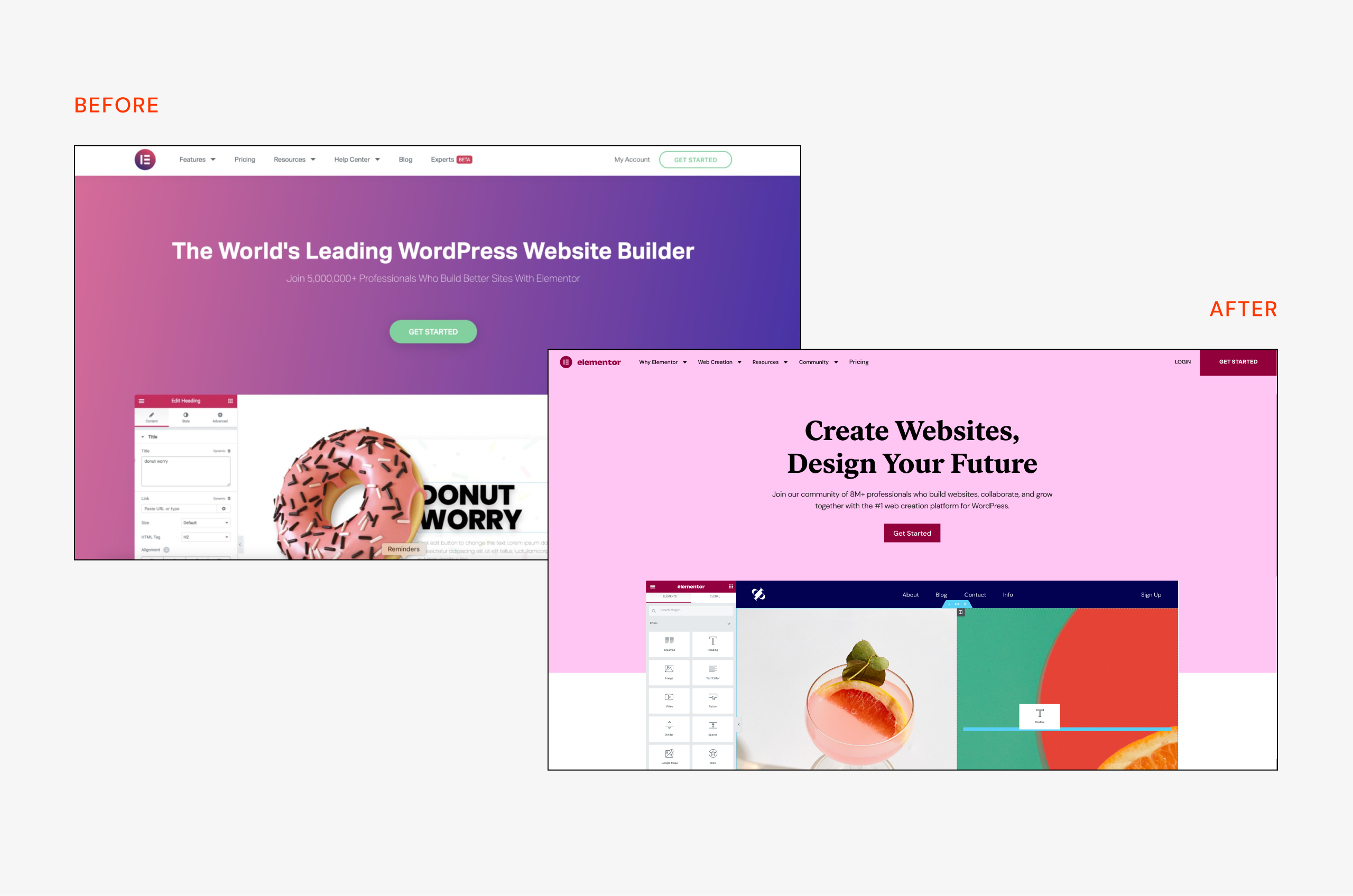
Before & after - home page
👋🏻 Introdusing Elementor
What is Elemntor?
Elementor is the leading website builder platform for professionals on WordPress. Elementor serves web professionals, including developers, designers, and marketers. It started as a humble WordPress plugin and became so much more.
I joined Elementor when the design department started to take shape. One day I was called to a room with Ronit (Head of Design) and Yoni (the CEO) and was given the mission to design the new Elementor website with the new brand.
At first, I had to map all the questions I had - who are we as a company, and what do we represent? what are our business goals? How does the brand react to the web environment? What are our users getting out of it? and what do they need?
Over time new team members joined the effort, a team leader was placed and healthy workflows were created. This project was a huge team effort and I couldn’t do it without the help and advice of so many people.
Live website: elementor.com

⚠️ The Problem
Why redesign a working website? elementor.com was working pretty well and had a good amount of traffic and conversions. We had a few good reasons to do so:1. The brand changed - elementor had a full rebranding and strategy change, it was more than just a wordpress plugin. It became a community of web creators with new goals and aspirations.
2. We had new and higher goals to achieve, first of them was serving the community - with education programs and learning material, new pricing tiers and more.
3. It was simply not the same company anymore and we wanted the website to reflect it. We were telling a new story.
4. Many things didn’t work well - the website wasn't really responsive and accessible and the architecture didn’t make sense anymore. We need to rebuild and restructure.
Product video by Alona Nof & Simon Shor (and that’s me in the green pants below!)
✅ Solution Guidlines
Where do the users go?
One of the first things we learned is that users come back a lot. We didn’t have the data if they already bought the elementor plugin or they are still browsing, but we noticed they came to learn. The pricing page was the most popular one, but after it, we had major traffic in the widgets page, big feature pages and the blog.
How do they browse?
It was very clear that most of the traffic comes from desktop - around 87%. Purchasing from the pricing page was higher - 96%, which made sense, since the elementor plugin is a work tool, a web desktop app, as a professional you’ll probably have your computer for working. Also people make big/important purchases on their computer mostly. So we designed desktop first, but always having in mind the responsive aspect.
How do we build?
It was important to build purly with the elementor plugin and show our users the best capabilities we have. It was limited in some parts but we tried to keep the code used to a minimum and just be creative. The mega menu for example was a “hack”, using the popup feature, but still, purely elementor with a touch of CSS.
The Design
Design-wise we wanted to be bold and to stretch the meaning of web design. We were guided by the idea of the product being part of our users daily life. More than just a work tool - an active and strong global community. This inspired our page hero sections, the bold color palette and the mockups we designed to demonstrate features - true to the product and still bold and inspirational.
The work is not done, probably will never be. The idea was to create a solid base for now and to build on it in the future, while keeping it bold, fresh and adapting to change. Of course we made some mistakes, some are still live and waiting in the backlog to be fixed.
As the design and developer team grew, we knew we had to keep the design language coherent, so that how the web design system was created, you can check out the study case here.
 User website carusel
Evolution of the pricing
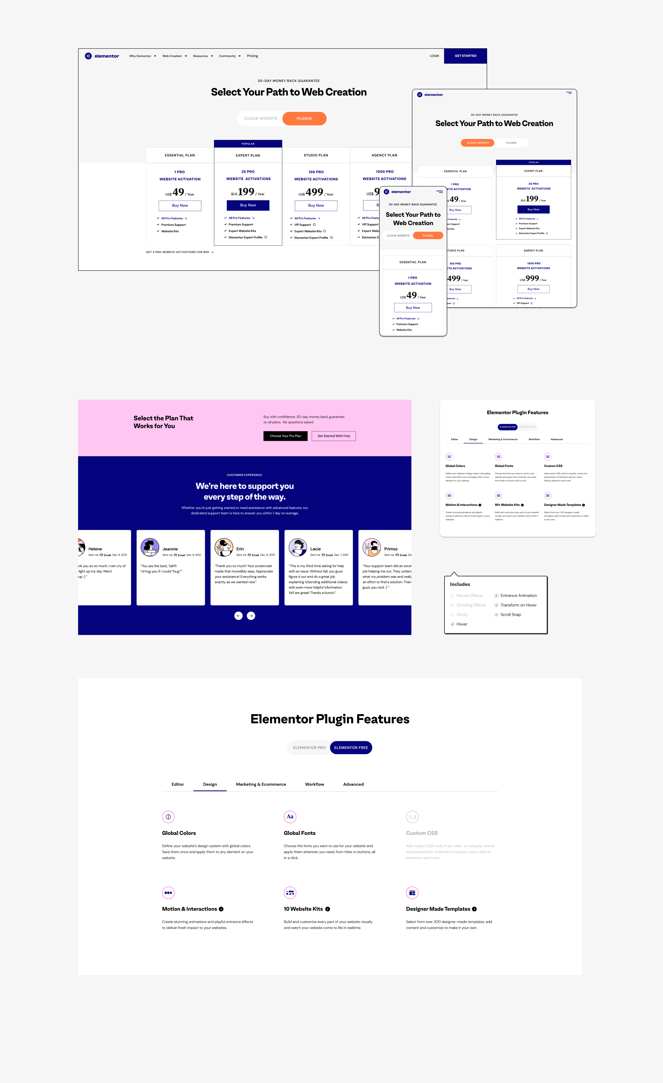
The 2nd most viewed page after the home page, was the pricing page. It was always a fun challenge to make it work, be clear and also reach all the goals and guidelines from the marketing department. Probably one of my favorite pages to think about.The first redesign happened when the website launched in June 2021, right after 2 new pricing tiers were added. It created a huge shockwave through the community. People were angry, because the $199 plan used to include 1000 websites, but now it’s just 25 websites. How could we do that? There’s of course a great explanation for that, but why should the users care?
The problem
Instead of 3 plans, we now had 5. The main difference between them was the price and amount of websites, there were also some other perks, but that came much later. When sales happen, like on Black Friday, it’s even harder to understand what’s going on. Sales we’re decreasing and we needed to help the effort on our front,
How we solved it
Tests, tests, tests. We did many A/B tests without hypothesis. One of the more successful ones was moving the 2 top tiers to diffrant tab/page, which helped with the sales of the cheaper plans. Design wise we went for the friendly pink approach, and made it all super transparent and easy to compare. We added illustrations and icons to help guide the users.
Collaboration with Yael Zlotnic
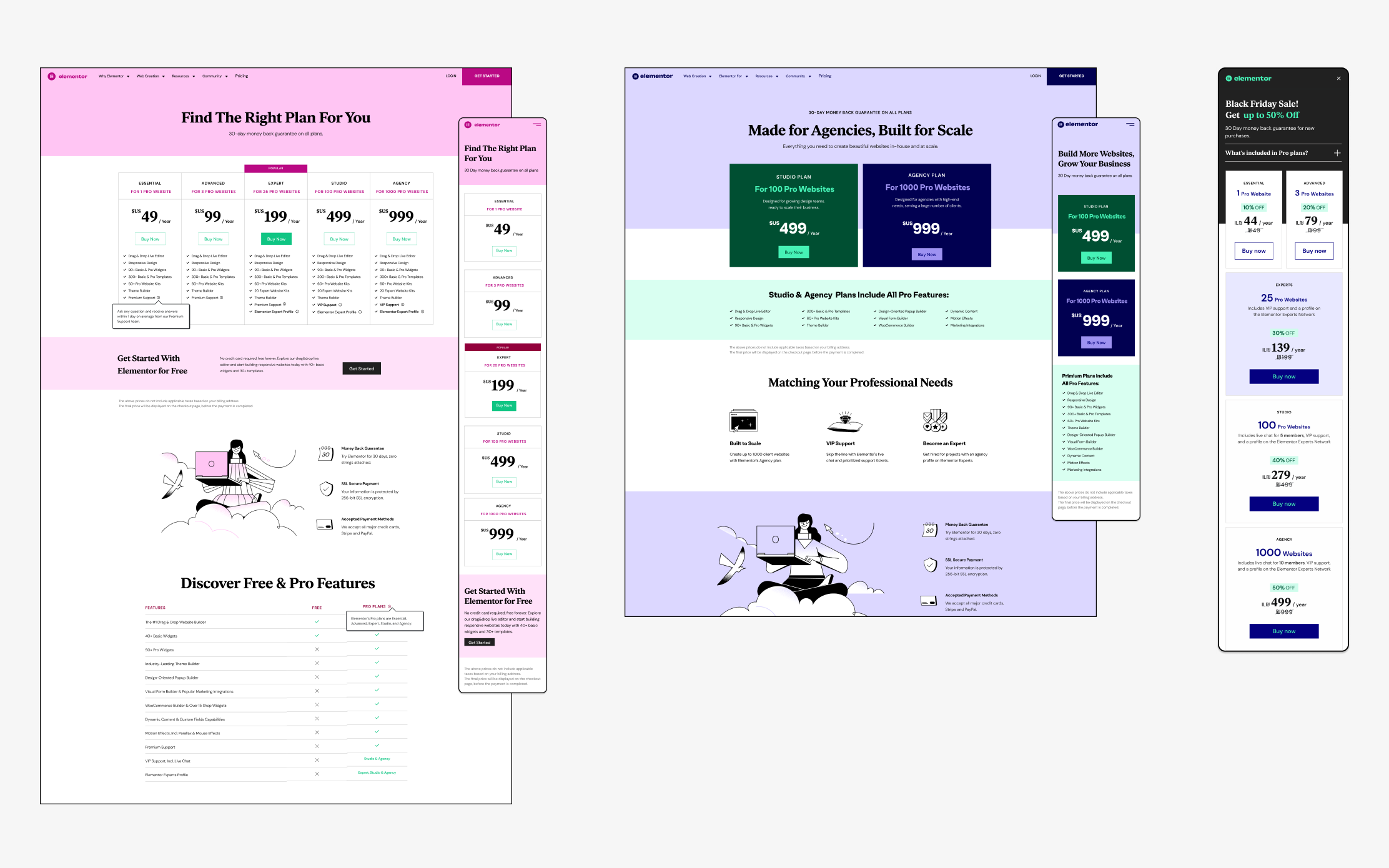
Old Pricing pages
From the left: Plugin pricing // Top tier test // Black Friday Sale
From the left: Plugin pricing // Top tier test // Black Friday Sale
The New Game Changer
In March 2022, a new player was added to the board - the Elementor Cloud Website. All the advantages on the plugin, but with hosting included. This one was tricky. It was not a 6th pricing tier, it was a whole new product. But it was still Elementor, with all the plugin advantages. We had to explain it very well to our slightly confused community of users.How we solved it
After some tests, we went with the bold approach - “Cloud First'' - which ment we that the first thing you see in the pricing page, was the Cloud Website option, the plugin was 2nd in hierarchy, you need to press the toggle to “reveal” it. After many sketches, brainstorming sessions, we got to this result. We knew it was temporary (more cloud plans were planned), but as always, we were creating a base for the future to come. The branding of the cloud product was those circles that we were trying to combine harmonically in the page.
A collaboration with Yael Zlotnik
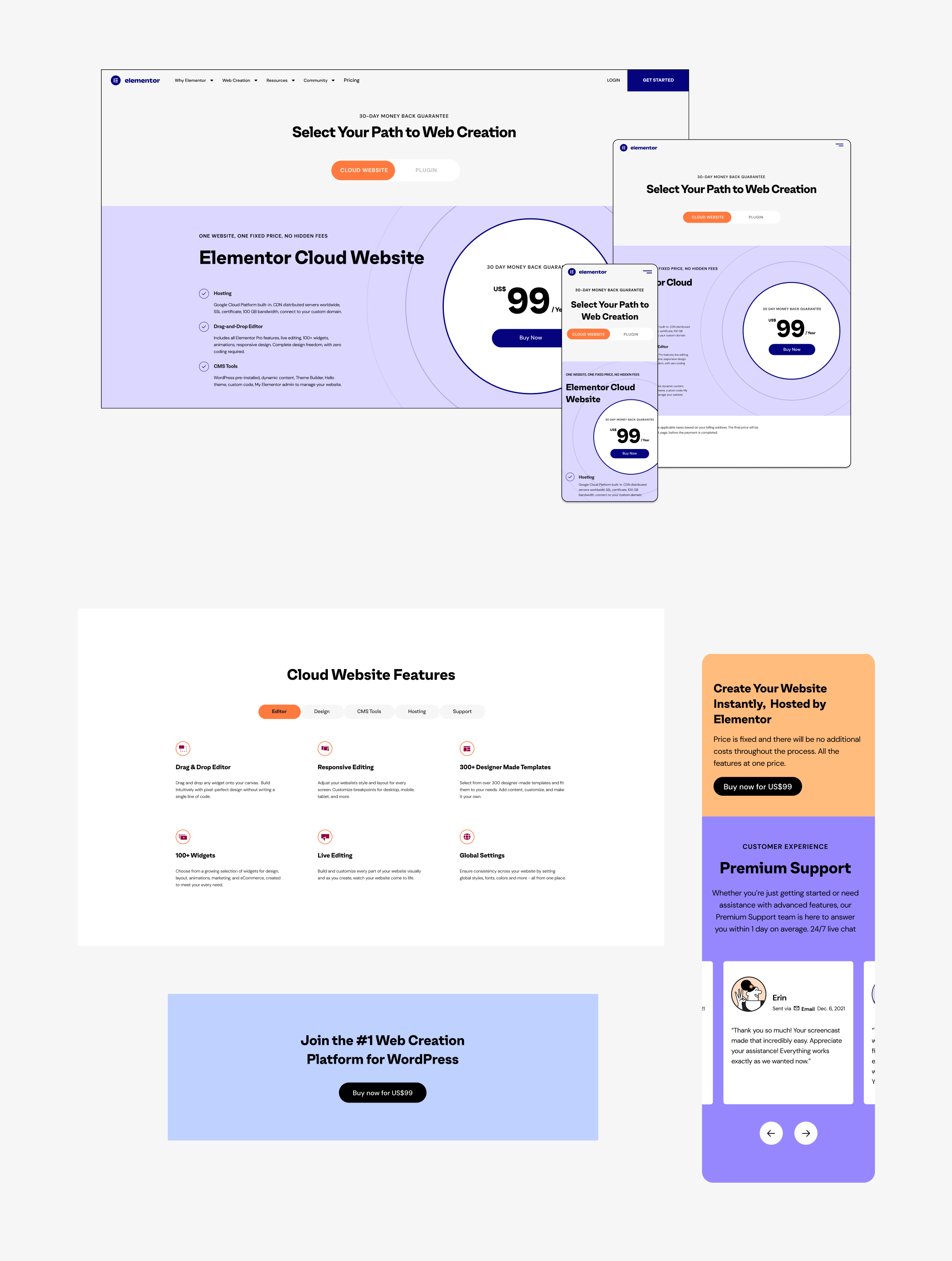
Don’t Forget the Plugin
We took this great opportunity to make some much needed updates in the good-old plugin page and help the users understand it better and to find the right fit for their needs. We cleaned it up and made it more simple, but also combined structures from the cloud version for the rest of the page. One of my favorite parts was the feature list - we divided them into tabs and made the comparison for what you get for the free vs. the paid version (see video below).
New product pricing - Cloud plan
Feature Focused
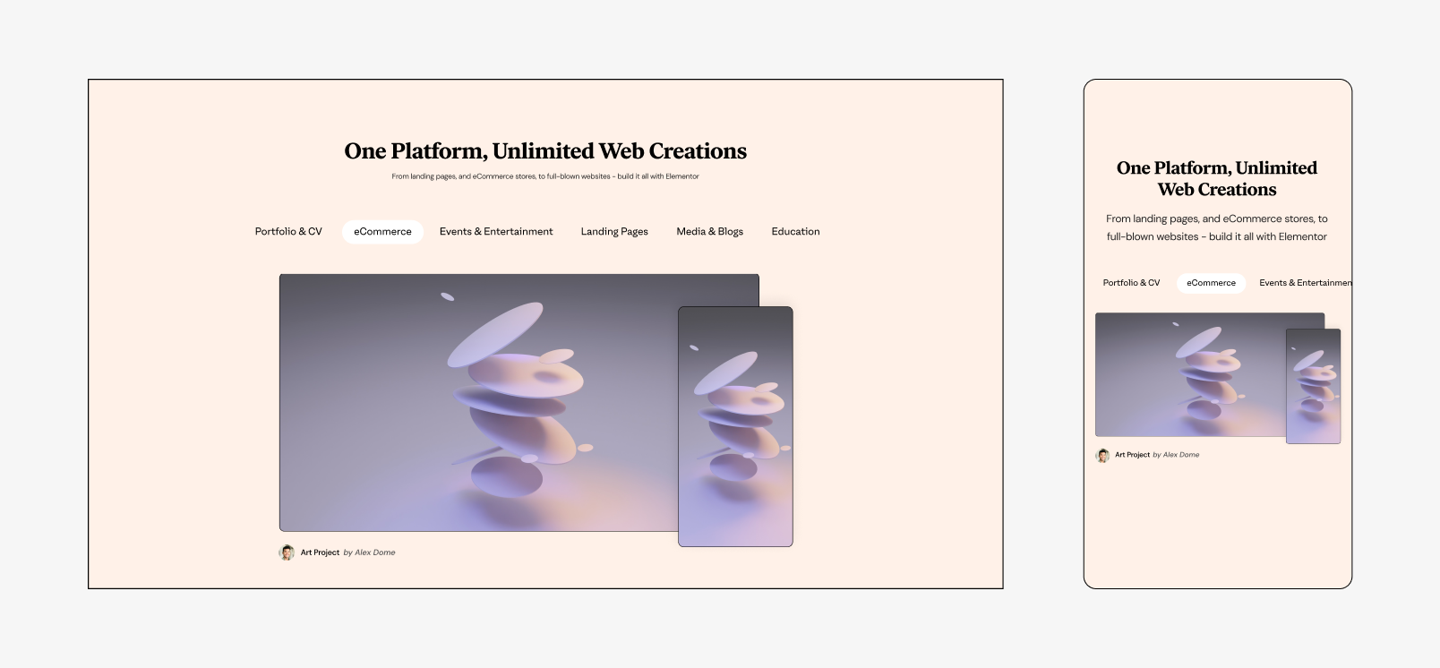
Users want to read about features, and not just the new ones. We saw a lot of traffic on feature pages, mostly the big ones Elementor had built in, that wordress users had to buy seperatly before. We created a playful 3D language for the hero section and tried bold colors, videos and illustrations.
Feature Pages
Feature index page
A fun UX challenge was to create a new index for all the Elementor features, including a search option that it didn’t have before. For that we had to use extra developers, since it was not a native Elementor option.
Also, I developed a simplification of the Elementor Editor, to help explain features to our users - where they are, how they look and what they do.
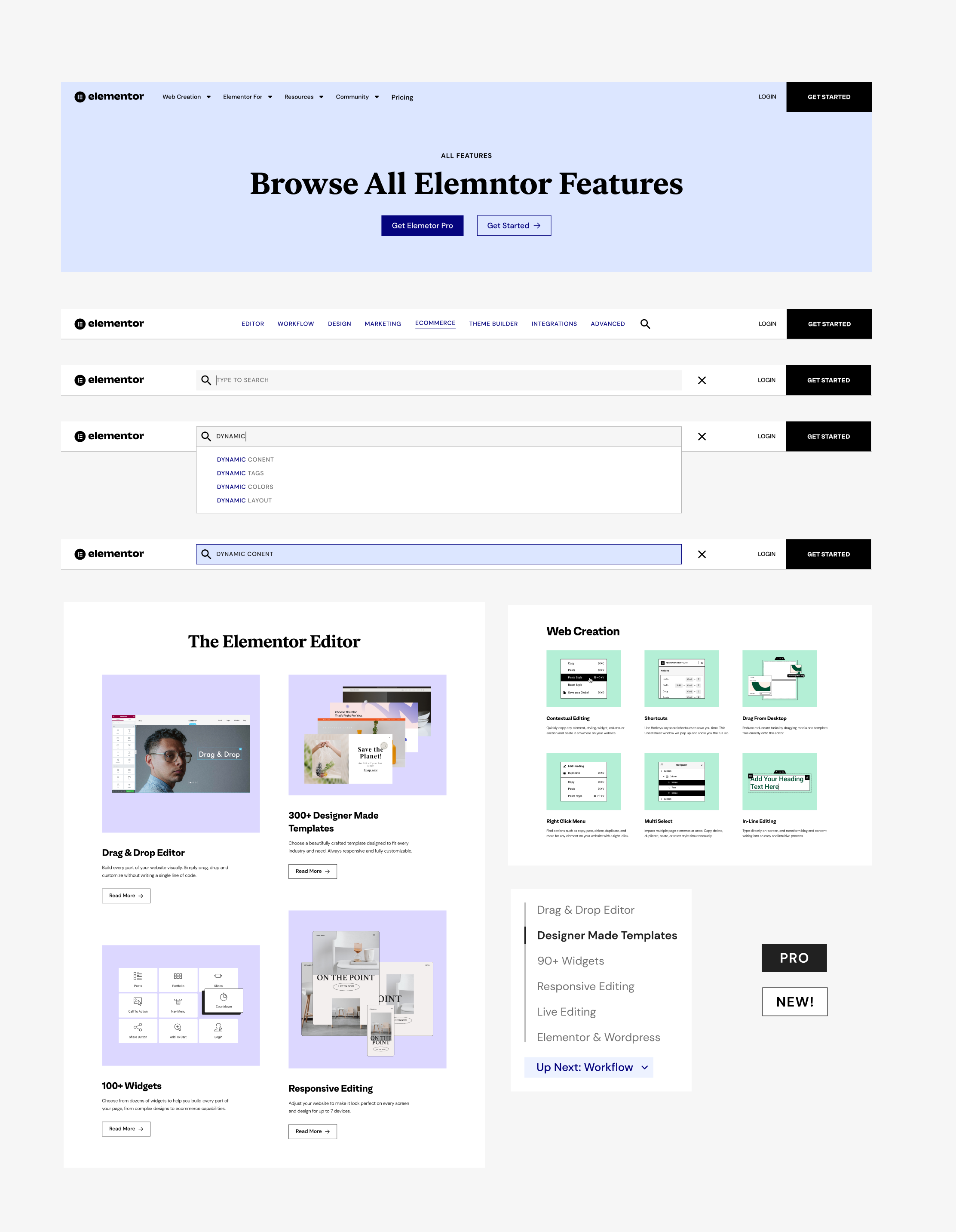
Feature Index Page
Anything for any user
We have 5 main user personas for the website, but of course in real life our users are usually a mix of those: designers, developers, marketers, SMB owners and agencies. We created hubs for each one, with the best features and solutions for them.Live Designer Page

Persona Pages
Designer Page Scroll
Special Pages
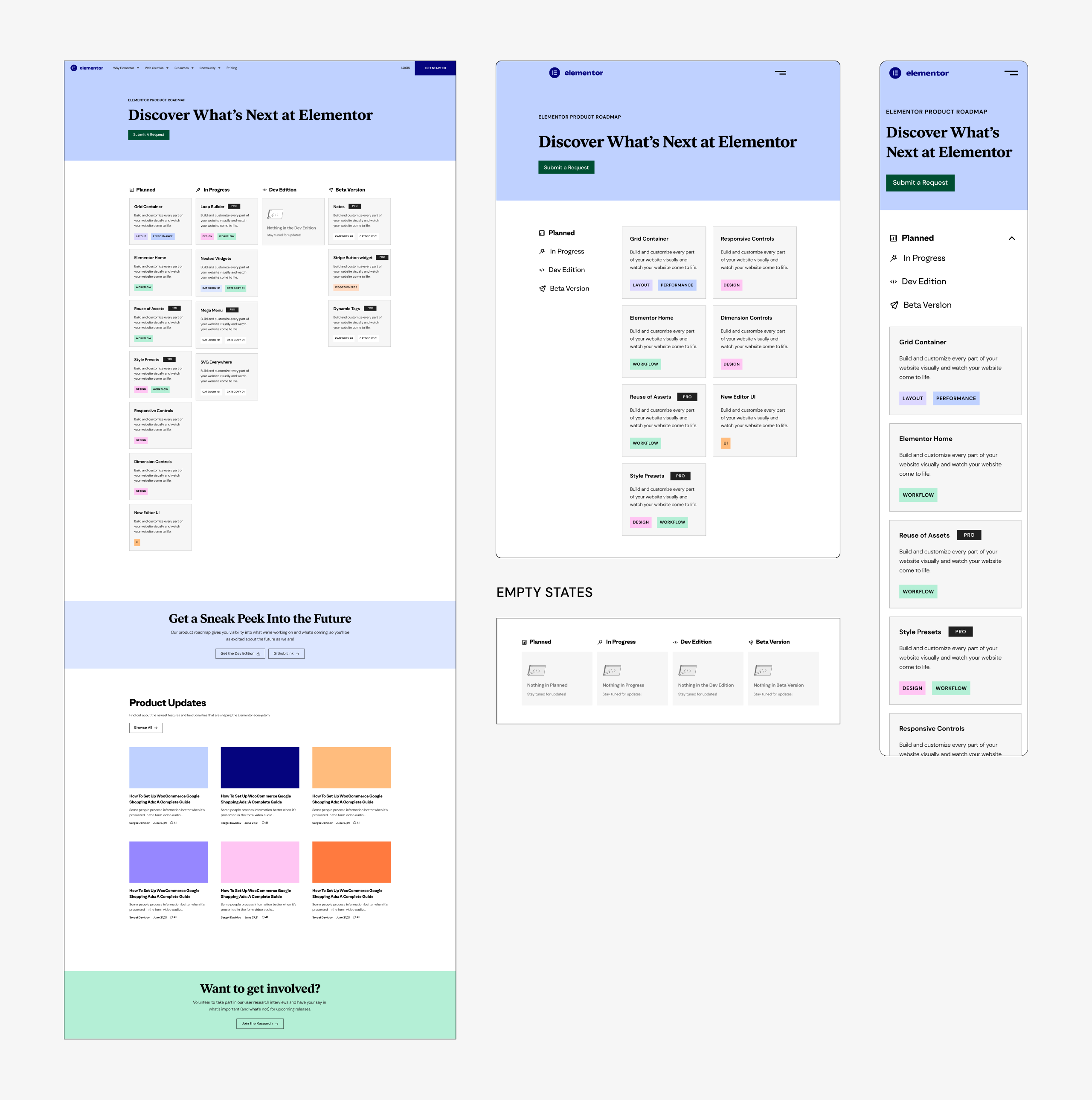
Not all the pages are feature or persona pages, some have no specific category, but they serve a need and tell a story. Those two are my favorite special pages:Roadmap Page
Transparency was always one of our key goals, and since our users always ask us when this and that feature will be launched, we created this roadmap page. Alongside the feature schedule, we added feature updates and an interactive explanation of our development process. The next stage will be adding voting on requested features. This page will be live soon.
Customer Experience Page
Elementor made a huge effort to make the customer service great. It’s our closest interaction with our users, in time of need. It became an award-winning experience and we really wanted to highlight it and the people behind it, make it easy to submit a ticket and explain the difference between our Pro & VIP support.
View live Customer Experience page
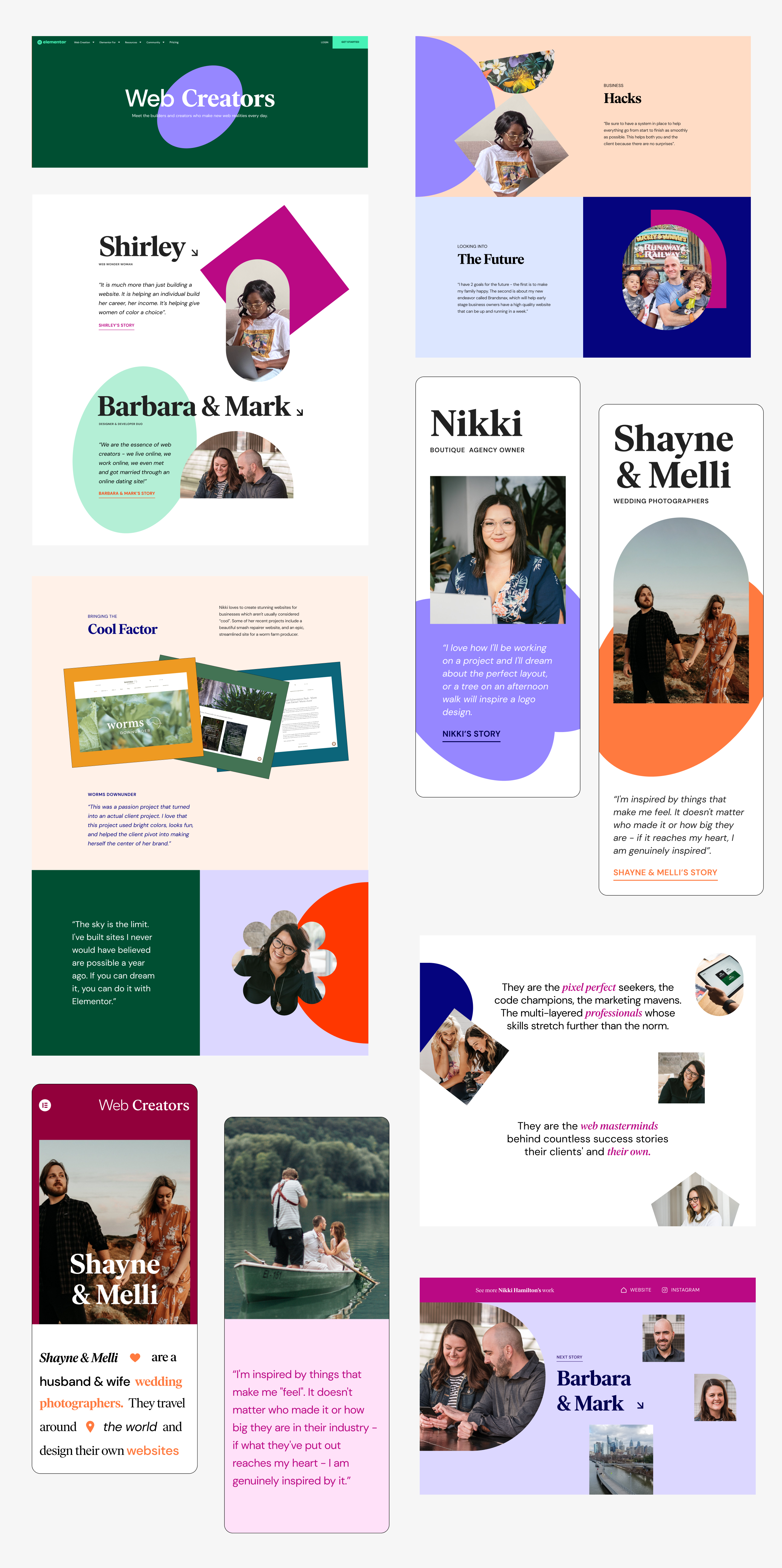
Web Creators Hub
This is the home of a very special project and it’s telling the stories of our actual users - with interviews and videos. We made a sub-brand for it and created a scrollytelling experience.
View live Web Creators Hub
Roadmap Page

Customer Experiance Page
Web Creators Hub